

| Key Takeaways
● Pick a color scheme type (monochromatic, analogous, complementary, or neutral) before choosing individual paint colors. ● Match undertones and LRV (light reflectance value) to your room’s light direction so colors don’t turn muddy or washed out. ● Apply the 60-30-10 ratio, dominant, secondary, accent, so a room feels intentional rather than busy. ● Renters can recreate most of these looks with textiles, removable wallpaper, and accessories instead of paint. ● Always test swatches under both daylight and evening lighting before committing to a full room. |
Walk into a room and, before you notice the furniture or the artwork, you already know whether the color feels right. That instant reaction is exactly why interior color scheme trends matter so much right now, the palette sets the mood of a home before anything else does. From moody, museum-like studies to airy, sun-washed kitchens, today’s most compelling schemes are less about chasing one trendy shade and more about building a complete, livable story across a room. This guide walks through 17 real, workable color scheme ideas for every corner of your home, the kind of practical, livable inspiration Sunday Abode is built around, plus the undertone, lighting, and application know-how that turns a mood board into a finished room.
What Makes a Color Scheme Actually Work in a Real Room?
A color scheme works when its undertones, proportions, and light reflectance value are matched to a room’s actual conditions, not chosen because they looked good in a photo or on a paint chip. Get those three fundamentals right and almost any color combination becomes livable.
The 60-30-10 Ratio
Professional colorists build a room around three roles rather than picking colors at random. The dominant color covers roughly 60% of the room, typically the walls or largest surface. A secondary color takes about 30%, usually through upholstery, cabinetry, or flooring. The remaining 10% is reserved for accents: pillows, art, hardware, and small decor. Skipping this ratio is one of the fastest ways to end up with a room that feels busy instead of intentional, even when every individual color is one you genuinely like.
Undertones and Light Reflectance Value (LRV)
Every paint color has two properties worth understanding before buying a gallon: undertone and LRV. Undertone is the underlying color cast beneath the main hue, a gray can lean blue, green, or purple, and a white can lean yellow or pink. LRV, or light reflectance value, measures how much light a color reflects on a scale of roughly 0 (absolute black) to 100 (pure white). Colors under about 20 LRV read as dark and can make a small or dim room feel closed in, while colors above about 70 LRV feel airy but can look washed out under harsh overhead lighting. Most of the ideas in this guide fall between LRV 20 and 65, which tends to read as rich rather than flat in an average room.
Match Undertones to Your Room’s Light Direction
Which way a room faces changes how a color actually reads on the wall, and this is one of the most commonly overlooked factors in color planning. In the Northern Hemisphere, north-facing rooms receive cooler, more indirect light, which can make cool-toned paints, blues, greens, and cool grays, look flat or slightly gray; warming up the undertone helps balance that. South-facing rooms get warmer, more direct light, so cooler undertones stay balanced instead of looking oversaturated. If you’re in the Southern Hemisphere, this pattern flips: south-facing rooms get the cooler, indirect light, and north-facing rooms get the warm, direct sun. Either way, check a color in the specific room it’s going in, not just near a window somewhere else in the house.
Test Swatches at Two Different Times of Day
Paint at least a 30 cm (about 1 ft) square swatch on two or three different walls in the room, then view it during the day and again once your evening lights are on. Warm LED bulbs, typically rated 2700 to 3000 Kelvin, can pull green out of blues and shift grays toward purple, which is why a color that looked perfect at noon can feel off by dinner. Give it 24 to 48 hours before deciding, since even daylight itself shifts meaningfully between morning and late afternoon.
Which Color Scheme Type Fits Your Space?
Every idea in this guide is built on one of four underlying color scheme structures. Knowing which one you’re working with makes it far easier to swap in your own favorite hues later.
| Scheme Type | How It Works | Best For | Watch Out For |
| Monochromatic | One hue in varying tints, tones, and shades | Small rooms, calm bedrooms, minimalist spaces | Can feel flat without varied texture and sheen |
| Analogous | Two to three neighboring hues on the color wheel (e.g., blue, blue-green, green) | Living rooms wanting harmony with gentle contrast | Needs one neutral to anchor it or colors can compete |
| Complementary | Two opposite hues on the color wheel, used in an uneven ratio | Accent walls, dining rooms, statement moments | Overwhelming if used in equal amounts across a room |
| Neutral / Tonal | Warm or cool neutrals layered through paint, wood, and textiles | Whole-house flow, resale-focused homes, rentals | Can read as bland without texture, metallics, or one accent |
17 Interior Color Scheme Trends Worth Trying
Each idea below is a complete, cohesive palette, not a single paint chip. Every one is built to the same standard: a clear undertone strategy, a realistic LRV range, and at least one honest caveat about where it does and doesn’t work.
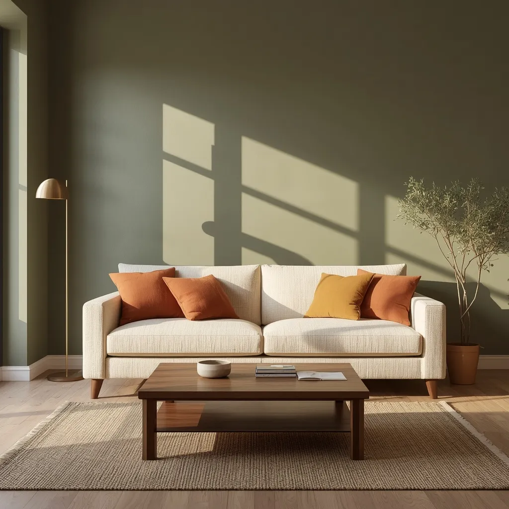
1. Olive Green Living Room
Olive green anchors a living room with an earthy, grounding calm that reads as sophisticated rather than trend-of-the-moment. Paired with warm walnut or oak furniture, brushed brass hardware, and a boucle or linen sofa in warm cream, the room feels like it belongs indoors and out at once.
Use olive, roughly LRV 20 to 28, as the dominant wall color in the 60% role, then let warm wood tones carry the 30% secondary layer through flooring and furniture. Reserve brass, terracotta, or mustard for the final 10% of accents. This works especially well with plenty of natural light, since olive can turn murky in a dim, north-facing room, if your space runs dark, size up to a lighter olive closer to LRV 30 rather than a deep, saturated shade.
- Best for: living rooms with good natural light and existing warm wood furniture
- Why it works: olive bridges warm and cool tones, so it pairs with both brass and black hardware
- Common mistake: choosing a cool, blue-based olive for a north-facing room, which can look gray and lifeless
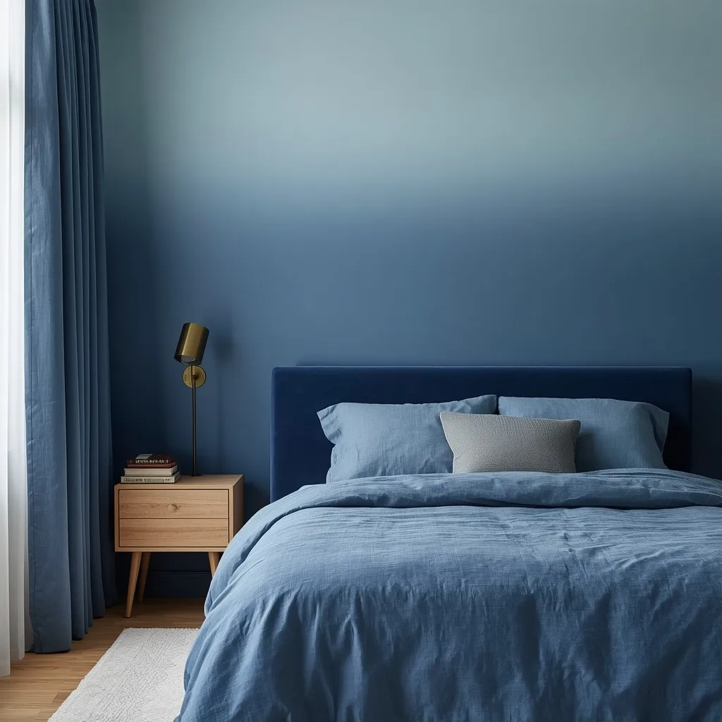
2. Monochromatic Blue Bedroom
A monochromatic blue bedroom layers a single blue family from a pale, powdery ceiling down to a deep navy headboard wall, creating a serene, cocoon-like retreat that never tips into feeling cold or sterile.
Pick one blue family and vary it across three or four tints, from lightest on trim and ceiling to darkest on a single accent wall or headboard nook. Lean on texture, velvet, linen, boucle, to keep an all-one-color room from reading flat, and add one warm neutral, like a light oak nightstand or brass sconce, to stop the palette from feeling cold. Varying the sheen between walls and trim also adds subtle depth without introducing a second color.
- Best for: light sleepers and anyone wanting a bedroom that feels calming rather than sterile
- Tip: use matte or eggshell walls with a slightly higher-sheen trim to build in dimension
- Common mistake: using the exact same sheen on every surface, which flattens a monochrome room
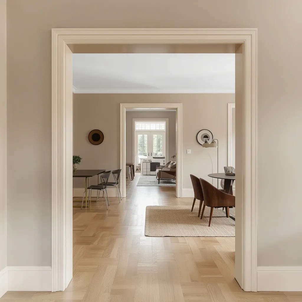
3. Warm Greige Whole-House Palette
Painting an entire main level, living room, dining area, hallway, and kitchen, in one warm greige creates a smooth visual flow from room to room, with no jarring color change every time a doorway opens.
Choose a warm greige with an LRV in the 50 to 65 range so it reads neither too dark nor washed out under mixed lighting. Because light exposure varies room to room even with identical paint, test the same greige in each space before committing to the whole level. Keep trim a soft, warm white rather than stark white to avoid an overly stark contrast, then layer rugs and textiles to give each room its own personality within the shared base.
- Best for: open floor plans, resale-focused homeowners, and renters who need one landlord-approved color
- Why it works: one base color removes the visual break between connected rooms
- Common mistake: assuming identical paint looks the same in every room regardless of window direction
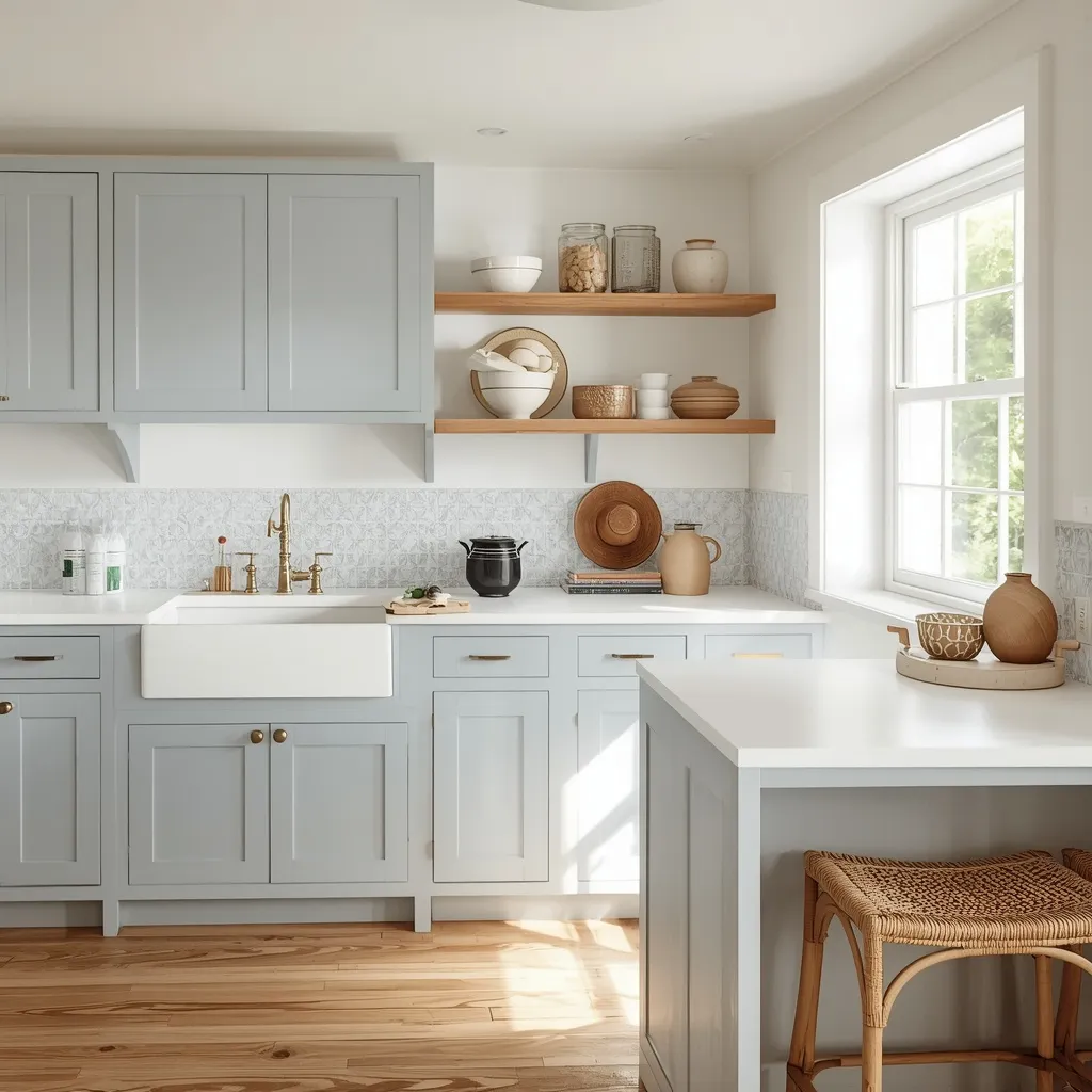
4. Coastal Blue Kitchen
A dusty, grayed coastal blue on the lower cabinets against warm white uppers and walls gives a kitchen an easy, seaside-adjacent calm that works whether the house sits near water or a thousand kilometers from it.
Let the lower cabinet color carry most of the visual weight, the kitchen’s 60% role, with a white handmade or subway tile backsplash as the secondary layer and warm wood open shelving or a cutting board display as the 10% accent. Sheen matters more in a kitchen than almost anywhere else: use satin or semi-gloss on cabinets for easy cleaning, and save true matte for walls only, away from splash zones.
- Best for: kitchens with strong natural light, from coastal cottages to inland bungalows
- Budget option: renters can use peel-and-stick backsplash tile and cabinet appliques instead of paint
- Common mistake: choosing high-gloss white uppers that show every grease splatter, satin hides them better
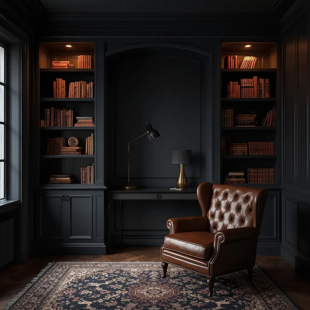
5. Charcoal & Brass Study
Deep charcoal walls, built-in bookshelves, brass picture lights, and a worn leather chair bring a mansion-library gravitas to a home office or den, no matter how modest the actual square footage is.
Dark walls absorb rather than bounce light, so a room this saturated needs layered lighting instead of a single overhead fixture: a brass picture light over the shelves, a floor lamp, and a task lamp at the desk. Keep the ceiling a lighter tone, white or pale charcoal, to prevent a cave-like feeling. This scheme suits rooms used mainly in the evening; a small windowless room without at least two or three added light sources will feel closed-in rather than cozy.
- Best for: a formal home office, den, or reading nook used mostly evenings
- Not ideal for: small, windowless rooms without supplemental lighting layered in
- Common mistake: painting a small dark room without adding extra light sources beyond the overhead fixture
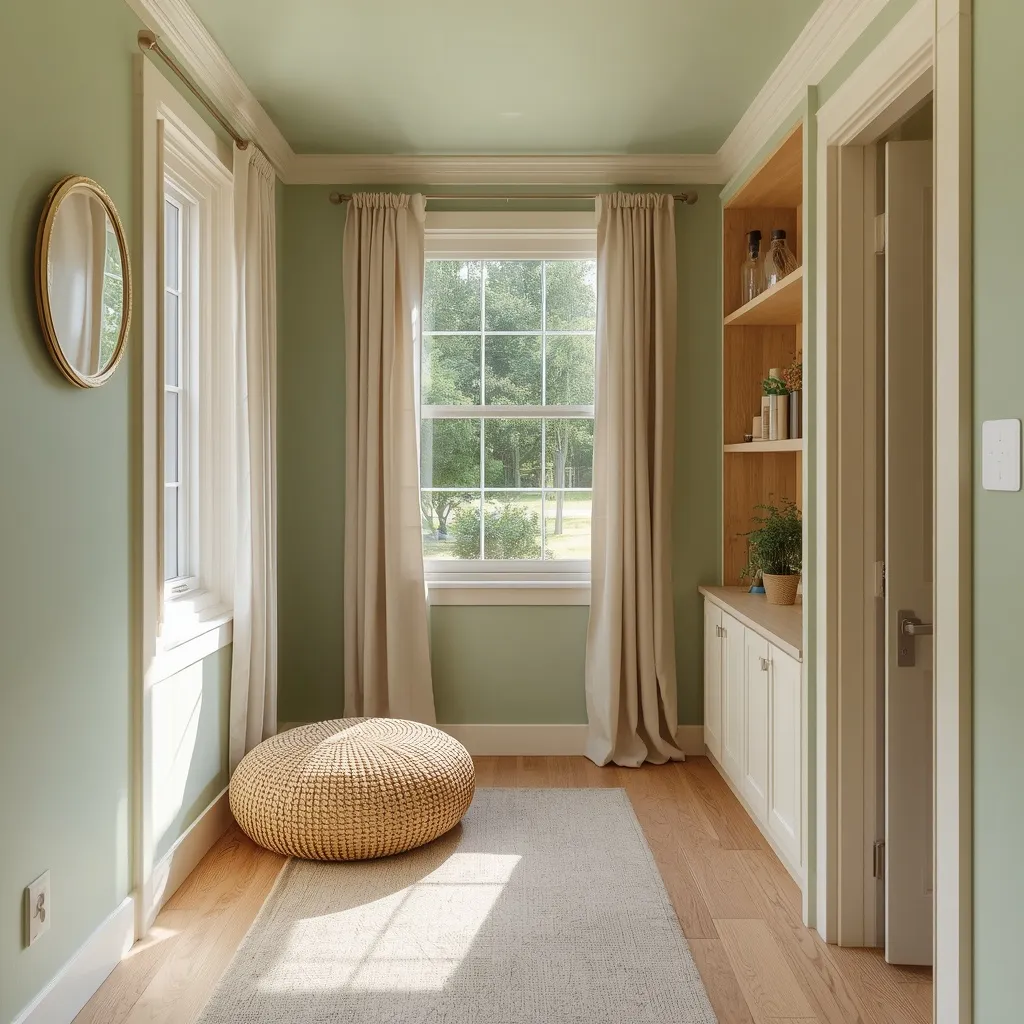
6. Sage & Cream Tiny House
A soft, grayed sage green on the walls, paired with cream trim and warm wood built-ins, visually expands a small footprint without resorting to stark, clinical white.
In small spaces, staying above roughly LRV 40 is the safest zone for keeping a room feeling open rather than boxed in. Painting the wall and ceiling the exact same color removes the visual line that makes low ceilings feel even lower, and hanging a mirror opposite the main window effectively doubles the perceived light. Add just one deeper sage element, a single cabinet run or door, for depth without visually shrinking the room further.
- Best for: tiny houses, studio apartments, and small bedrooms
- Renter option: sage textiles plus cream paint (if permitted) or a removable wallpaper accent
- Common mistake: layering too many different accent colors, which fragments a small room visually
7. Terracotta Earthy Living Room
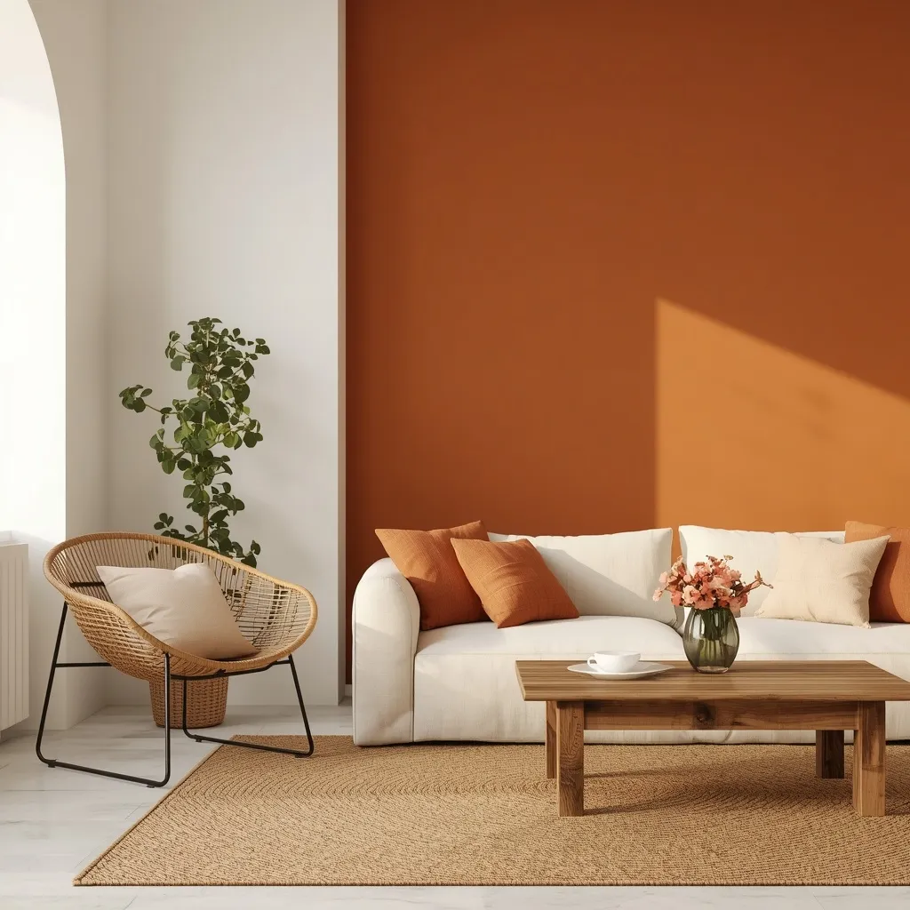
A warm terracotta accent wall set against warm white surrounding walls, with rattan, a jute rug, and an aged wood coffee table, gives a living room a Mediterranean-leaning warmth without repainting the whole room.
Terracotta, roughly LRV 25 to 30, tends to work best as one accent wall or nook rather than covering all four walls, since a fully terracotta room can feel heavy in lower-light climates. Pair it with a warm gray-white (rather than pure white) as the dominant 60% color to balance the saturation, and layer in natural materials, rattan, linen, unlacquered brass, to round out the earthy story.
- Best for: living rooms with south- or west-facing light for a warm, sun-washed effect
- Budget option: one terracotta accent wall plus terracotta textiles instead of a full room
- Common mistake: painting all four walls terracotta in a small, low-light room, where it can feel heavy
8. Emerald Green Dining Room
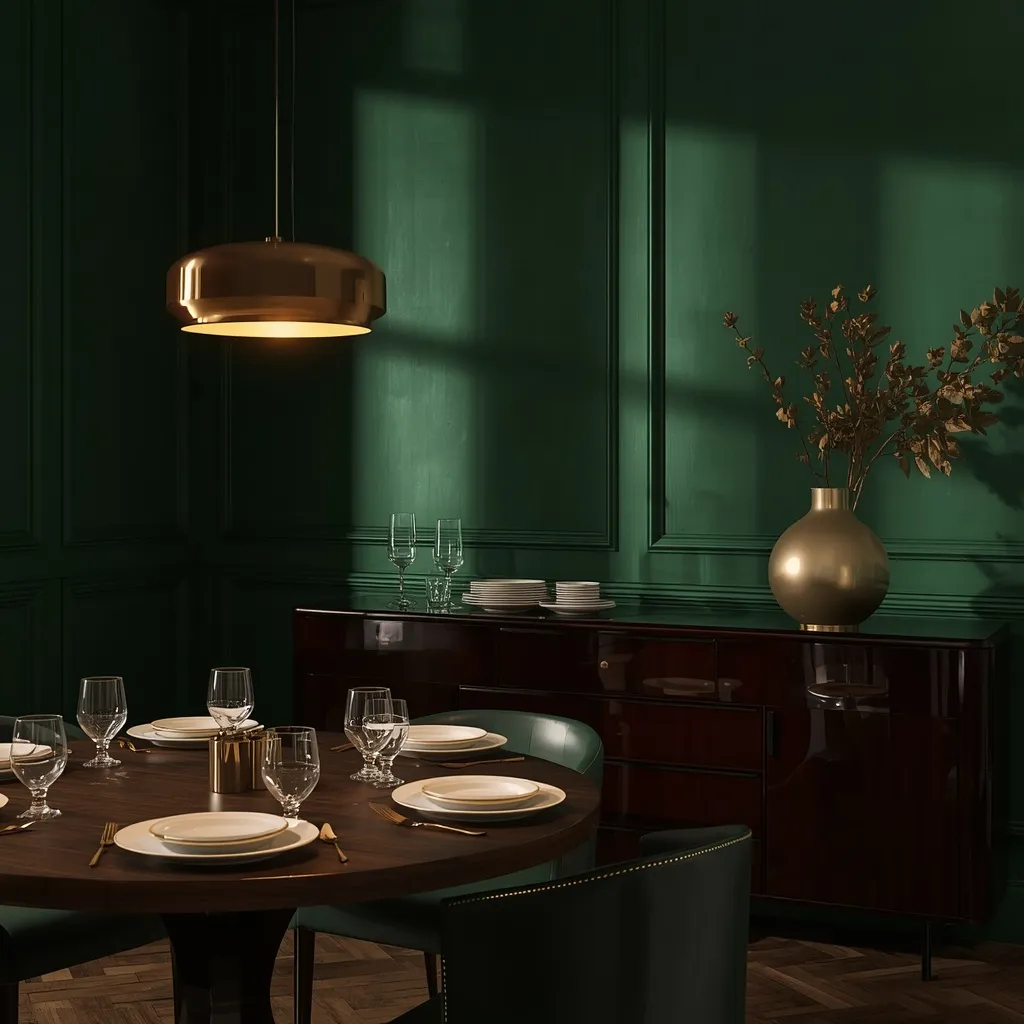
Deep, jewel-toned emerald walls, gold-rimmed dinnerware, and a statement pendant light turn a dining room into the most dramatic room in the house, and dining rooms are the ideal candidate for exactly that kind of boldness.
Because a dining room typically sees far less daily use than a living room or kitchen, its bold saturation doesn’t fatigue the eye the way it might elsewhere. Pair emerald, roughly LRV 10 to 15, with a lighter ceiling and warm, dimmable lighting around 2700 to 3000 Kelvin to keep evenings inviting rather than flat. A mirror or a glossy wood sideboard helps bounce available light back into the deep color.
- Best for: a dedicated, less-trafficked dining room used mainly in the evening
- Not ideal for: an all-day family eating space with low natural light and no dimmer switches
- Common mistake: pairing deep emerald with cool white, 5000K or higher, overhead bulbs, which flattens its richness
9. Dusty Rose Bedroom
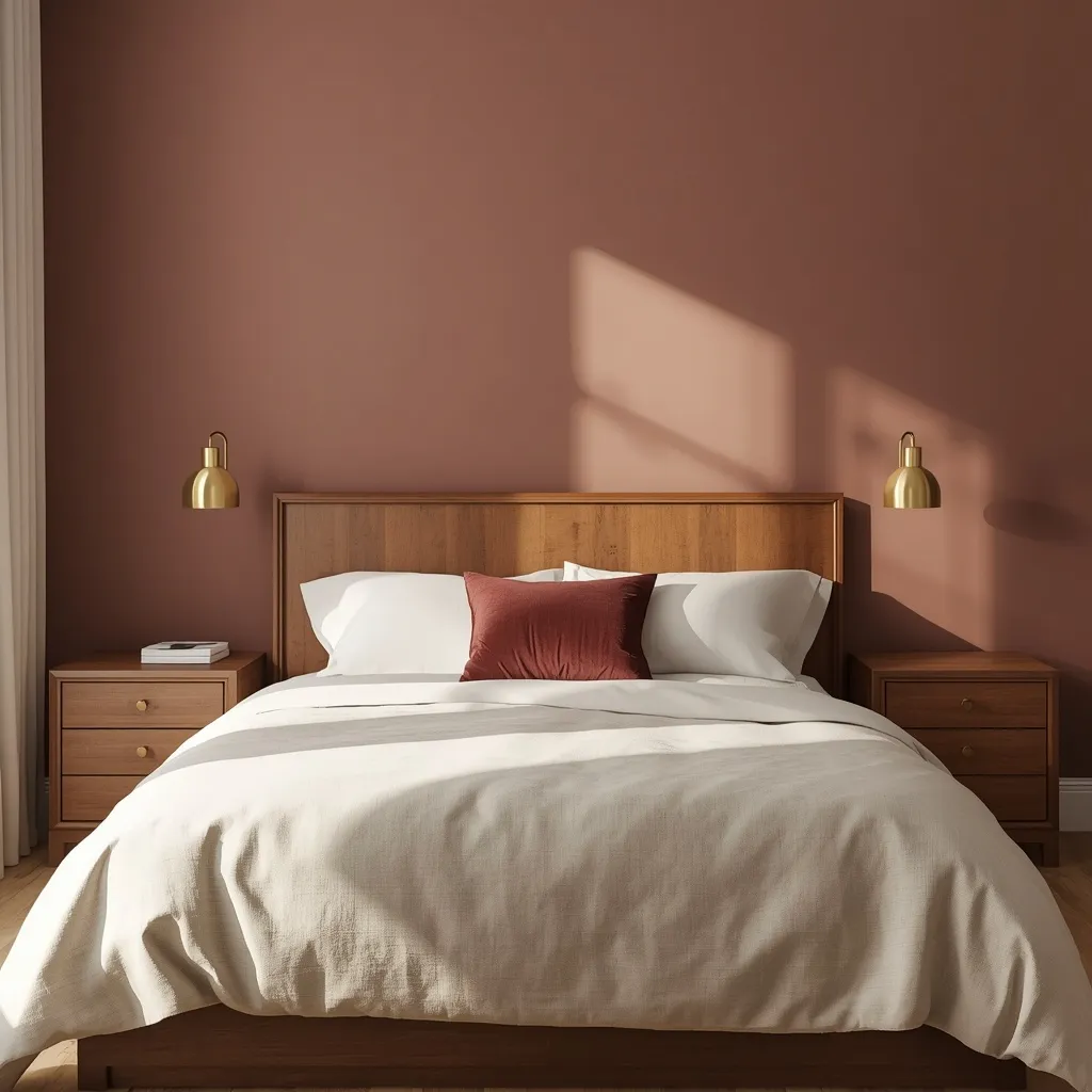
A muted, grayed dusty rose, not a sweet bubblegum pink, paired with warm ivory bedding and brushed brass fixtures, makes for a soft but distinctly grown-up bedroom palette.
The trick to making pink read sophisticated rather than juvenile is choosing a dusty, grayed version, roughly LRV 55 to 65, rather than a saturated candy pink, then grounding it with a darker neutral like charcoal or deep walnut furniture so the room isn’t one-note sweet. Layer in warm ivory bedding and reserve one deeper rose textile, a single velvet pillow or throw, for the 10% accent role.
- Best for: adults wanting a soft palette that doesn’t read as a child’s room
- Works well: in both north- and south-facing rooms, since dusty rose is fairly undertone-neutral
- Common mistake: pairing it with cool gray bedding, which pulls out the pink’s coolness and looks washed out
10. Navy & Brass Entryway
Navy walls or wainscoting below a chair rail, paired with brass hooks, a graphic runner, and a warm wood bench, gives even a modest entryway a grand, mansion-style first impression.
Entryways are the ideal testing ground for a bold color, since they’re transitional spaces rather than ones people sit in for hours. Navy, roughly LRV 5 to 10, kept below a chair rail with a lighter warm white above visually raises a low ceiling, while brass or unlacquered brass hardware warms up the cool navy base. Because entryways see daily scuffs and dirt, a washable satin or eggshell finish matters more here than in almost any other room.
- Best for: foyers, mudrooms, and stairwells rather than all-day living spaces
- Budget-friendly: entryways are typically small, so the project needs less paint and less time
- Common mistake: using a flat, matte finish in a high-traffic entry, which scuffs and can’t be wiped clean
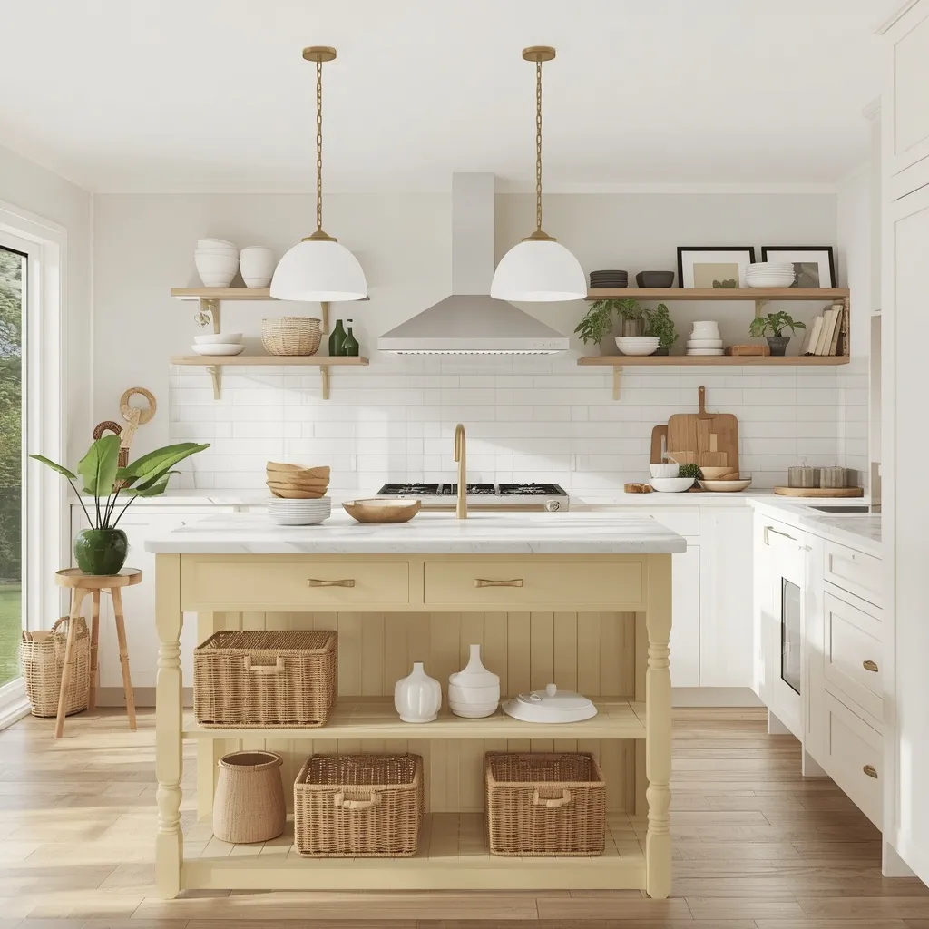
11. Butter Yellow Kitchen
A soft, muted butter yellow on cabinetry or an island, paired with warm white countertops and vintage brass fixtures, brings genuine cheer to a kitchen without tipping into the stark all-white look of the last decade.
Butter yellow, roughly LRV 60 to 70, is a warm, grayed-down yellow, and it’s far more livable long-term than a true saturated yellow because it doesn’t fatigue the eye the same way. If you’re unsure how much color to commit to, apply it to the island or lower cabinets only and keep upper cabinets and walls neutral. Because yellow shifts more dramatically than most colors between morning and evening light, give a test swatch at least 48 hours before committing.
- Best for: kitchens wanting warmth without a full-color commitment
- Flexible option: island or lower cabinets alone deliver the look at a fraction of the cost
- Common mistake: choosing a true, saturated yellow for full cabinetry, which can overwhelm a small kitchen
12. Cool Gray Home Office
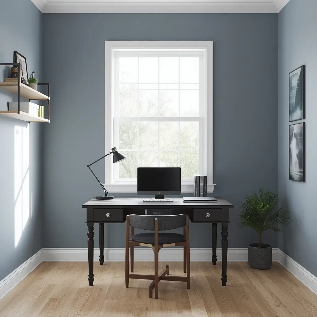
Cool, blue-gray walls around LRV 40 to 50, white trim, and a dark wood or black desk create a focused, screen-friendly backdrop that photographs and video-calls well, a genuinely practical concern for a lot of home offices now.
Cool grays reduce glare and eye strain behind a monitor better than warm tones, which can cast an unwanted yellow tint on camera. Keep the scheme genuinely monochromatic by staying within one undertone family, all blue-based or all green-based grays, since mixing them creates a muddy, accidental clash rather than an intentional monochrome. The same undertone logic applies whether the office is a spare bedroom or a converted outbuilding; Sunday Abode’s guide to turning a shed into an office covers the layout and insulation side of that specific setup.
- Best for: remote workers who take frequent video calls
- Also works for: anyone converting a shed, garage, or backyard structure into a dedicated office
- Common mistake: mixing warm gray trim with cool gray walls, which reads as an accidental clash
13. Mocha Mousse Living Room
A warm, brownish neutral in the mocha family, think chocolate milk rather than true brown, paired with cream boucle seating and brushed gold accents, delivers a cozy, grounding living room that reads a step warmer than gray or greige.
Mocha-toned neutrals, roughly LRV 25 to 35, work as a full-room wall color in spaces with ample natural light, or as lower walls and wainscoting in dimmer rooms to avoid a closed-in feel. Pair it generously with cream and warm wood to keep it from reading dark or heavy, and add one metallic accent, brushed brass or warm gold, to catch and bounce available light.
- Best for: living rooms wanting warmth without going as bold as terracotta or emerald
- Pairs well with: the warm greige whole-house base for a cozier reading nook or den
- Common mistake: using mocha in a small, low-light room with no metallic or lighter accent, which can feel dim
14. Forest Green Cabin Palette
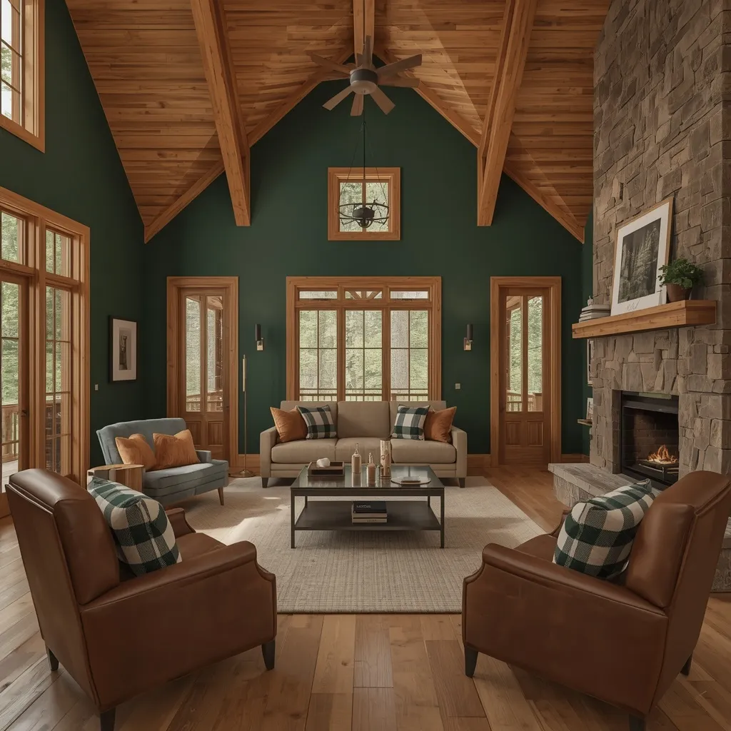
Deep forest green walls, exposed honey-toned wood beams, and buffalo-check textiles turn a whole house into a year-round cozy retreat, the kind of palette built for cabins and lake houses more than everyday family homes.
Forest green, roughly LRV 8 to 15, reads best against warm, honey-toned wood rather than gray-washed wood, which creates an unintentional cool-versus-warm clash. Use it across a great room or lower-level walls, but keep bedrooms a touch lighter, a softer sage or cream, so the whole house doesn’t feel uniformly dark. This palette leans into a specific mood, so it suits a dedicated vacation property more than a family home that needs bright, stimulating spaces for young children.
- Best for: cabins, lake houses, and rustic whole-house schemes
- Not ideal for: households wanting an airy, light-filled feel throughout
- Common mistake: pairing forest green with gray-toned driftwood flooring instead of warm wood, which fights the coziness
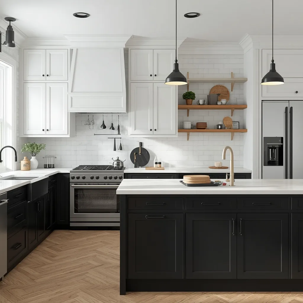
15. Black & White Kitchen
Crisp white upper cabinets, matte black lower cabinets or an island, and black hardware create a high-contrast kitchen that reads current without chasing a fleeting color trend, a genuinely timeless combination.
High-contrast schemes rely on proportion more than color choice. Keeping black to roughly a third of the visual field, an island, the lower cabinets, or one wall, prevents the kitchen from feeling like a photo negative of itself. Matte black shows fingerprints more readily than satin, so choose finish based on how heavily the kitchen actually gets used, and let brass or warm wood accents soften the contrast so it doesn’t read clinical.
- Best for: kitchens wanting a resale-friendly, non-trendy statement
- Works in: both small and large kitchens, since the white keeps the room feeling open
- Common mistake: using black on more than half the kitchen’s surfaces, which can make a small room feel smaller
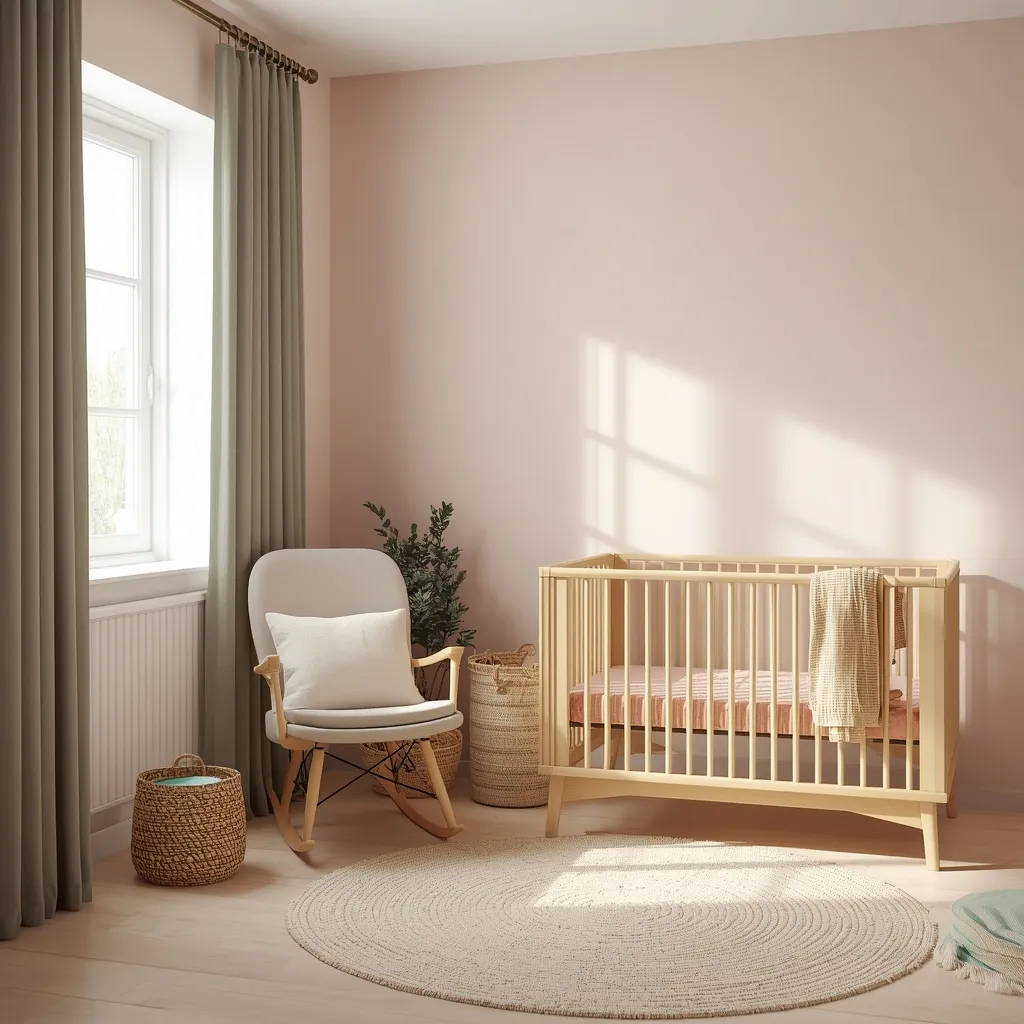
16. Blush & Sage Nursery
Soft blush pink walls paired with sage green textiles, a warm light-wood crib, and a cream rug create a gender-neutral nursery palette calm enough for daytime naps and flexible enough to grow with a child past infancy.
Choose a fairly light LRV, generally 55 or higher, to keep the room bright enough for daytime use, and rely on blackout curtains rather than dark paint to handle sleep-training darkness, since deep-colored walls in a small, low-light room can feel oppressive for both baby and the adult spending hours in there. Combine blush and sage in roughly a 70/30 split rather than an even mix to keep the two colors from visually competing, and choose a zero- or low-VOC paint, letting the room air out for 24 to 48 hours before moving the crib back in.
- Best for: a gender-neutral palette that transitions into a toddler room later
- Renter option: a removable wallpaper accent wall plus textiles instead of paint
- Common mistake: pairing highly saturated pink and green, which reads more like a holiday palette than a calm nursery
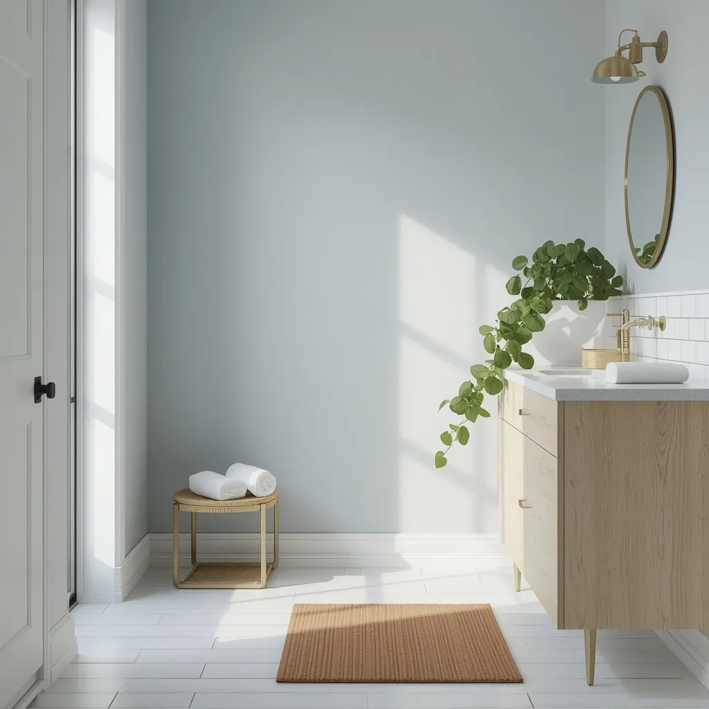
17. Spa Blue-Gray Bathroom
Soft blue-gray walls, white subway tile, a teak bath mat, and a light wood vanity bring spa-like calm to a bathroom without requiring a full renovation.
Bathrooms need a moisture-resistant finish, so use satin or semi-gloss rather than matte on the walls, and confirm the paint is rated for high-humidity rooms before buying. Blue-gray, roughly LRV 50 to 60, pairs well with both warm and cool fixtures, which makes it a safe choice if you aren’t also replacing hardware. A trailing pothos, which tolerates humidity and lower light, adds a final spa-like touch without any special care routine.
- Best for: a primary or guest bathroom refresh without a full remodel budget
- Works even in: windowless bathrooms, since a satin finish reflects available light well
- Common mistake: using a flat or matte finish in a bathroom, which traps moisture and can peel or mildew
The Most Common Color Scheme Mistakes to Avoid
Most color scheme regrets trace back to four fixable habits: ignoring LRV, testing swatches under only one type of light, mismatching undertones with materials that are already fixed in the room, and using the wrong paint sheen for how the room is actually used.
- Choosing by hue alone: a “greige” or “gray” chosen from a small paint chip can read noticeably lighter, darker, or more colorful once it covers an entire wall, so always test a full-size swatch, not just the chip.
- Testing in daylight only: evening lighting can shift a color’s undertone enough to change how a whole room feels after dark.
- Ignoring fixed materials: flooring, countertops, and large tile already set an undertone family for a room; a wall color that clashes with warm oak flooring or a cool-toned quartz countertop will look slightly off no matter how nice it looks alone.
- Wrong sheen for the room: flat or matte finishes in bathrooms, kitchens, and entryways trap moisture and scuff easily, while satin or eggshell holds up far better in high-traffic or high-humidity spaces.
Making These Palettes Work as a Renter or on a Budget
Nearly every palette above can be recreated without painting a single wall, using textiles, removable finishes, and a few key accessories to carry the color story instead.
- Removable or peel-and-stick wallpaper recreates an accent wall, like the terracotta or navy looks above, in an afternoon, with no damage deposit at risk.
- Textiles do more work than people expect: bedding, curtains, rugs, and throw pillows alone typically carry 30 to 40% of a room’s visible color, often enough to capture a scheme’s feeling without touching the walls.
- Cabinet appliques or contact paper can mimic painted lower cabinets for kitchen renters drawn to the coastal blue or black-and-white kitchen ideas.
- Start with one statement piece, like a headboard or an accent chair, before committing to a full room, especially with a bolder color like emerald or charcoal.
- Low- or zero-VOC paint is worth the small price difference in any room, but it matters most in bedrooms and nurseries; the U.S. Environmental Protection Agency notes that many paints and finishes release volatile organic compounds into indoor air as they cure, so choosing low-VOC formulas and ventilating the room during and after painting reduces that exposure.
Frequently Asked Questions
What’s the most versatile interior color scheme trend right now?
Warm, layered neutrals like greige and mocha-toned browns remain the most versatile choice because they work across an entire home without clashing from room to room. They also read consistently in both daylight and evening light, which matters most if you’re testing a color before committing to it.
How do I choose a color scheme for my whole house?
Start with one neutral base color in the LRV 50 to 65 range for connected spaces like hallways and living areas, then layer in room-specific accent colors through furniture, textiles, and a single accent wall where needed. This keeps sightlines between open rooms feeling cohesive instead of choppy.
What color schemes work best in small spaces or tiny houses?
Stick to lighter LRVs, generally above 40, and keep the walls and ceiling the same color to remove the visual break that makes low ceilings feel lower. A soft sage or warm greige with one slightly deeper accent, rather than several competing accent colors, reads as more spacious.
Can I try these color schemes if I’m renting and can’t paint?
Yes. Most of the palettes in this guide can be built with removable wallpaper, bedding, curtains, rugs, and cabinet appliques instead of paint. Textiles alone typically carry 30 to 40% of a room’s visible color, which is often enough to recreate the feel of a scheme without a single coat of paint.
How many colors should be in one interior color scheme?
Most successful schemes use three tones split across a 60-30-10 ratio: one dominant color, one secondary color, and one accent. Going beyond three or four distinct colors in a single room tends to fragment the space rather than unify it.
What’s the difference between warm and cool paint undertones?
Warm undertones lean yellow, red, or orange and tend to suit rooms with abundant natural light or north-facing exposure, while cool undertones lean blue, green, or violet and help balance very sunny, south- or west-facing rooms. Checking a paint’s undertone against fixed materials already in the room, like flooring or countertops, before committing to a full room prevents an unexpected clash.
How do I know if a paint color will look different once it’s on my wall?
Paint a swatch at least 30 cm (about 1 ft) square on two or three different walls and view it in natural daylight, then again under your room’s evening artificial lighting, ideally over 24 to 48 hours. Colors can shift noticeably between morning light, midday sun, and warm-toned LED bulbs, so a single glance at a paint chip in the store rarely tells the full story.
Choosing the Right Color Scheme for Your Home
The best interior color scheme trends aren’t about chasing one fashionable shade, they’re about matching undertone, proportion, and light to a room you actually live in. Whether that means a full olive green living room, one terracotta accent wall, or simply new dusty rose bedding, every idea here can flex to fit a renter’s lease, a tight budget, or a full renovation. For more direction on where your interior style could go next, browse Sunday Abode’s trending interior ideas across every room of the house. Pick the palette that matches your space’s real light and use, test it on the wall first, and give it a few days to settle before deciding it isn’t right.