
Key Takeaways
- Contrast, not darkness, is what makes a small bathroom feel cramped, a dark room with low contrast can feel larger than a white one chopped up by strong edges.
- In a windowless bathroom the light bulb matters as much as the paint: choose 2700–3000K warm bulbs with a high CRI (90+) so colors read true.
- Work with fixed elements you can’t change, oak trim, existing tile, a colored suite, rather than fighting them.
- Use a bathroom-grade paint in satin or semi-gloss on walls exposed to moisture; many are formulated to resist mildew growth on the paint film.
- Always test samples on the wall in the room’s own light, at two times of day, before committing.
Introduction
A small bathroom is the easiest room in a home to repaint and the hardest to get right. These small bathroom color ideas cover complete schemes, wall color, how it meets the tile and trim, and the light it lives under, rather than isolated paint swatches. Whether your bathroom is bright, windowless, rented, or stuck with oak trim, there’s a scheme here that works with what you’ve got.
Below are 23 full color schemes, from crisp whites and soft blues to deep greens, moody darks, and color-drenched monochromes, plus focused approaches for bathrooms with no natural light, existing wood trim, or tile you’re keeping. Every entry explains what to pair it with and who it suits, with practical notes on paint type, sheen, and testing. Consider it your guide to picking a palette for the smallest room in your abode, one you’ll still like in five years.
The rule that overturns most small-bathroom advice: Small rooms don’t need to be white. What makes a small bathroom feel cramped is high contrast, strong visual breaks between wall, trim, tile, and ceiling that chop the space into pieces. A deep green bathroom with low contrast throughout can feel more generous than a white one with a dark border, a contrasting ceiling, and busy tile. Choose your level of contrast first, then choose the color.
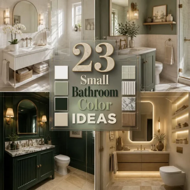
23 Small Bathroom Color Ideas
1. Crisp All-White Scheme
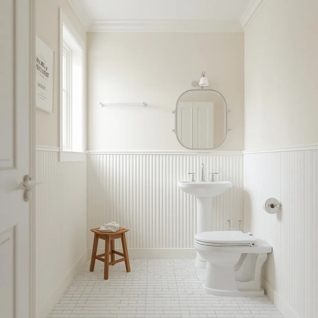
The all-white small bathroom is the reliable classic: white walls meeting white tile and white fixtures, with texture and metal finishes providing all the interest. Bright and clean, white reflects every bit of available light. Simple, fresh, and endlessly flexible.
Choose a soft or warm white rather than a stark brilliant white, which reads cold and clinical under bathroom lighting, and keep the ceiling and trim within a shade or two of the walls so no hard lines break the space up. Add interest through texture, a ribbed tile, a woven basket, a wooden stool, rather than color. The common mistake is mixing three different whites that don’t match, which looks accidental. This suits bright bathrooms, rentals, resale-minded updates, and anyone wanting a blank canvas.
- Why it works: A single soft white with low contrast reflects light and avoids visual breaks.
- Best for: Bright bathrooms, rentals, resale-minded updates.
- Key elements: one soft white across walls, trim, and ceiling, texture instead of color.
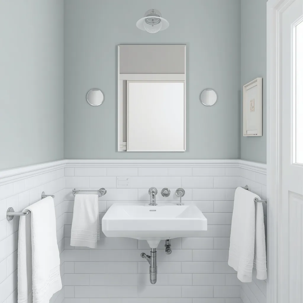
2. Soft Powder Blue Bathroom
A powder blue bathroom feels fresh and calm: pale blue walls above white tile, with chrome fittings and white towels keeping the scheme crisp. Light and airy, soft blue is the classic bathroom color for good reason. Clean, cool, and quietly cheerful.
Use a pale, slightly grey-leaning blue rather than a bright or baby blue, pairing it with white tile and trim so the color stays fresh rather than sweet. Blue works especially well in bathrooms with good natural light, where it stays clear rather than turning cold. Be careful in north-facing or dim rooms, where cool blues can go grey and flat, a warmer blue-green suits those better. This suits bright, coastal, and traditional small bathrooms.
- Why it works: Pale grey-blue stays crisp against white and feels naturally clean.
- Best for: Bright, coastal, and traditional bathrooms.
- Key elements: pale grey-blue walls, white tile and trim, chrome fittings.
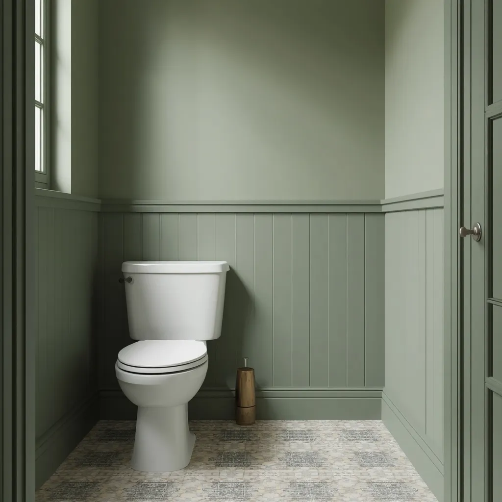
3. Sage Green Calm
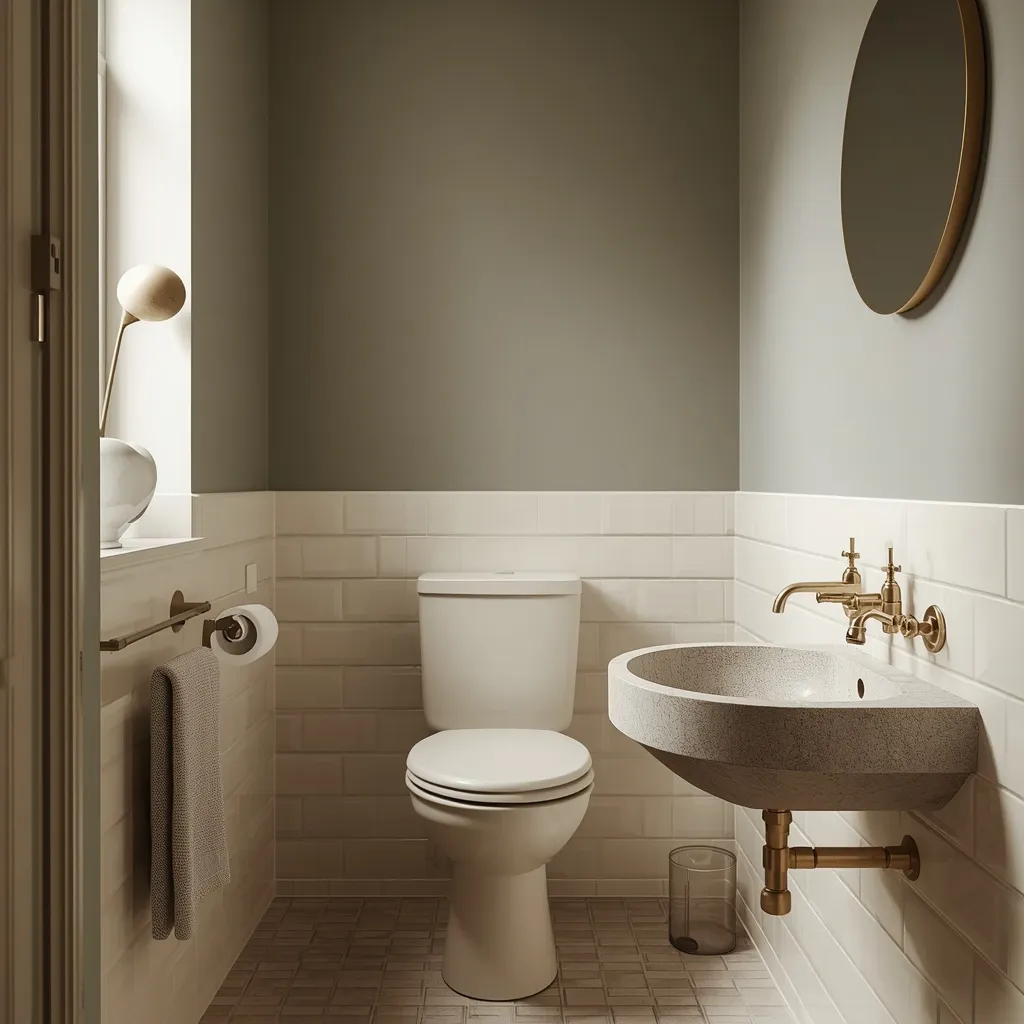
A sage green bathroom is soft and restorative: muted grey-green walls with cream or stone tile and warm brass fittings, the color gentle enough to read almost as a neutral. Peaceful and current, sage suits people who want color without commitment. Subtle, soothing, and easy.
Pick a muted, grey-leaning sage rather than a bright or yellow-toned green, and pair it with cream or natural stone rather than stark white, which can make sage look washed out. Sage’s low saturation means it shifts gently rather than dramatically as the light changes through the day, making it one of the most forgiving colors in a bathroom. It flatters brass and aged bronze particularly well. This suits almost any small bathroom and anyone nervous about color.
- Why it works: Low saturation shifts gently with changing light, making sage very forgiving.
- Best for: Almost any small bathroom; the color-cautious.
- Key elements: muted grey-sage, cream or stone tile, brass or bronze fittings.
4. Deep Forest Green Retreat
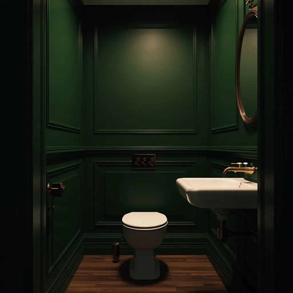
A deep green small bathroom feels like a private study: forest or hunter green walls wrapping the room, white sanitaryware standing out crisply, and brass fittings glowing against the depth. Rich and enveloping, dark green makes a small room feel deliberate. Moody, warm, and confident.
Take the green across all four walls rather than one, keeping contrast low by painting trim in the same color or a close tone, and let the white basin and toilet provide the only real brightness. Deep green reads warmer than navy or charcoal, which makes it more comfortable in a room without much natural light. Pair with warm brass and a wooden or stone surface for balance. This suits guest bathrooms, cloakrooms, and anyone wanting drama over brightness.
- Why it works: Deep green reads warmer than navy or charcoal, so it stays comfortable in dim rooms.
- Best for: Guest bathrooms, cloakrooms, drama seekers.
- Key elements: forest green on all walls, matching trim, white sanitaryware, brass.
5. Classic Navy and White
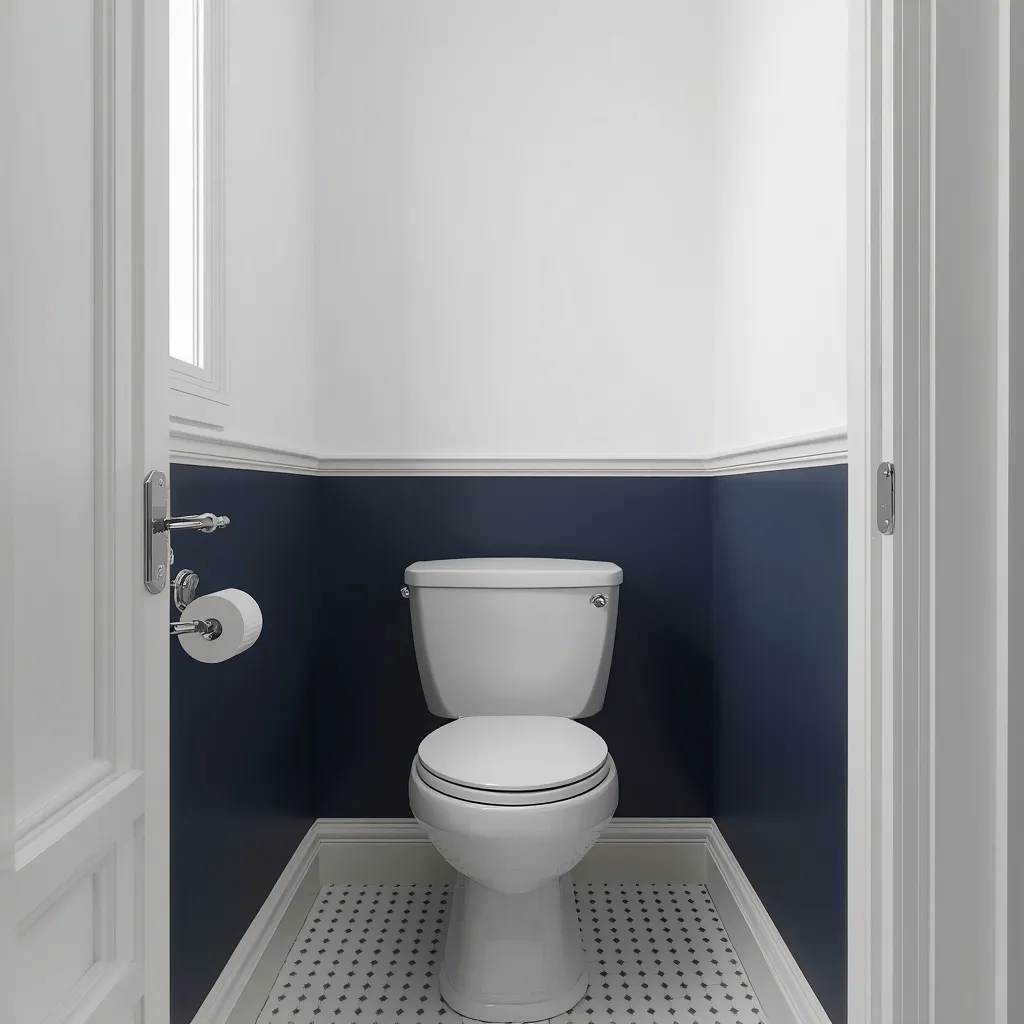
Navy and white is the small bathroom scheme that always looks smart: deep blue walls or lower panelling against white tile, with crisp white trim and polished chrome. Sharp and traditional, navy behaves almost like a neutral. Timeless, tailored, and hard to get wrong.
Use navy on the walls with white tile below, or reverse it with navy panelling and white walls above, keeping the two colors cleanly separated at a consistent height. Navy carries the depth of a strong color while coordinating as easily as a neutral, which is why it survives changing tastes. Avoid pairing navy with cool grey tile that has a purple undertone, since the combination looks muddy. This suits classic, coastal, and family bathrooms.
- Why it works: Navy has real depth but coordinates as easily as a neutral, so it dates slowly.
- Best for: Classic, coastal, and family bathrooms.
- Key elements: navy walls or panelling, white tile and trim, chrome, consistent divide height.
6. Warm Beige and Cream
A beige bathroom is warm and welcoming rather than bland: layered cream, sand, and oatmeal tones across walls and tile, with wood and woven texture stopping it feeling flat. Soft and inviting, warm neutrals flatter under artificial light. Cozy, calm, and universally easy.
Layer several close beige and cream tones rather than using one flat beige, and add texture through wood, stone, and woven baskets so the scheme has depth without color. Warm neutrals look noticeably better than cool greys under the warm artificial light most bathrooms rely on, which is a practical reason they suit windowless rooms. Keep everything within a narrow tonal band for low contrast. This suits spa-style bathrooms, low-light rooms, and anyone who finds grey cold.
- Why it works: Warm neutrals look better than cool greys under the artificial light bathrooms rely on.
- Best for: Spa schemes, low-light rooms, grey-averse readers.
- Key elements: layered cream, sand, and oatmeal, wood and woven texture, narrow tonal band.
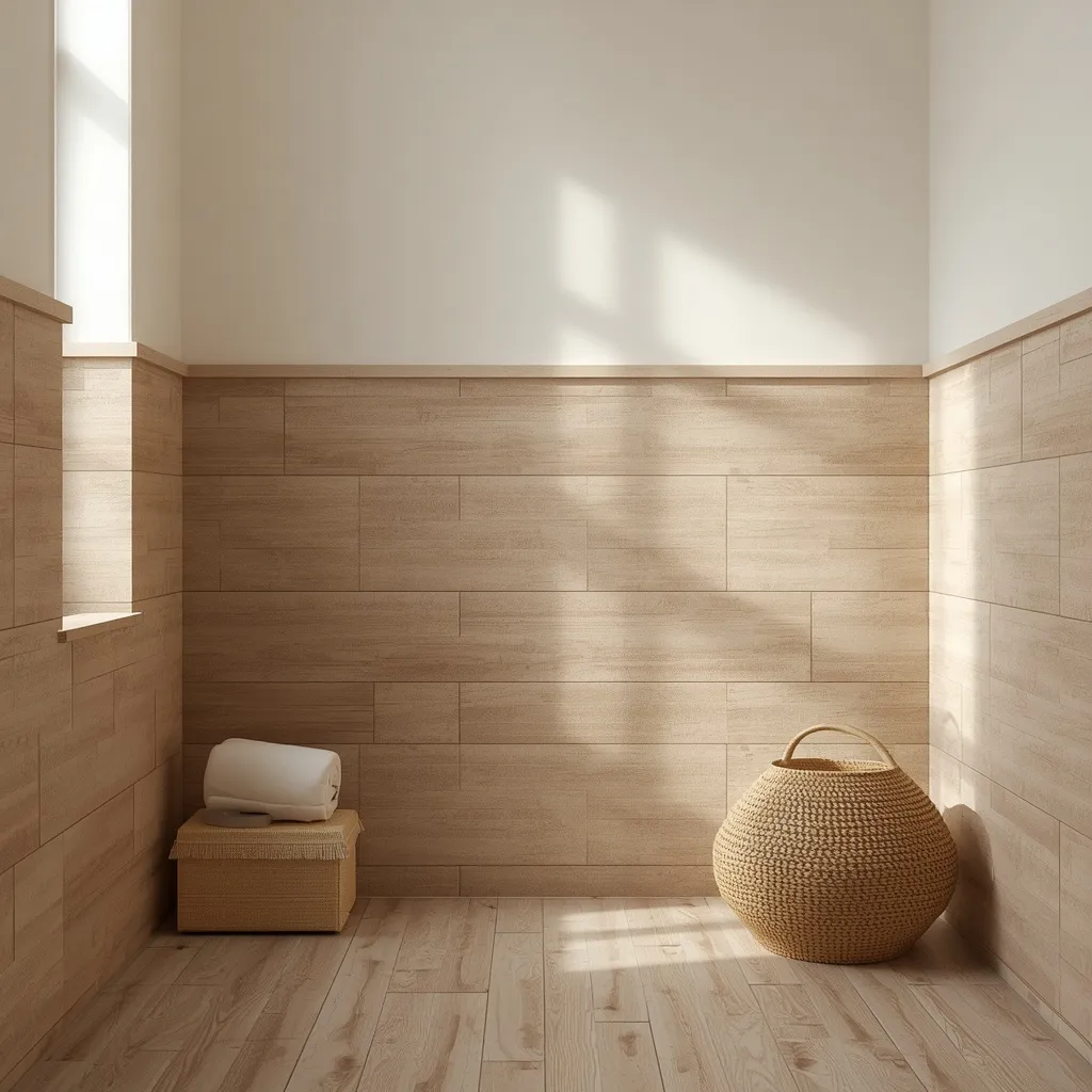
7. Soft Greige Modern Scheme
A greige bathroom bridges warm and cool: a beige-grey wall color that sits comfortably beside both cool tile and warm wood, with simple modern fittings. Understated and flexible, greige solves rooms full of mismatched finishes. Quiet, forgiving, and practical.
Choose a light-to-mid greige when your bathroom mixes undertones you can’t change, cool grey floor tile beside a warm oak door, for instance, since greige contains both warm and cool pigment and bridges rather than picks a side. It also hides everyday marks better than white. Greiges vary widely in how warm they lean, so check samples against every fixed surface. This suits mismatched bathrooms, staged renovations, and rentals where you’re working around existing finishes.
- Why it works: Greige contains both warm and cool pigment, bridging mismatched fixed finishes.
- Best for: Mismatched bathrooms, staged renovations, rentals.
- Key elements: light-to-mid greige, checked against every fixed surface, modern fittings.
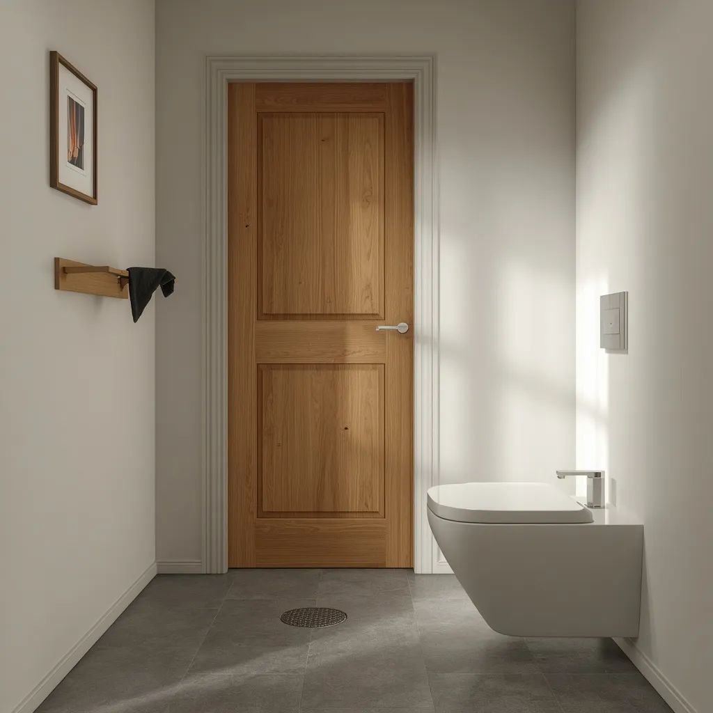
8. Charcoal Grey Sophistication
A charcoal grey bathroom is modern and grounded: deep grey walls with white sanitaryware and matte black or chrome fittings, the scheme reading as considered rather than gloomy. Sharp and practical, charcoal hides bathroom mess well. Contemporary, forgiving, and easy.
Use a deep charcoal with a slight warm lean so it doesn’t turn cold and blue, keeping the ceiling in a lighter tone of the same color rather than stark white to avoid a hard contrast line. Charcoal is the most practical dark color in a bathroom because it disguises water spots and dust noticeably better than either black or white. Pair with warm lighting so the room feels inviting after dark. This suits modern and family bathrooms wanting depth with low maintenance.
- Why it works: Charcoal disguises water spots and dust better than either black or white.
- Best for: Modern and family bathrooms; low-maintenance depth.
- Key elements: warm-leaning charcoal, lighter same-color ceiling, warm lighting.
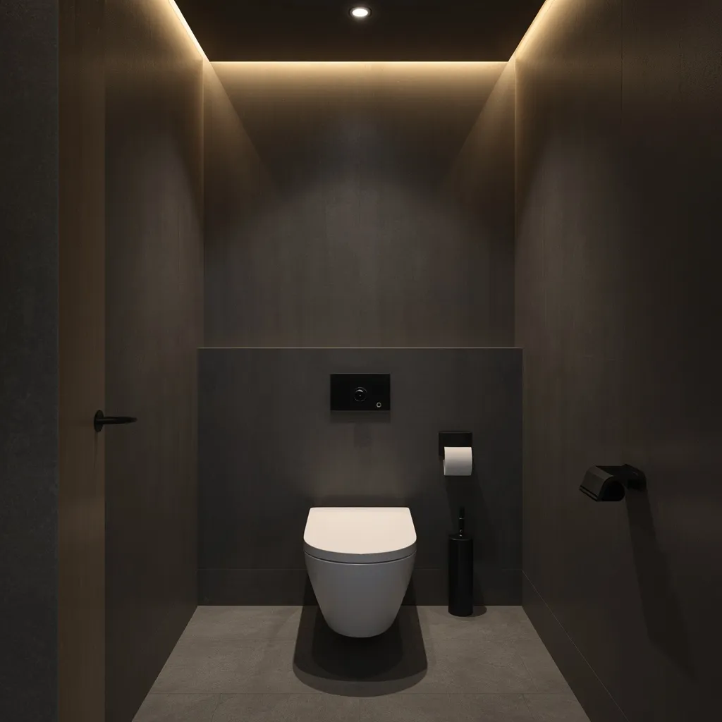
9. Color-Drenched Monochrome
Color drenching paints everything one shade: walls, ceiling, trim, and often the door in a single color, so the room’s edges dissolve and the space reads as one enveloping whole. Immersive and confident, drenching is the technique that makes small rooms feel intentional. Cocooning, cohesive, and bold.
Paint walls, ceiling, and woodwork in the same color, varying sheen rather than shade, a flatter finish on walls and ceiling, satin or semi-gloss on woodwork for durability. Because there’s no contrast to break the space up, the boundaries blur and a tiny bathroom stops feeling like a box. This works with any color, dark or pale, and is especially effective in rooms with awkward angles or sloped ceilings that contrast would emphasize. This suits small bathrooms, cloakrooms, and confident decorators.
- Why it works: Removing all contrast blurs the room’s edges so a small space feels intentional.
- Best for: Tiny bathrooms, awkward angles, sloped ceilings.
- Key elements: one color on walls, ceiling, and trim, varied sheen, correct paint per surface.
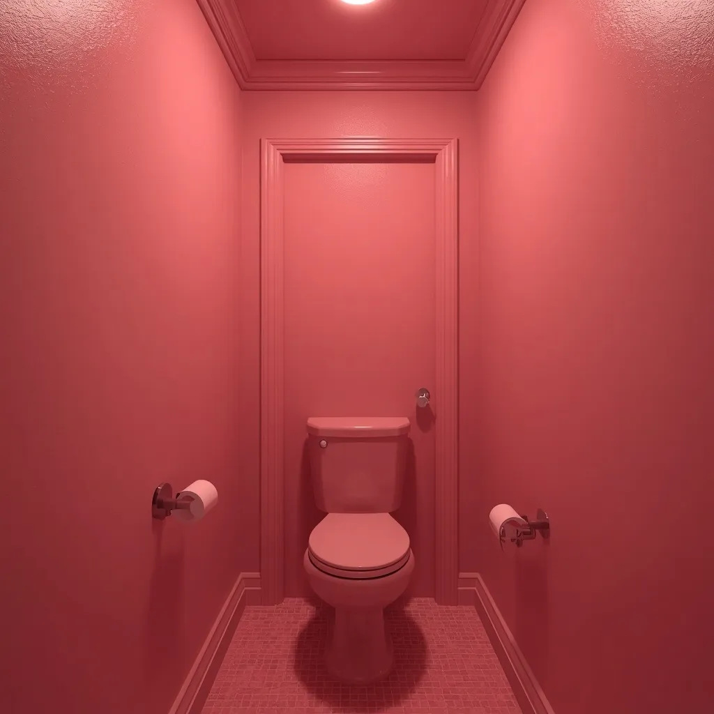
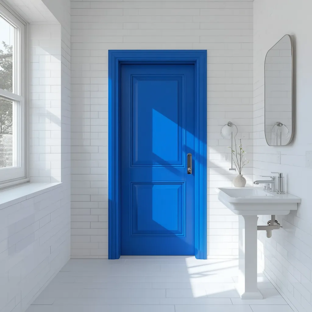
10. Bright White With Bold Accent
A white bathroom with one bold accent gets personality without losing light: white walls and tile throughout, with a single strong color on the door, the vanity, or a tiled niche. Fresh and playful, one accent does the work of a whole scheme. Light, bright, and characterful.
Keep walls, tile, and ceiling white, then commit one element fully to a strong color, a cobalt door, a mustard vanity, a green tiled niche, so the accent looks deliberate rather than timid. One saturated accent against white reads as designed; three small colored touches read as clutter. This is also the easiest scheme to change later, since repainting a single door takes an afternoon. This suits renters, small budgets, and anyone testing whether they like color.
- Why it works: One fully committed accent against white looks designed, not accidental.
- Best for: Renters, small budgets, color-testers.
- Key elements: all-white base, one saturated accent element, nothing else colored.
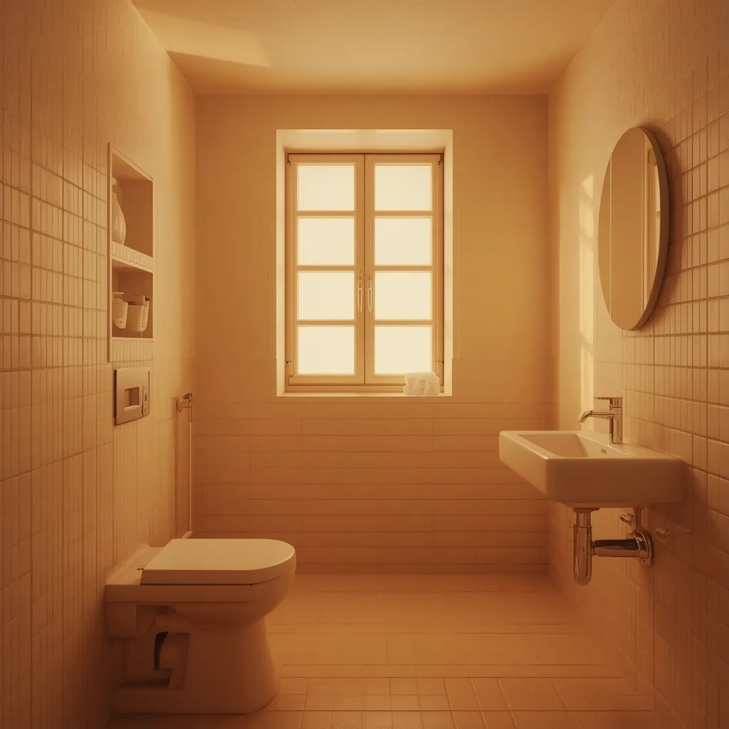
11. Windowless Bathroom Warm Palette
A bathroom with no windows needs a palette built for artificial light: warm whites, soft creams, or gentle warm colors that stay true under bulbs rather than going grey and lifeless. Practical and flattering, the right warm scheme rescues a dim room. Warmth where there’s no daylight.
In a windowless bathroom, the light source matters as much as the paint. Choose warm bulbs around 2700–3000K with a high color rendering index (CRI 90 or above), which lets colors read true rather than washed out, and layer at least two light sources so the room isn’t lit by one flat overhead. Then pick warm whites, creams, or soft warm colors, and avoid cool greys and cool blues, which look genuinely dingy without daylight. Always test paint under the actual bulbs. This suits internal bathrooms, cloakrooms, and basement flats.
- Why it works: Warm bulbs at high CRI let warm colors read true where daylight can’t.
- Best for: Windowless bathrooms, internal cloakrooms, basement flats.
- Key elements: 2700–3000K bulbs at CRI 90+, two light sources, warm whites and creams, no cool greys.
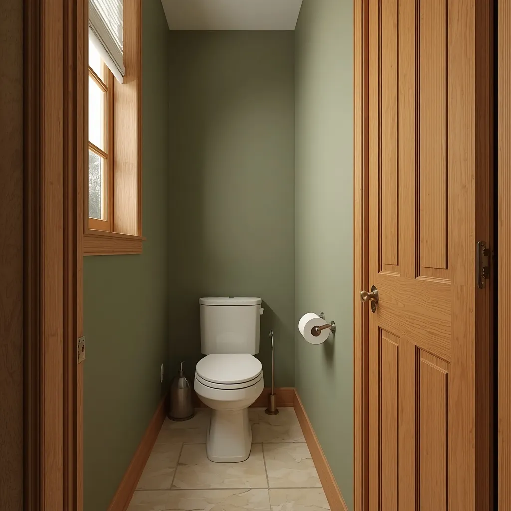
12. Working With Oak Trim
A bathroom with existing oak trim doesn’t need everything painted over: warm wall colors that flatter the wood’s golden undertone make the oak look intentional rather than dated. Harmonious and cost-free, working with the wood beats fighting it. Warm, cohesive, and practical.
Choose wall colors with a warm undertone that complements oak’s yellow-gold cast, soft sage, warm greige, muted olive, creamy off-white, or a soft clay all sit comfortably beside it. Avoid cool greys and stark cool whites, which make honey oak look orange and dated by contrast. If the oak is very orange, a deeper, more saturated wall color reduces the contrast and calms it down more effectively than a pale one. This suits anyone keeping existing wood trim, doors, or vanities, and it costs nothing extra.
- Why it works: Warm undertones complement oak’s golden cast instead of making it look orange.
- Best for: Anyone keeping existing oak trim, doors, or vanities.
- Key elements: warm sage, greige, olive, or clay walls, no cool greys, deeper color for orange oak.
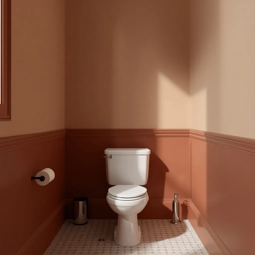
13. Two-Tone Wall Split
A two-tone bathroom divides the wall horizontally: a deeper color or panelling below, a lighter shade above, with a rail or tile edge marking the line. Balanced and classic, splitting the wall adds interest without shrinking the room. Structured, smart, and traditional.
Run the darker color to roughly one-third of the wall height, or up to the top of the tile or panelling, and keep the lighter color above, putting weight low and lightness high grounds a room and draws the eye upward. Keep the divide at a consistent height all the way around, since an uneven line is the detail that makes two-tone look amateur. This suits period homes, panelled bathrooms, and anyone wanting color while keeping the upper room light.
- Why it works: Weight low and lightness high grounds the room while drawing the eye upward.
- Best for: Period homes, panelled bathrooms, cautious color use.
- Key elements: darker lower third, lighter above, consistent divide height, rail or tile edge.
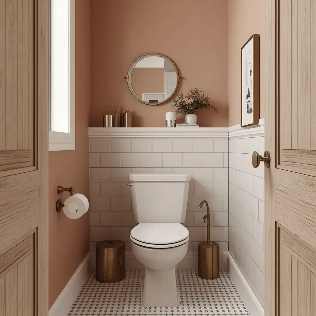
14. Blush and Warm Pink
A blush bathroom is softer and more grown-up than it sounds: dusty pink walls with white tile, brass fittings, and warm wood reading as a warm neutral rather than a statement. Gentle and flattering, muted pink is unexpectedly easy to live with. Soft, warm, and quietly stylish.
Choose a heavily muted, dusty or greyed pink rather than a clear bright pink, so it behaves like a warm neutral. Blush has a practical advantage in a bathroom: warm pink light reflects onto skin more kindly than cool tones, which genuinely matters in a room with a mirror where people get ready. Pair with brass and white for a fresh look, or with terracotta and wood for something earthier. This suits modern, eclectic, and guest bathrooms.
- Why it works: Warm pink reflects flatteringly at the mirror and behaves like a warm neutral.
- Best for: Modern, eclectic, and guest bathrooms.
- Key elements: dusty greyed pink, brass fittings, white tile, wood or terracotta accents.
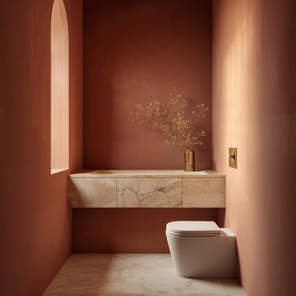
15. Terracotta and Clay Warmth
A terracotta bathroom feels sun-warmed and earthy: muted clay walls with cream tile, natural stone, and unlacquered brass, the whole scheme glowing under warm light. Grounding and inviting, earthy tones make a bathroom feel less clinical. Warm, tactile, and Mediterranean.
Use a muted, dusty terracotta rather than a bright orange, pairing it with cream, limestone, or off-white rather than cool grey, which makes both colors look dirty. Earthy pigments hold their warmth under artificial light better than cool tones do, so this palette suits bathrooms that rely on bulbs rather than daylight. Add natural texture through stone, wood, and linen. This suits Mediterranean, desert-modern, and warm eclectic bathrooms.
- Why it works: Earthy pigment holds warmth under artificial light where cool tones go flat.
- Best for: Mediterranean, desert-modern, warm eclectic bathrooms.
- Key elements: muted terracotta, cream or limestone, unlacquered brass, natural texture.
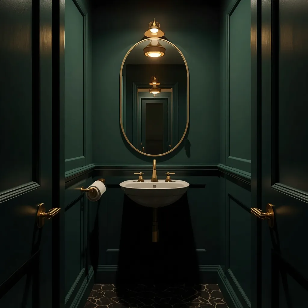
16. Moody Jewel-Tone Cloakroom
A jewel-toned small bathroom is pure drama: deep teal, aubergine, or oxblood walls with warm metallic fittings and soft lighting creating a jewel-box effect. Bold and memorable, saturated color turns a functional room into a talking point. Rich, intimate, and unexpected.
Commit fully to a saturated jewel tone across all walls, adding warm brass or bronze fittings and soft, layered lighting so the depth feels inviting rather than cave-like. This works best in rooms used briefly, guest bathrooms and cloakrooms, rather than a bathroom serving a daily morning routine, where you generally want brightness. A large mirror bounces what light there is and stops the scheme feeling closed in. This suits guest bathrooms, cloakrooms, and confident decorators.
- Why it works: A briefly used room can carry saturated depth a daily bathroom can’t.
- Best for: Guest bathrooms and cloakrooms.
- Key elements: deep teal, aubergine, or oxblood, brass or bronze, layered soft light, large mirror.
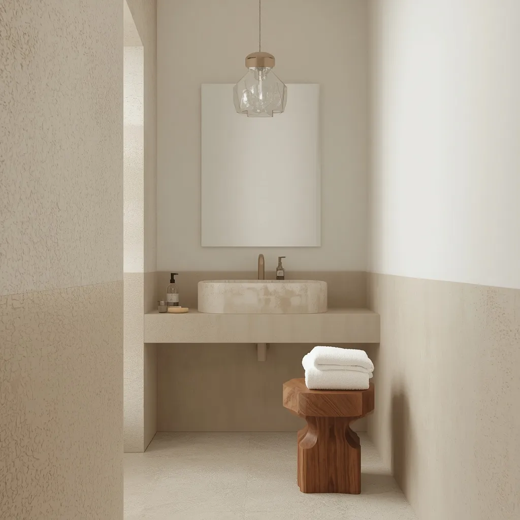
17. Spa Neutral Tonal Scheme
A spa bathroom keeps everything within one gentle tonal range: soft stone, warm white, and pale taupe across walls and tile, with wood and natural texture supplying all the contrast. Serene and hotel-like, tonal neutrals feel restful. Calm, cohesive, and quietly luxurious.
Work within a narrow band of pale neutrals, letting texture rather than color create depth, matte plaster-look walls, a stone basin, a teak stool, folded white towels. Because there’s no color contrast to interrupt the eye, a small bathroom reads as one continuous, generous space. The risk is flatness, so vary the surface textures deliberately. This suits spa-style, modern, and minimalist bathrooms, and anyone wanting a calm start to the day.
- Why it works: A narrow tonal band with varied texture reads generous rather than busy.
- Best for: Spa, modern, and minimalist bathrooms.
- Key elements: pale stone, warm white, taupe, texture as contrast, matte finishes.
18. Bright Bold Statement Color
A bold small bathroom goes all in on saturated color: a strong yellow, coral, or emerald across the walls, with white sanitaryware keeping it crisp. Joyful and confident, bright color turns a tiny room into the most cheerful space in the house. Vivid, fun, and full of personality.
Choose one saturated color and use it generously rather than nervously, keeping fixtures and tile white so the color has a clean frame. Small bathrooms are the ideal place for bright color precisely because they’re small: the area is limited, the room is used briefly, and repainting later is a single afternoon’s work. Test the color under the room’s own lighting, since saturated shades shift dramatically under warm bulbs. This suits families, renters with permission, and anyone bored of neutral bathrooms.
- Why it works: A small, briefly used room makes bold color low-risk and easy to undo.
- Best for: Families, permitted renters, neutral-fatigued decorators.
- Key elements: one saturated color used generously, white fixtures, lighting test.
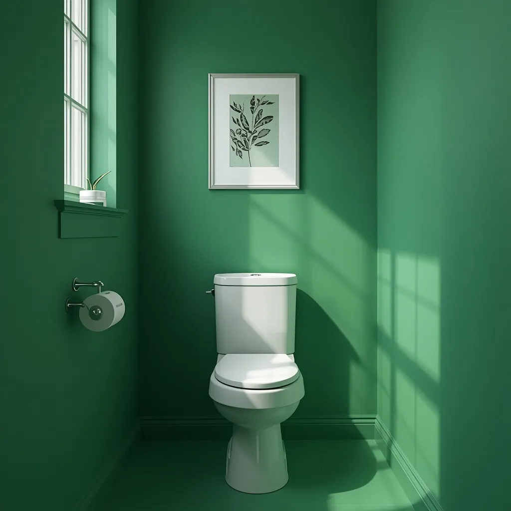
19. Soft Grey Modern Minimal
A soft grey bathroom is the modern default done properly: a light-to-mid grey with a warm lean, white sanitaryware, and simple chrome or black fittings. Clean and contemporary, grey stays quiet and lets other elements speak. Understated, neutral, and versatile.
Choose a grey with a warm rather than blue undertone, since cool greys turn flat and cold in bathrooms without much natural light, a very common regret. Keep the ceiling and trim close in tone to avoid harsh contrast lines. Mid-greys hide water marks and dust better than either white or very dark colors. This suits modern and minimal bathrooms with decent natural light; in a dim or windowless room, a warm neutral will serve you better than any grey.
- Why it works: A warm-leaning grey stays neutral without the coldness cool greys develop.
- Best for: Modern bathrooms with decent natural light.
- Key elements: warm-leaning light-to-mid grey, close-toned ceiling and trim, simple fittings.
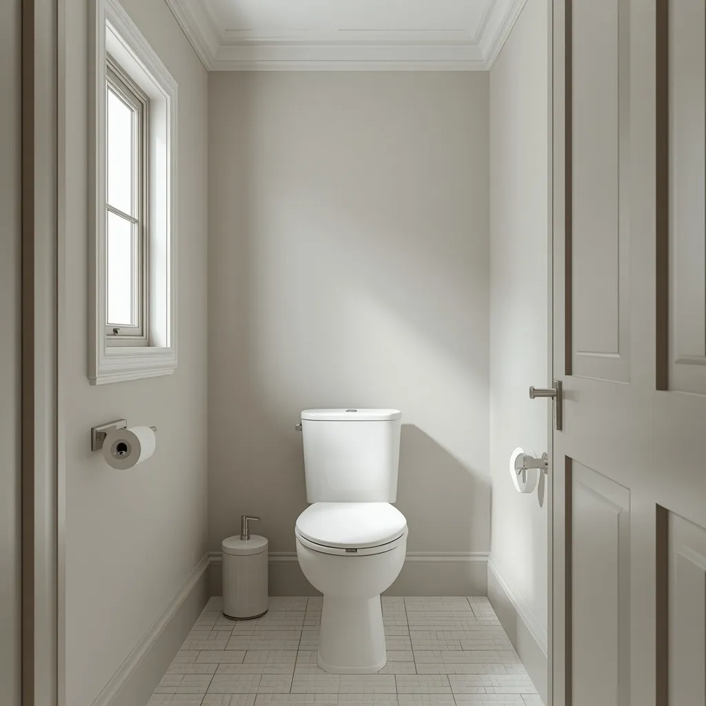
20. Black Accents on Light Walls
Black used sparingly sharpens a light bathroom: pale walls with black fittings, a black-framed mirror, and black window or shower framing drawing crisp lines through the space. Graphic and modern, black accents give a light room definition. Sharp, current, and easy to add.
Keep the walls and tile light, then repeat black in three or four places, tap, mirror frame, light fitting, shower frame, so it reads as a deliberate thread rather than a stray dark object. Repetition is what makes accent color work; a single black item just looks out of place. Matte black fittings show water spots more than chrome, so expect to wipe them. This suits modern and industrial bathrooms and is one of the cheapest ways to update a plain white room.
- Why it works: Repeating black three or four times reads as a deliberate graphic thread.
- Best for: Modern and industrial bathrooms; cheap updates to plain white.
- Key elements: light walls, black repeated in three or four places, matte black upkeep.
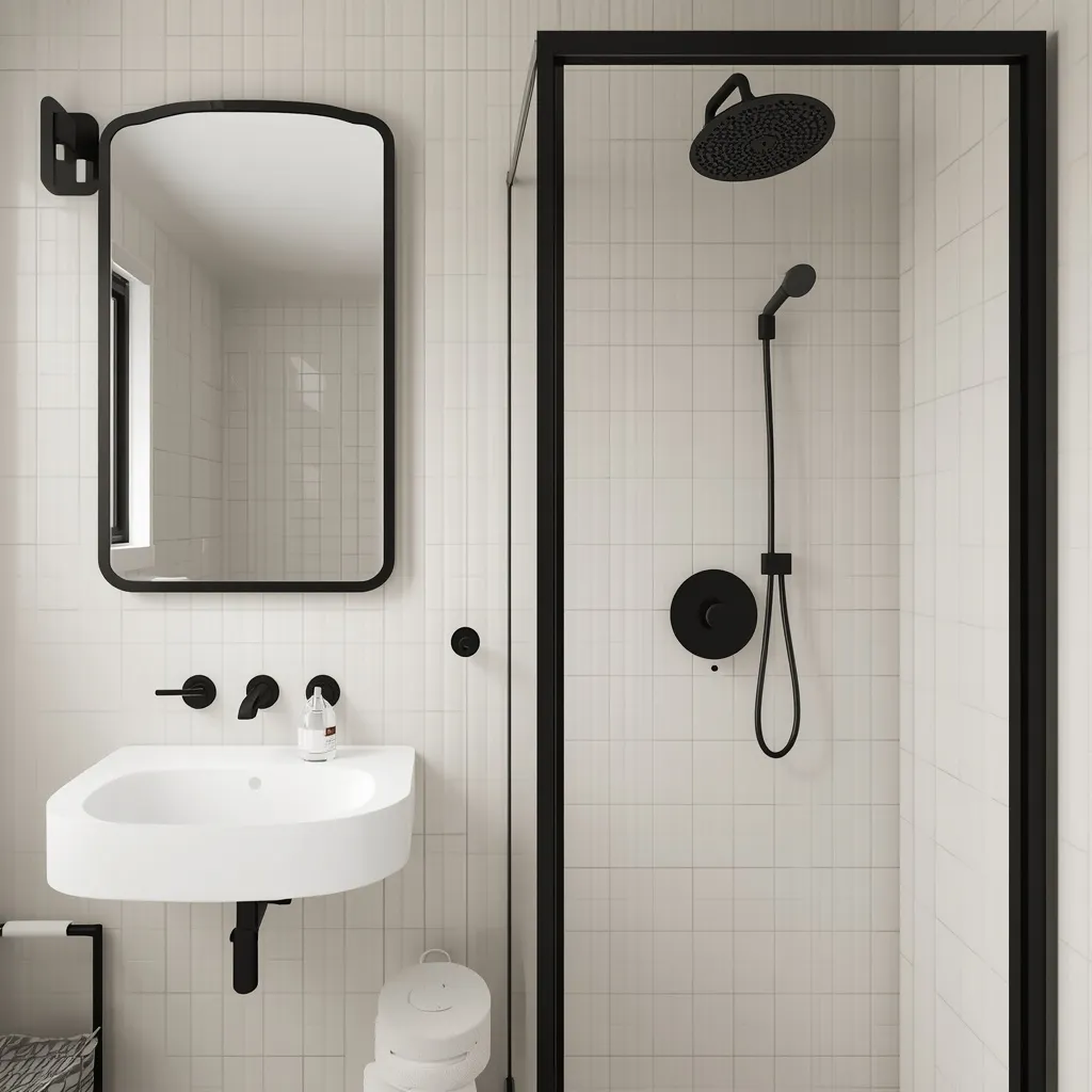
21. Renter-Friendly No-Paint Palette
A rental bathroom gets its color from everything except the walls: towels, a shower curtain, a bath mat, storage baskets, and art delivering a full scheme without a drop of paint. Reversible and cheap, textiles do all the work. Colorful, temporary, and landlord-proof.
Build the scheme through soft furnishings and accessories in a consistent palette, two or three colors repeated across towels, curtain, mat, and storage, so it reads as designed rather than assembled. Peel-and-stick vinyl or removable wallpaper can add pattern where permitted, but check your tenancy agreement and test removal on a small hidden area first. Keep the palette tight; more than three colors in a small bathroom looks cluttered. This suits renters, students, and anyone who can’t paint.
- Why it works: A tight repeated palette in textiles reads as a designed scheme without paint.
- Best for: Renters, students, no-permission situations.
- Key elements: two or three colors across towels, curtain, mat, baskets, optional removable vinyl.
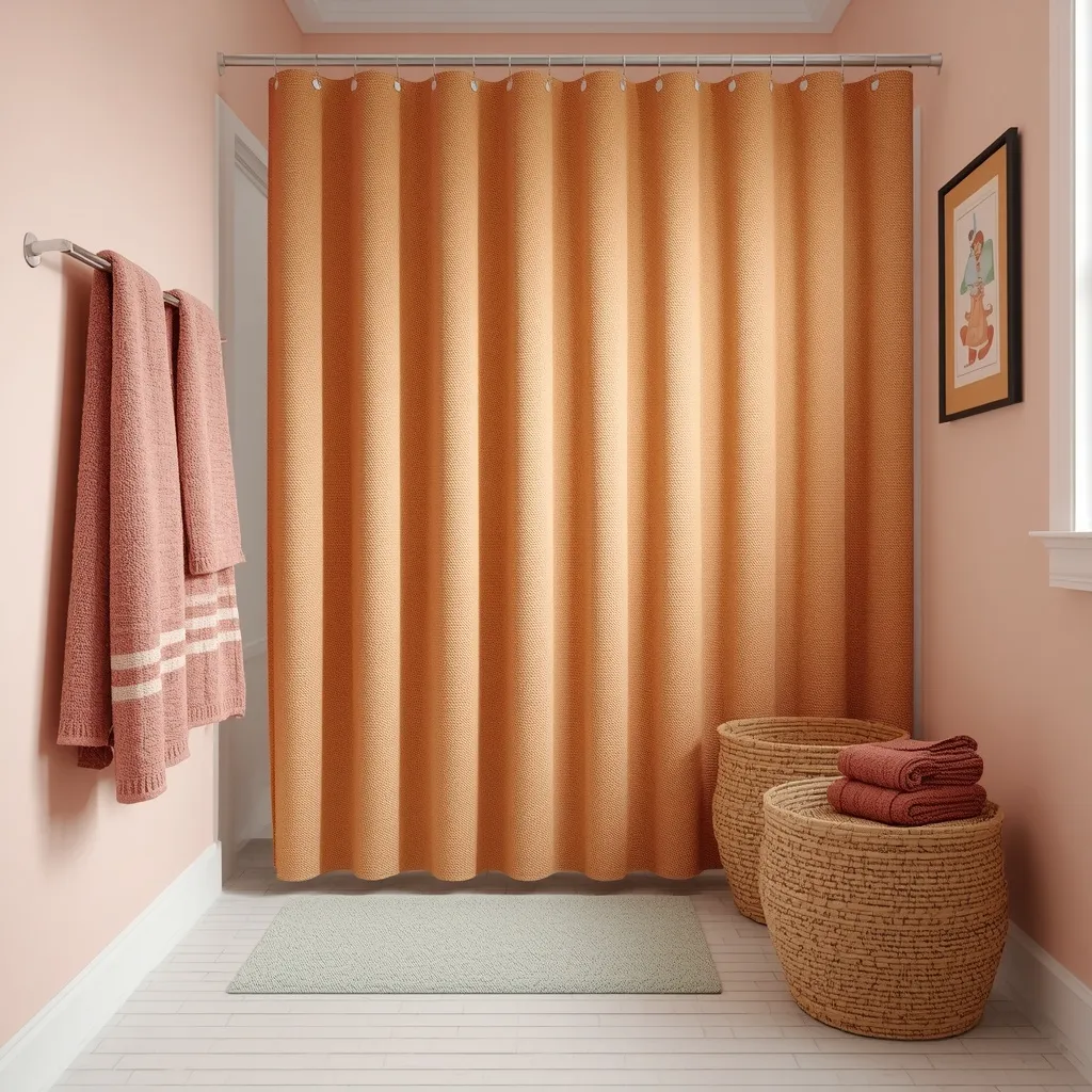
22. Coordinating With Existing Tile
The smartest wall color often comes out of the tile you’re keeping: pulling a quiet secondary tone from existing tile and putting it on the walls makes dated tile suddenly look deliberate. Cohesive and clever, this is the cheapest bathroom rescue there is. Instant coherence, no demolition.
Identify a minor color within your existing tile, the soft green in a patterned floor, the warm grey in a stone tile, the pink in an older suite, and use a muted version of it on the walls, rather than trying to match the tile’s dominant color exactly. Echoing a secondary tone reads as intentional; an exact match of the main color usually looks like a near-miss. This is the single most effective trick for dated bathrooms you can’t afford to retile, including 1970s colored suites.
- Why it works: Echoing a secondary tile tone makes dated tile look like a deliberate choice.
- Best for: Dated tile and colored suites you can’t replace.
- Key elements: muted secondary tile tone on walls, no exact matching, sampled against tile.
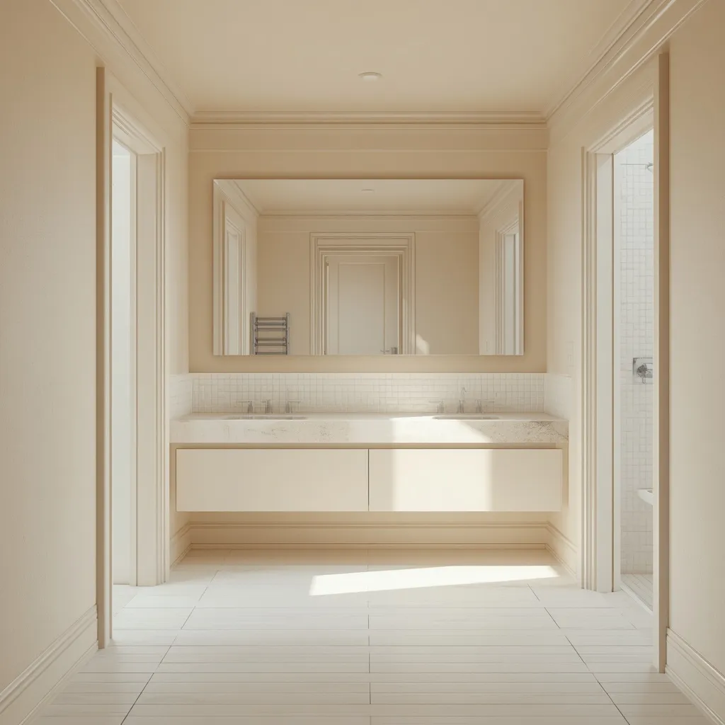
23. Light and Airy Low-Contrast Scheme
A low-contrast light bathroom is the most reliable way to make a small room feel bigger: walls, ceiling, trim, and tile all within a few shades of each other, so nothing interrupts the eye. Open and seamless, this is the technique behind rooms that photograph larger than they are. Soft, continuous, and expansive.
Keep every large surface within two or three shades of the same pale color, walls, ceiling, trim, and ideally tile, so there are no hard edges dividing the space, and use a large mirror to bounce whatever light exists. Contrast is what shrinks small rooms, so eliminating it is more effective than simply choosing white. If your tile is a fixed mid-tone, pick a wall color close to it rather than fighting it with white. This suits the smallest bathrooms and anyone whose priority is maximum perceived space.
- Why it works: Removing hard edges between surfaces is what makes a small room read larger.
- Best for: The smallest bathrooms; maximum perceived space.
- Key elements: all surfaces within two or three shades, large mirror, wall color matched to fixed tile.
What Color Makes a Small Bathroom Look Bigger?
Low contrast makes a small bathroom look bigger, not white specifically. When walls, ceiling, trim, and tile all sit within a few shades of each other, there are no hard edges dividing the space, so the eye reads it as one continuous room. Pale colors help because they reflect more light, but a deep color used consistently across every surface can feel more generous than a white room broken up by dark trim and contrasting tile.
Practical, livable decisions like this sit at the heart of the Sunday Abode approach to a home. Once the palette is settled, a little greenery softens all the hard surfaces, our guide to the best plants for a bathroom covers what actually thrives in humidity and low light. For more on planning the space, browse the rest of our bathroom ideas.
Choosing a Color for Your Bathroom’s Conditions
The right color depends less on taste than on what your bathroom actually gives you, light, fixed finishes, and how the room is used. Use this quick guide to narrow the field before collecting samples.
| Your bathroom | Colors that work | Approach with care |
| No windows | Warm white, cream, soft warm colors | Cool greys and cool blues go dingy |
| Good natural light | Almost anything, including blue and grey | Very dark on one wall only |
| Has oak or wood trim | Sage, greige, olive, clay, cream | Cool grey makes oak look orange |
| Dated or colored tile | A muted secondary tone from the tile | Exact-matching the main tile color |
| Used briefly (guest) | Deep green, jewel tones, drenched color | Nothing, this is the room to be bold |
| Daily family use | Warm neutrals, greige, charcoal | Flat matte finishes on wet walls |
Paint, sheen & practical notes: bathrooms are humid, so use a paint suited to the room, many manufacturers sell bathroom-specific formulations, and some include additives that resist mildew growth on the paint film itself. Satin or semi-gloss handles moisture and wipes clean far better than flat matte on walls near a shower or basin. Ventilation matters more than paint choice for preventing damp: run an extractor fan during and for a while after showering, since persistent condensation causes mold that no paint fully prevents. If you already have mold, address the moisture cause and clean the affected area before painting rather than covering it. Ventilate while painting, follow the product’s guidance on respiratory protection, and keep paints away from children and pets. Homes built before 1978 may contain lead paint, and sanding it releases hazardous dust, the US EPA publishes guidance on testing and safe practices, with equivalent rules in many other countries, so check before sanding old paintwork. Always test samples on the wall in the room’s own light at two times of day.
Frequently Asked Questions
What color makes a small bathroom look bigger?
Low contrast does more than any single color. Keeping walls, ceiling, trim, and tile within a few shades of each other removes the hard edges that visually chop a small room into pieces. Pale colors help because they reflect more light, but a deep color applied consistently across every surface can feel more generous than a white room broken up by dark trim and busy tile.
What are the best colors for a bathroom with no windows?
Warm whites, creams, and soft warm colors work best, because cool greys and cool blues look genuinely dingy without daylight. The bulbs matter as much as the paint: choose warm bulbs around 2700–3000K with a high color rendering index, ideally CRI 90 or above, so colors read true. Layer at least two light sources rather than relying on one flat overhead fitting.
Can you use dark colors in a small bathroom?
Yes, and they often work beautifully. A dark bathroom feels deliberate rather than cramped as long as the darkness is applied consistently, since contrast rather than darkness is what shrinks a room. Deep green and other warm darks suit low-light rooms better than navy or charcoal. Dark schemes work best in guest bathrooms and cloakrooms used briefly rather than in a daily morning routine.
What wall color goes with oak trim in a bathroom?
Warm-undertoned colors flatter oak’s golden cast: soft sage, warm greige, muted olive, creamy off-white, and soft clay all sit comfortably beside it. Avoid cool greys and stark cool whites, which make honey oak look orange and dated by contrast. If the oak is very orange, a deeper and more saturated wall color reduces the contrast more effectively than a pale one.
What kind of paint should you use in a bathroom?
Use a paint suited to humid rooms, in a satin or semi-gloss sheen on walls near a shower or basin, since these wipe clean and handle moisture far better than flat matte. Many manufacturers make bathroom-specific formulations, some containing additives that resist mildew growth on the paint film. Good ventilation still matters more than paint choice for preventing damp problems.
How do you add color to a rental bathroom without painting?
Build the scheme from textiles and accessories instead: towels, a shower curtain, a bath mat, storage baskets, and framed art in a consistent palette of two or three colors repeated throughout. Repetition is what makes it read as designed rather than assembled. Removable vinyl or peel-and-stick wallpaper can add pattern where your tenancy permits, but test removal on a small hidden area first.
Should the ceiling be a different color in a small bathroom?
Usually not. Painting the ceiling stark white against colored walls creates a hard contrast line that visually lowers and shrinks the room. Carrying the wall color onto the ceiling, or using a lighter tone of the same color, keeps the space feeling continuous and taller. This is the core idea behind color drenching, and it’s especially effective in bathrooms with sloped ceilings or awkward angles.
Conclusion
The best small bathroom color ideas start with the room you actually have rather than a rule about what small rooms are allowed to be. Once you know how much daylight reaches the space, which finishes you’re keeping, and how the room gets used, the choice narrows quickly, a warm cream for a windowless cloakroom, a sage that flatters existing oak trim, a drenched forest green for a guest bathroom meant to surprise people. Keep contrast low if space is the priority, and test every sample on the wall before committing. For more on planning the space, explore the bathroom ideas collection on Sunday Abode and save the palette that suits your light.