


Key Takeaways
- Navy is not one color, it ranges from purple-leaning to green-leaning, and that undertone decides which metals, tiles, and whites will work with it.
- A powder room has no shower, so wallpaper, grasscloth, unlacquered brass, and antique furniture survive here as they wouldn’t in a full bathroom.
- Navy absorbs light, so a windowless powder room needs layered lighting at 2700–3000K with a high CRI (90+) to keep the color rich rather than flat.
- Dark walls don’t shrink a powder room, high contrast does, which is why drenching the whole room in navy often feels larger than navy on one wall.
- Warm brass and gold flatter navy most reliably; chrome reads cooler and more modern, and matte black gives the sharpest contemporary edge.
Introduction
The powder room is the one space in a house where you can be genuinely bold, and navy blue powder room ideas prove it better than any other color. It’s small, guests only spend a few minutes there, and it doesn’t need to feel bright for a morning routine, which makes deep color a design decision rather than a risk. These 15 schemes cover the whole room, not just the paint.
Below are complete navy schemes spanning color-drenched monochrome, classic navy and white, wainscoting, wallpaper, grasscloth, and beadboard, paired with brass, gold, black, and chrome, and set against marble, wood, and patterned tile. Each explains the metals, flooring, and lighting that hold it together, plus who it suits. Consider it your guide to the boldest small room in your abode, the one people notice and remember.
Start here, navy is not one color: Navy paints vary enormously in undertone. Some lean purple, some lean green or teal, and some sit close to true blue-black. That undertone decides everything downstream: purple-leaning navies clash with warm cream tile and can look dated beside yellow-gold brass, while green-leaning navies sit beautifully with brass and natural stone. Hold your sample against your intended tile, countertop, and metal finish in the room’s own light before committing, not against a white wall in a store.
15 Navy Blue Powder Room Ideas
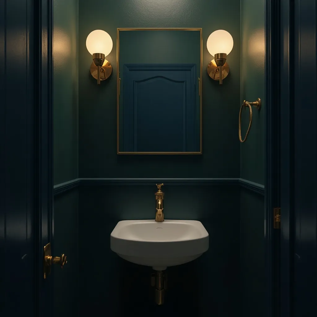
1. Navy and Brass Jewel Box
Navy walls with unlacquered brass is the pairing that made this look famous: deep blue wrapping the room, a warm brass tap and sconces glowing against it, and a white basin cutting through cleanly. Rich and enveloping, brass gives navy the warmth it needs. Jewel-like, warm, and quietly luxurious.
Pair a green-leaning or true navy with unlacquered brass, which develops a living patina over time rather than staying uniformly shiny, a genuine advantage in a powder room, where the aging looks intentional. Keep the basin and toilet white so there’s a clean break, and repeat the brass at least three times (tap, sconces, mirror frame or handles) so it reads as a scheme. Warm metals counteract navy’s coolness, which is why brass suits it better than chrome for a cozy effect. This suits classic, traditional, and transitional homes.
- Why it works: Warm brass counteracts navy’s coolness and gains character as it patinas.
- Best for: Classic and traditional homes; warm, enveloping schemes.
- Key elements: green-leaning navy, unlacquered brass repeated three times, white sanitaryware.
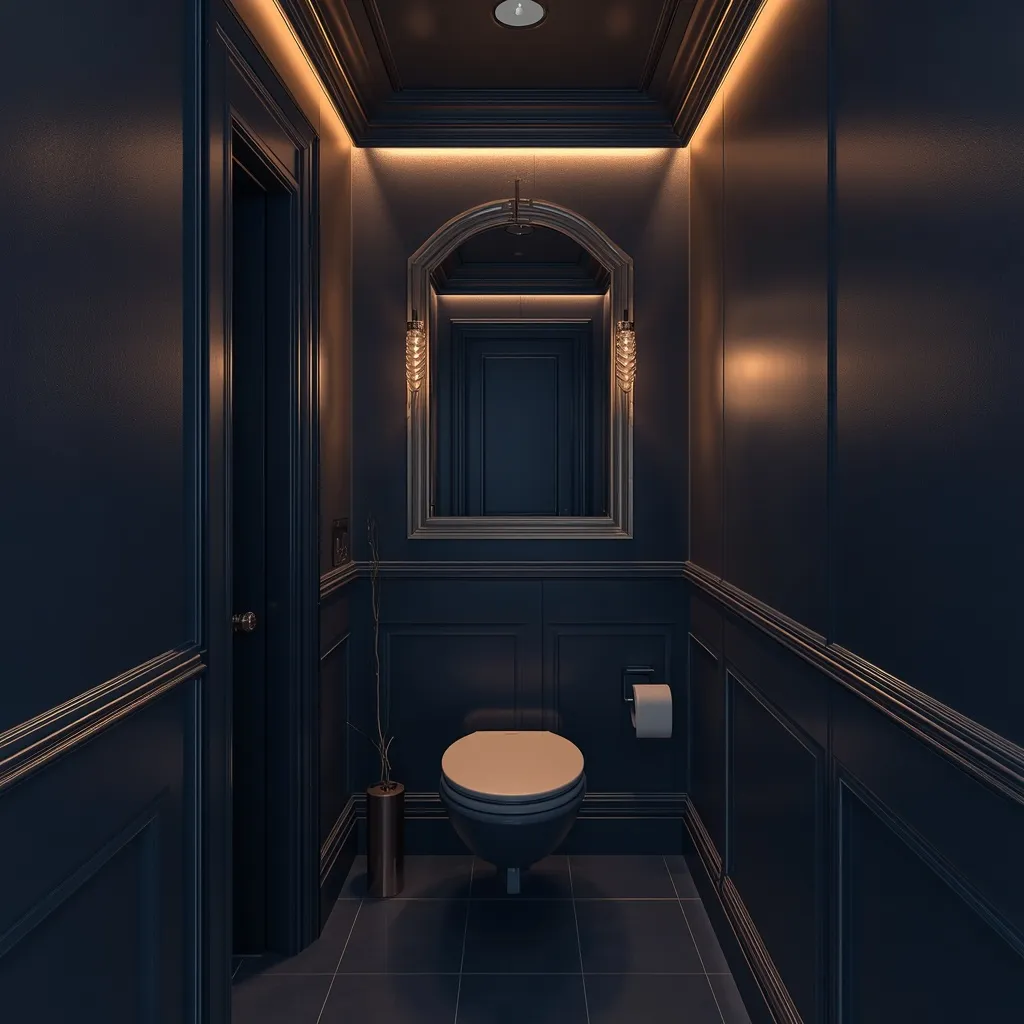
2. Color-Drenched Navy Monochrome
Color drenching takes navy across everything: walls, ceiling, trim, door, and sometimes the vanity, so the room’s edges dissolve into one deep, continuous shell. Immersive and confident, drenching turns a tiny room into a deliberate statement. Cocooning, seamless, and dramatic.
Paint walls, ceiling, and woodwork the same navy, varying sheen rather than shade, a flatter finish on walls and ceiling, satin or semi-gloss on trim and doors for durability. Because no contrast breaks the space up, the boundaries blur and a small powder room reads as intentional rather than cramped. This is the single most effective technique for awkward shapes, sloped ceilings, and rooms under the stairs. Add a large mirror and warm lighting so the depth feels rich, not closed in. This suits tiny powder rooms and confident decorators.
- Why it works: Removing all contrast blurs the room’s edges so a small space feels designed, not tight.
- Best for: Tiny powder rooms, sloped ceilings, under-stair spaces.
- Key elements: one navy across walls, ceiling, and trim, varied sheen, large mirror, warm light.
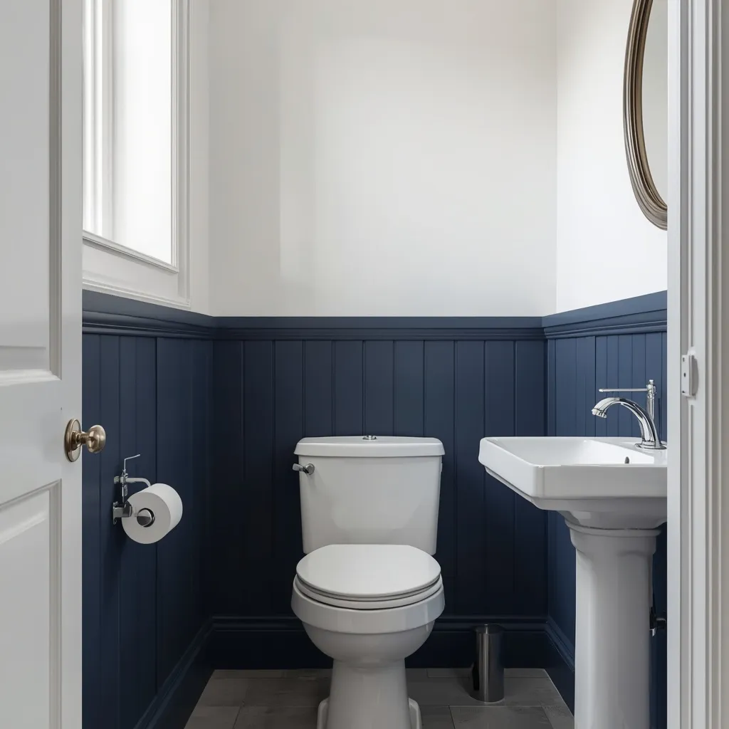
3. Classic Navy and White
Navy and white is the scheme that never dates: crisp white above, deep navy below or on the vanity, white sanitaryware, and polished chrome keeping everything sharp. Tailored and timeless, this is navy at its most versatile. Clean, smart, and endlessly safe.
Split the room cleanly, navy on the lower wall or vanity with white above, or navy walls with white trim and tile, keeping the divide at a consistent height all the way around. A true navy rather than a purple-leaning one keeps the white looking crisp; purple-leaning navies can make a cool white look slightly grey beside them. Polished chrome or nickel suits this scheme better than brass if you want a cooler, more traditional finish. This suits family homes, resale-minded updates, and anyone wanting bold without risk.
- Why it works: A true navy against crisp white stays sharp and survives changing tastes.
- Best for: Family homes; resale-minded updates; cautious decorators.
- Key elements: true navy, crisp white, consistent divide height, polished chrome or nickel.
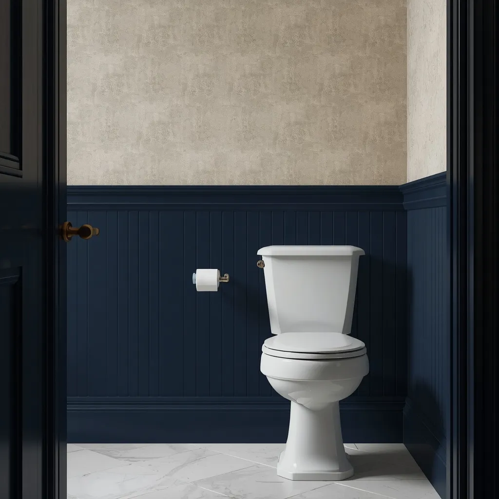
4. Navy Wainscoting Two-Tone
Navy wainscoting brings architecture to a plain powder room: panelled navy running to about a third of the wall height, lighter color or wallpaper above, and a rail marking the change. Structured and period-correct, panelling adds character walls alone can’t. Traditional, layered, and substantial.
Run navy panelling or beadboard to roughly one-third of the wall height, or up to about 90 cm (3 ft), keeping the rail level all the way around, an uneven line is the detail that makes wainscoting look amateur. Paint the panelling in satin or semi-gloss so it wipes clean, since the lower wall takes the most contact. Weight low and lightness high grounds the room while drawing the eye upward. This suits period properties, traditional homes, and powder rooms needing more character than paint alone provides.
- Why it works: Weight low and lightness high adds architecture while keeping the upper room open.
- Best for: Period and traditional homes; character-poor powder rooms.
- Key elements: navy panelling to 90 cm, level rail, satin or semi-gloss, lighter treatment above.
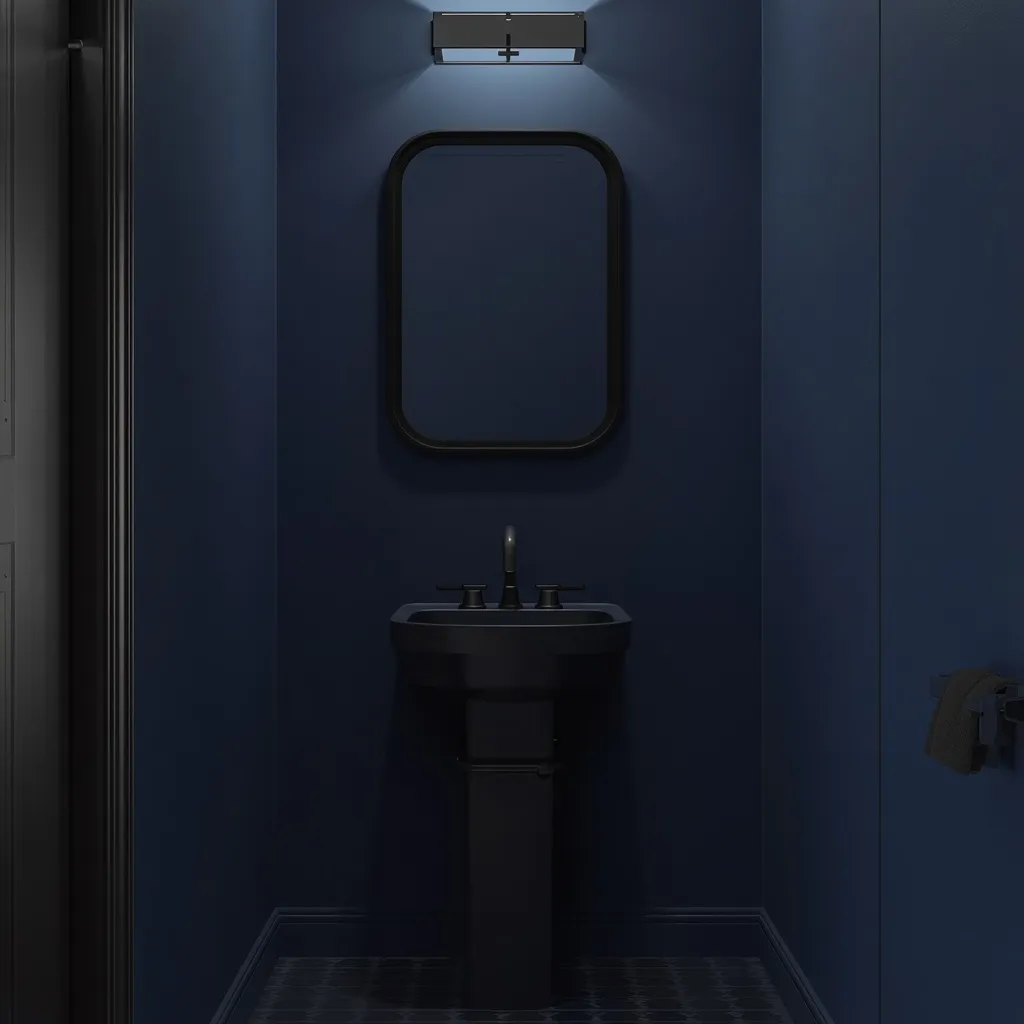
5. Modern Navy and Matte Black
Navy with matte black is the sharpest contemporary version: flat navy walls, black tap and fittings, a black-framed mirror, and clean-lined surfaces with no ornament anywhere. Graphic and disciplined, this is navy stripped of tradition. Sleek, dark, and architectural.
Pair a true or slightly blue-black navy with matte black fittings, repeating the black in three or four places, tap, mirror frame, light fitting, handles, so it reads as a deliberate thread rather than mismatched hardware. Keep forms simple and surfaces flat, since this scheme relies on line rather than detail. Practical caveat: matte black shows water spots and fingerprints more than chrome, so expect to wipe it. This suits modern and minimalist homes, new builds, and anyone who finds brass too traditional.
- Why it works: Black repeated three or four times against navy creates a disciplined graphic scheme.
- Best for: Modern and minimalist homes; new builds.
- Key elements: true navy, matte black repeated, simple flat forms, regular wiping.
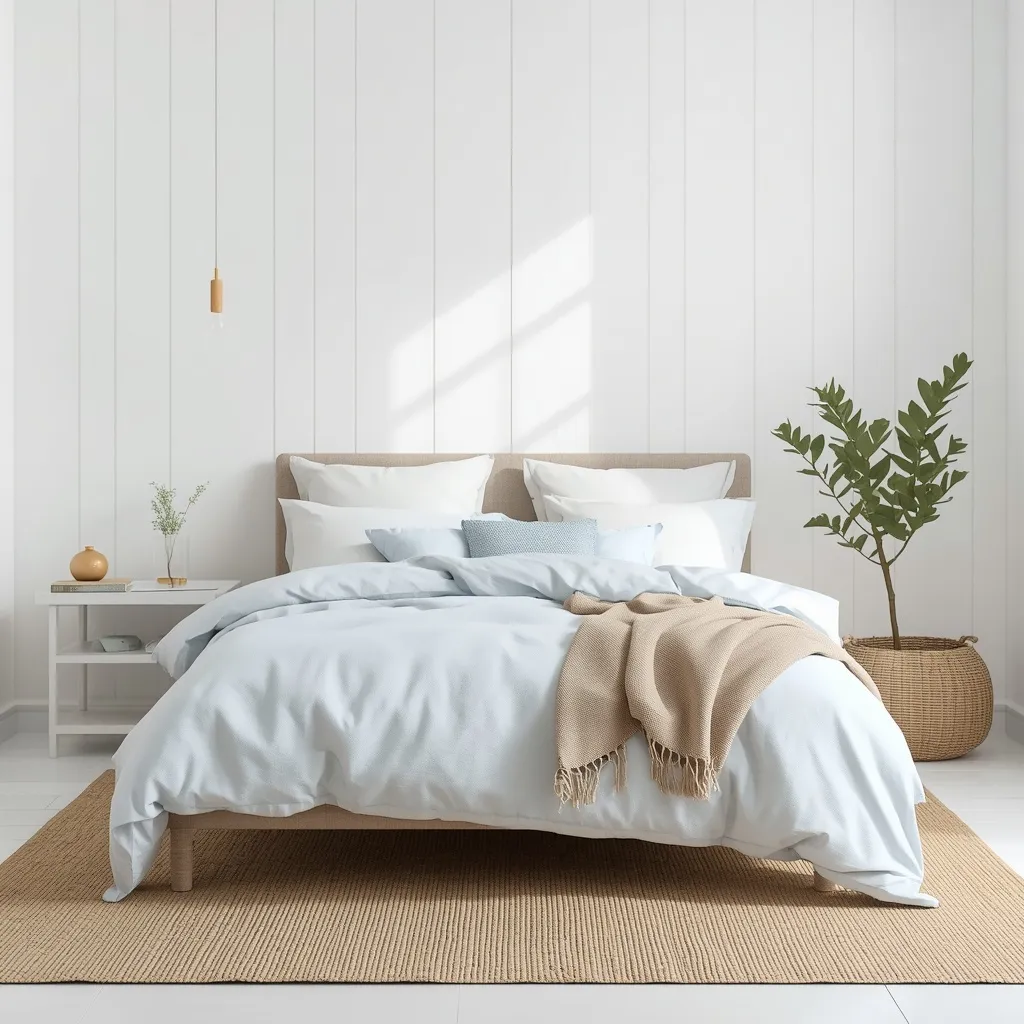
6. Navy Vanity with Pale Walls
A navy vanity beneath pale walls is the lower-commitment version: soft white or greige walls keeping the room bright, with a deep navy vanity anchoring it at floor level. Balanced and practical, this gives you navy without darkness. Bright, grounded, and easy to live with.
Paint or buy a navy vanity and keep walls, ceiling, and trim pale, letting the vanity be the only strong color, this grounds the room while maintaining brightness, which matters if the powder room has no window and you want it to feel light. Use a cabinet-grade enamel in satin or semi-gloss if painting an existing vanity, over a bonding primer. Repainting a vanity later is a weekend job, making this the most reversible navy scheme here. This suits small, dark powder rooms and anyone testing navy before committing further.
- Why it works: Color low and lightness high delivers navy without darkening the whole room.
- Best for: Dark or windowless powder rooms; cautious first-time color use.
- Key elements: navy vanity, pale walls and trim, cabinet enamel over bonding primer.
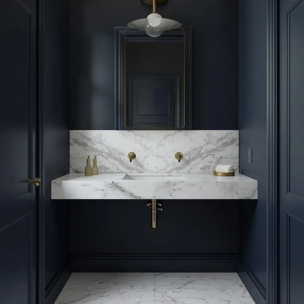
7. Navy and Marble Luxe
Navy against white marble is quietly expensive: deep blue walls meeting a veined marble countertop or splashback, with the stone’s grey veining picking up the blue. Refined and hotel-like, marble gives navy a sense of occasion. Polished, cool, and elegant.
Pair navy with a white marble or marble-look quartz whose veining carries grey or blue rather than warm beige, so the stone and paint share an undertone. Marble-look porcelain and quartz are far more practical than natural marble in a powder room, since real marble is porous and etches from acidic products. Keep metals consistent, brass for warmth, chrome for a cooler look, and let the stone be the pattern. This suits formal homes, hotel-inspired schemes, and anyone wanting navy to read as luxurious rather than cozy.
- Why it works: Grey-veined marble shares navy’s cool undertone, so stone and paint read as one scheme.
- Best for: Formal and hotel-inspired powder rooms.
- Key elements: navy walls, grey-veined marble or quartz, consistent metals, porcelain for practicality.
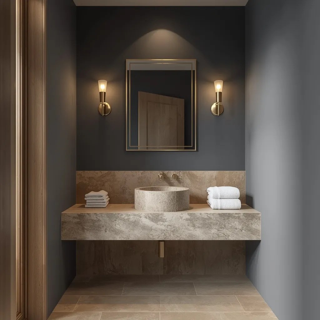
8. Spa-Like Navy and Stone
A spa-style navy powder room is calm rather than dramatic: muted navy walls, natural stone, pale timber, and soft diffused lighting creating a still, restful atmosphere. Serene and tactile, this proves navy doesn’t have to be theatrical. Quiet, natural, and soothing.
Choose a slightly softened or greyed navy rather than a saturated one, pairing it with honed rather than polished stone, pale oak or teak, and folded white towels. Matte and honed surfaces absorb light softly, which is what creates the calm, glossy finishes bounce light and read as energetic rather than restful. Add a single plant and warm, diffused lighting instead of a bright overhead. This suits spa-style homes, quiet minimalists, and anyone wanting depth without drama.
- Why it works: Honed matte surfaces absorb light softly, creating calm rather than drama.
- Best for: Spa-style schemes; quiet minimalists.
- Key elements: softened greyed navy, honed stone, pale oak, diffused warm lighting.
9. Small Powder Room Navy Wallpaper
Navy wallpaper turns a tiny powder room into a jewel: a small-scale patterned navy paper covering every wall, with a compact basin and a single sconce. Pattern-rich and immersive, wallpaper does in a small room what it would overwhelm in a large one. Detailed, bold, and memorable.
Choose a small-to-medium scale pattern on a navy ground and paper all four walls rather than one, since a feature wall in a tiny room usually just looks unfinished. Powder rooms are the ideal place for wallpaper because there’s no shower, so steam won’t lift the seams the way it would in a full bathroom, this is genuinely the room where paper survives. Prepare walls properly and use an adhesive suited to the paper type. This suits tiny powder rooms, pattern lovers, and anyone wanting maximum impact from a small area.
- Why it works: No shower means no steam, so wallpaper survives here as it wouldn’t in a full bathroom.
- Best for: Tiny powder rooms; pattern lovers.
- Key elements: small-scale navy pattern, all four walls papered, correct adhesive, prepared surfaces.
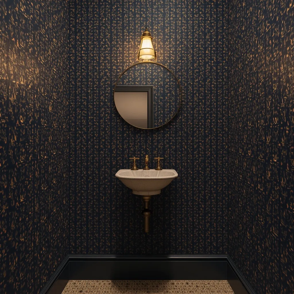
10. Navy Grasscloth Texture Walls
Navy grasscloth adds texture you can see and feel: woven natural fibers in deep indigo catching the light differently across each wall, giving flat navy a subtle organic depth. Tactile and sophisticated, grasscloth makes a small room feel considered. Textured, natural, and warm.
Hang navy grasscloth on all walls for a subtle, shifting texture that flat paint can’t replicate, accepting that visible seams and slight color variation between panels are inherent to the material rather than defects. Grasscloth is another material that works in a powder room specifically because there’s no shower, it stains and marks easily, so it’s unsuitable near a bath or shower. Keep it away from direct splash zones around the basin. This suits sophisticated, textural interiors and anyone tired of flat painted walls.
- Why it works: Woven fibers catch light unevenly, giving depth flat paint can’t achieve.
- Best for: Textural, sophisticated interiors; no-shower rooms only.
- Key elements: navy grasscloth on all walls, accepted seams and variation, kept clear of splash zones.
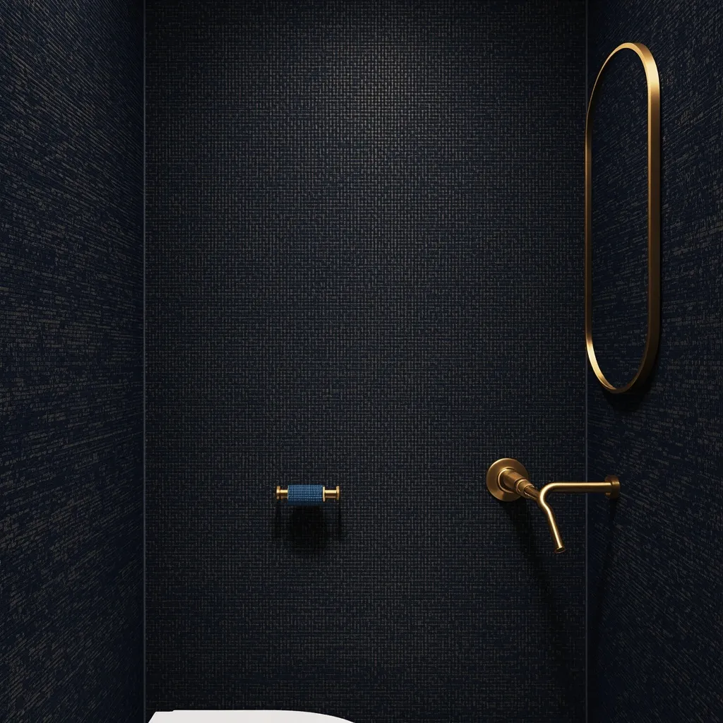
11. Vintage Navy with Antique Brass
A vintage navy powder room feels collected rather than decorated: deep navy walls, an antique wooden washstand converted to a vanity, aged brass fittings, and a gilt-framed mirror. Characterful and layered, vintage pieces give navy history. Warm, personal, and full of patina.
Combine navy walls with genuinely old pieces, a repurposed console or washstand, an antique mirror, aged brass or bronze fittings, letting patina and imperfection carry the character. Converting furniture into a vanity requires cutting for plumbing, so have the work done properly and seal any exposed timber against splashes. This is another scheme only a powder room can carry, since antique wood would suffer in a steamy full bathroom. This suits period properties, antique lovers, and anyone wanting a room that doesn’t look bought as a set.
- Why it works: Patinated antique pieces give navy a sense of history no new fitting can replicate.
- Best for: Period homes; antique collectors.
- Key elements: navy walls, converted antique washstand, aged brass, gilt mirror, sealed timber.
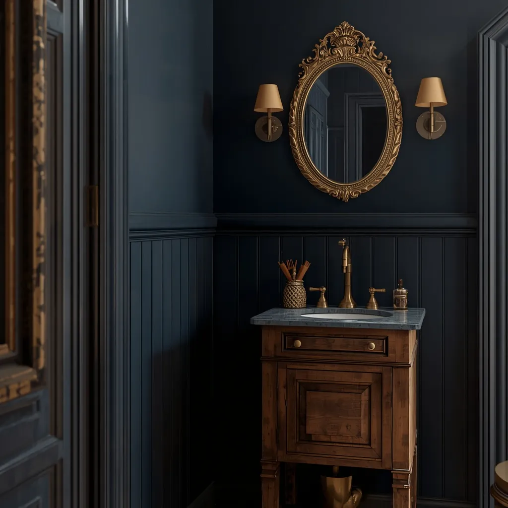
12. Navy with Patterned Floor Tile
Navy walls above a boldly patterned floor is a confident combination: plain deep navy meeting an encaustic-style geometric or Moroccan-pattern tile underfoot. Graphic and energetic, the floor becomes the room’s personality. Bold, patterned, and lively.
Keep the walls plain navy and let the floor carry all the pattern, choosing a tile whose secondary colors pick up or complement the navy, a pattern containing blue, white, and warm ochre works particularly well. Two competing patterns in a small room fight each other, so plain walls are what let a strong floor succeed. Choose a floor tile with adequate slip resistance rather than a high-polish finish, since powder room floors get wet around the basin. This suits eclectic and characterful homes.
- Why it works: Plain navy walls give a strong patterned floor the space it needs to work.
- Best for: Eclectic homes; renovations keeping bold flooring.
- Key elements: plain navy walls, patterned encaustic-style floor, coordinated secondary colors, slip-resistant finish.
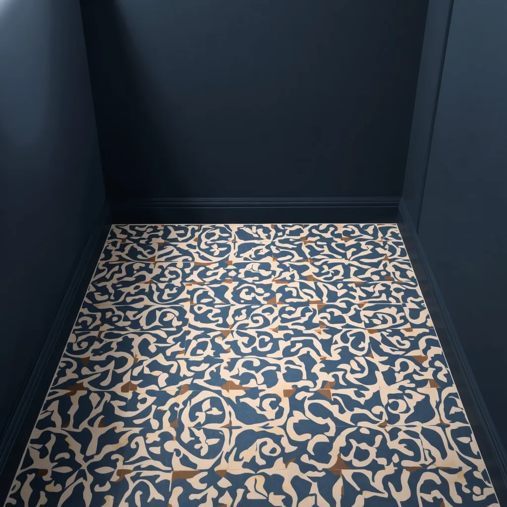
13. Navy and Gold Art Deco
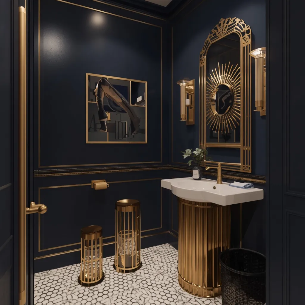
Navy and gold together read unmistakably deco: deep navy walls, warm gold fittings and mirror frame, fluted or geometric detailing, and a fan-shaped or scalloped motif somewhere in the room. Glamorous and confident, gold pushes navy from smart to opulent. Rich, geometric, and theatrical.
Pair navy with polished gold or champagne-gold rather than aged brass for a cleaner deco effect, adding geometric detail through fluted vanity fronts, a sunburst or arched mirror, or a hexagonal floor tile. Gold and navy work because gold is navy’s warm opposite, the contrast is what creates the richness. Keep the geometry consistent rather than mixing several unrelated motifs. This suits glamorous interiors, deco-era properties, and anyone wanting a powder room that feels like an event.
- Why it works: Gold is the navy’s warm opposite, and that contrast is what creates deco richness.
- Best for: Glamorous interiors; deco-era homes.
- Key elements: navy walls, polished or champagne gold, fluted or geometric detail, one consistent motif.
14. Coastal Navy Beadboard
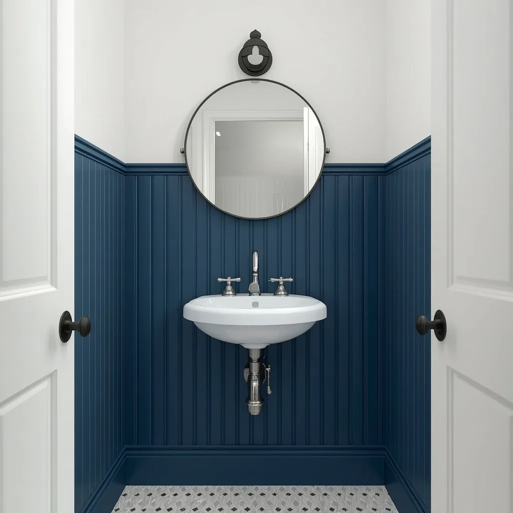
Navy beadboard gives a relaxed coastal feel: vertical grooved panelling in deep navy running to shoulder height, white above, and simple chrome fittings with a rope-framed or plain round mirror. Fresh and unfussy, beadboard keeps navy casual. Breezy, textured, and easygoing.
Fit beadboard to around shoulder height with white above, painting the panelling in a durable satin finish so the grooves wipe clean, vertical grooves also draw the eye upward, which helps a low-ceilinged powder room. Keep the accessories simple and the palette to navy, white, and natural fiber, avoiding literal nautical motifs, which tip a coastal scheme into theme-park territory quickly. This suits coastal homes, cottages, and relaxed family houses.
- Why it works: Vertical grooves draw the eye upward and keep navy feeling casual rather than formal.
- Best for: Coastal homes, cottages, relaxed family houses.
- Key elements: navy beadboard to shoulder height, white above, satin finish, restrained accessories.
15. Navy with Living Greenery
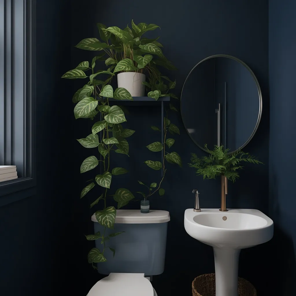
Navy walls make green foliage glow: deep blue as a backdrop with a trailing plant on a shelf or a small potted fern beside the basin, the leaves reading almost luminous against the dark. Fresh and softening, greenery stops navy feeling severe. Alive, contrasting, and inviting.
Use navy as a backdrop and add one or two plants at different heights, a trailing pothos on a high shelf and a compact fern near the basin, since green against deep blue is one of the most naturally flattering pairings in interiors. Powder rooms are often windowless, so choose genuinely low-light tolerant species or rotate plants with a brighter room every two to three weeks. If you have pets, check toxicity first, as pothos and several other common choices are toxic to cats and dogs. This suits anyone wanting to soften a dark scheme cheaply.
- Why it works: Green foliage reads almost luminous against the deep navy, softening a dark scheme.
- Best for: Softening dark powder rooms on a small budget.
- Key elements: navy backdrop, two plants at varied heights, low-light species or rotation, toxicity checked.
Does Navy Make a Small Powder Room Look Smaller?
No, high contrast makes a small powder room feel smaller, not darkness itself. A room drenched entirely in navy, with the ceiling and trim carried in the same color, often feels more generous than a white room broken up by dark trim and busy tile, because there are no hard edges chopping the space into pieces. What a navy powder room does need is good layered lighting, since deep colors absorb rather than reflect light.
Rooms that work in daily life rather than only in photographs are what the Sunday Abode approach is built around. Since the floor carries so much of the scheme here, our guide to choosing tile for a powder room floor covers materials and slip resistance in detail. For more on shaping the space, browse the rest of our bathroom ideas.
Matching Metals and Materials to Your Navy
Navy’s undertone decides what works beside it. Check which way your sample leans by holding it against a sheet of plain white paper, the cast will show clearly. Then use this guide before choosing metals and tile.
| Navy undertone | Best metals | Best partners | Avoid |
| Green-leaning | Brass, bronze, gold | Natural stone, oak, cream | Cool grey tile |
| True navy | Anything, most flexible | White, marble, most tile | Very little |
| Purple-leaning | Chrome, nickel, silver | Crisp cool white, grey | Warm cream, yellow-gold |
| Blue-black | Matte black, chrome | White, concrete, terrazzo | Ornate warm brass |
Why a Powder Room Lets You Do More
A powder room has no shower or bath, which means no sustained steam, and that single fact unlocks materials that would fail in a full bathroom. Wallpaper seams don’t lift, grasscloth doesn’t stain, unlacquered brass patinas gently rather than spotting, and antique timber furniture survives. It’s the one wet room where you can decorate almost like a hallway.
- Lighting spec: navy absorbs light, so use warm bulbs at 2700–3000K with a high color rendering index (CRI 90 or above) and at least two light sources, a sconce pair beside the mirror plus one overhead beats a single ceiling fitting.
- Sheen matters: flat matte navy shows dust, lint, and hand marks; satin or semi-gloss on trim, doors, and vanity wipes clean and reflects a little light back.
- Sampling: paint a large sample directly on the wall and check it at two times of day, since navy shifts dramatically between daylight and bulb light.
- Mirror size: a generous mirror is the cheapest way to bounce light around a dark powder room and visually double the space.
- Ventilation: even without a shower, powder rooms usually need extraction, check local building requirements, which commonly specify a fan or openable window.
Safety notes: any new or relocated electrical fitting in a bathroom or powder room should be installed by a qualified electrician, since bathroom wiring is governed by specific zone and protection rules in nearly every country, this applies to sconces beside a basin in particular. Fix heavy mirrors and wall-hung vanities into studs or properly rated anchors, never into plasterboard alone. If sanding old paintwork or converting antique furniture in a home built before 1978, be aware it may contain lead paint, which releases hazardous dust when sanded; the US EPA publishes guidance on testing and safe practices, and most countries have equivalents. Ventilate well when painting or hanging wallpaper, follow product guidance on respiratory protection in a small enclosed room, and choose flooring with adequate slip resistance, since powder room floors get wet around the basin.
Frequently Asked Questions
Is navy a good color for a powder room?
Navy is one of the best choices for a powder room, because the room is small, used briefly, and doesn’t need to feel bright for a daily routine. Deep color reads as a deliberate design decision here rather than a risk, and the small surface area means repainting later is inexpensive. Navy also behaves almost like a neutral, coordinating with brass, chrome, black, marble, and wood alike.
What colors go with navy in a powder room?
Crisp white gives the sharpest classic contrast, while cream and natural stone soften navy for a warmer look. Warm metals, brass, bronze, and gold, flatter navy most reliably, and green foliage reads almost luminous against it. The one pairing to approach carefully is cool grey with a purple cast, which can make a purple-leaning navy look muddy.
Does a dark navy make a small powder room feel cramped?
Not by itself. Contrast is what shrinks small rooms, not darkness, so a navy room with the ceiling and trim carried in the same color often feels more generous than a white one broken up by dark edges. What matters is lighting: navy absorbs light, so use layered warm lighting and a generous mirror to keep the room from feeling closed in.
Which metal finish looks best with navy blue?
Brass and gold are the most reliably flattering, because warm metals counteract navy’s coolness and create richness. Chrome and nickel give a cooler, more traditional or modern look depending on the rest of the scheme, and matte black produces the sharpest contemporary contrast. Choose based on your navy’s undertone: green-leaning navies suit brass, while purple-leaning navies sit better with chrome.
Can you use wallpaper in a powder room?
Yes, and a powder room is the best room in the house for it. Because there’s no shower or bath, there’s no sustained steam to lift the seams the way it would in a full bathroom. The same applies to grasscloth, unlacquered brass, and antique timber furniture, all of which survive in a powder room but struggle elsewhere. Keep paper clear of direct splash zones around the basin.
What lighting works best in a navy powder room?
Layered warm lighting at around 2700–3000K with a high color rendering index of 90 or above, since navy absorbs light and cheap bulbs make deep colors look flat and grey. Two sources beat one: a pair of sconces beside the mirror gives flattering light at face height, with a discreet overhead fitting for general illumination. Have any new wiring done by a qualified electrician.
Should you paint the ceiling navy too?
In a small powder room, usually yes. Carrying navy across the ceiling and trim removes the hard contrast line that visually lowers and shrinks a room, and it’s the core idea behind color drenching. This works particularly well with sloped ceilings, under-stair spaces, and awkward angles that contrast would otherwise emphasize. Vary the sheen rather than the shade, using a more durable finish on woodwork.
Conclusion
The best navy blue powder room ideas all start from the same recognition: this is the one room where boldness costs almost nothing. It’s small, guests pass through briefly, and repainting is a weekend rather than a renovation. Check which way your navy leans before choosing metals, take advantage of the no-shower freedom to use wallpaper or grasscloth if you want them, and spend your attention on lighting, since that’s what keeps deep color rich rather than flat. For more on shaping the space, explore the bathroom ideas collection on Sunday Abode and save the scheme that suits your home.