


Introduction
Picture morning light sliding across a wall the color of steeped chamomile tea, or a deep evergreen headboard nook that feels like stepping into a quiet forest clearing. That’s the power of a well-planned palette: bedroom color palette ideas aren’t just about paint chips, they’re the emotional temperature of the one room in your home built entirely for rest. Whether you’re working with a rented studio, a sprawling primary suite, or something in between, the right combination of hues can make a space feel calmer, larger, warmer, or more grounded within a single weekend. This guide walks through fifteen distinct, tested palettes, plus the color-building logic behind them, so your bedroom becomes a genuine Sunday Abode moment: unhurried, personal, and entirely your own.
How to Build a Bedroom Color Palette That Works
Before diving into specific combinations, it helps to understand the framework that makes any bedroom color palette read as intentional rather than accidental.
Most professional stylists build a room’s palette using a simple 60-30-10 ratio: 60% dominant color (usually your walls and largest surfaces), 30% secondary color (bedding, an accent wall, large furniture), and 10% accent (throw pillows, art, a lamp base). This ratio keeps a scheme balanced instead of busy, and it’s the fastest way to make three or four colors feel cohesive rather than random.
Undertones matter more than the color name on the swatch. A “greige” with a pink undertone will clash with cool gray bedding, while the same greige with a green undertone pairs beautifully with sage or olive textiles. Hold your paint sample next to your existing furniture and flooring in daylight before committing; the same chip can look warm at 9 a.m. and noticeably cooler by evening.
Light Reflectance Value, or LRV, is worth checking too. Colors under LRV 20 read as genuinely dark and dramatic, while anything above LRV 70 feels airy even in a room with limited daylight. North- and east-facing bedrooms generally handle warmer, higher-LRV tones better, while south- and west-facing rooms have enough natural warmth to carry cooler, moodier colors.
If you’re renting or simply not ready to commit to a wall color, most of the palettes below translate through bedding, an oversized area rug, curtains, and a gallery wall, no paint required. For anyone who is painting, choose a low- or zero-VOC formula and keep a window cracked with a fan running for at least 48 to 72 hours after application; the U.S. Environmental Protection Agency notes that VOC levels can remain elevated indoors well after paint appears dry (Source: U.S. EPA, Volatile Organic Compounds’ Impact on Indoor Air Quality).
Once you’ve settled on the ratio and undertone that suit your room’s light, take a look at our Modern Interior Design Ideas guide for pulling the rest of the room together, or use the fifteen palettes below as a direct starting point.
15 Bedroom Color Palette Ideas to Try in Your Space
1. Warm Greige & Cream
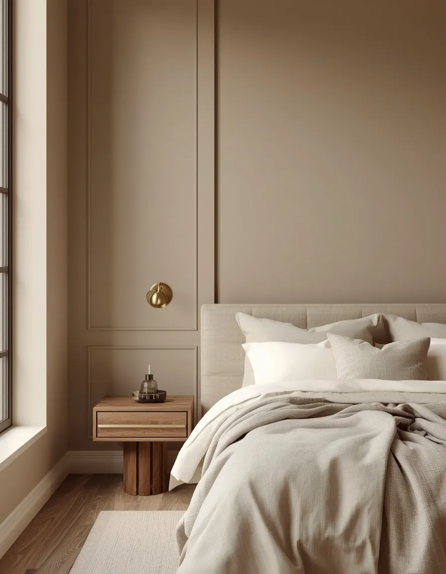
A warm greige wall wrapped in soft cream linen bedding turns a bedroom into the kind of space that never looks dated, whether the rest of your home leans farmhouse, minimalist, or transitional.
Warm greige sits between beige and gray, so lean into a formula with visible warmth, check the undertone in daylight, rather than a flat, chalky gray-beige, which can read cold and institutional under artificial light. Layer in cream, oatmeal, and warm white through bedding and drapery, then add one deeper wood tone, like a walnut nightstand, to keep the room from feeling washed out. This combination works especially well in small or low-light bedrooms, even those under about 120 square feet (11 square meters), because the high LRV bounces available light around the room. A common mistake is pairing warm greige with cool-toned metals like chrome; stick with brass or matte black hardware instead.
- Works in nearly any home style, from farmhouse to transitional modern
- Reads as move-in ready for renters and resale-minded homeowners alike
- Reflects light well, making it ideal for small or windowless bedrooms
- Pairs with warm wood, brass, and rattan without looking themed
2. Soft Sage & Linen White
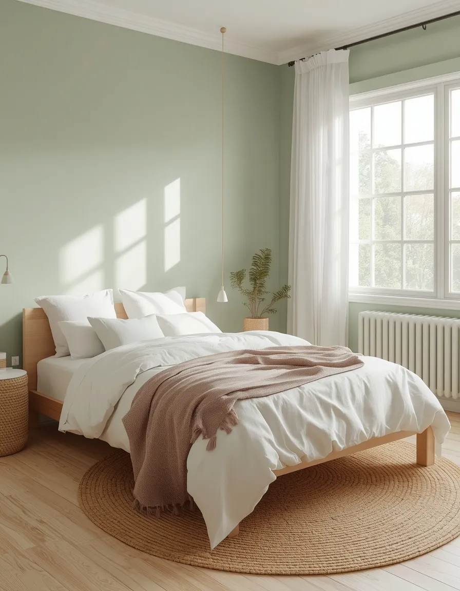
Soft sage walls paired with linen-white bedding bring an outdoor stillness indoors, like a bedroom tucked just behind a garden hedge.
Sage sits in the gray-green family, which makes it easier to live with than a true, saturated green; it reads as calming rather than bold. Use sage as the dominant 60% on walls, then let linen white and a touch of raw wood carry the remaining balance. This palette is one of the most consistently recommended relaxing bedroom color palette ideas because muted greens produce noticeably less visual stimulation than brighter hues, similar to the effect of time spent outdoors. Avoid pairing sage with stark white trim, which can push the green cooler than intended; a soft off-white keeps the whole room feeling warm. Add texture through boucle, linen, or a jute rug so the palette doesn’t read flat.
- One of the most reliably calming, sleep-friendly color combinations available
- Suits bedrooms with plenty of natural light and leafy outdoor views
- Easy to soften or deepen seasonally through textiles alone
- Works equally well in cottage, Scandinavian, and modern farmhouse styles
3. Dusty Blue & Warm White
A dusty, slightly gray-toned blue on the walls, paired with warm white linens, gives a bedroom the hush of an overcast morning at the coast, quiet without feeling cold.
Dusty blue works because it’s desaturated; a true, saturated blue can feel energizing rather than restful, while a grayed-down version keeps the calming effect without the flatness of plain gray. This is consistently one of the top relaxing bedroom color palette ideas, since cooler, muted hues are associated with a more settled state before sleep. Balance the coolness with warm white bedding, a caramel leather bench, or brass sconces so the room doesn’t tip into feeling clinical. A frequent misstep is choosing a blue with too much gray and not enough pigment, which can read as simply gray on the wall; test a large sample swatch before committing to the full room.
- Widely regarded as genuinely restful, especially in the hour before sleep
- Reads sophisticated without leaning masculine or overly traditional
- Works in bedrooms of nearly any size or light exposure
- Balances well against warm wood, brass, and leather accents
4. Blush Pink & Terracotta Clay
Dusty blush walls grounded by terracotta clay bedding and a rust-toned throw give a bedroom warmth and personality without tipping into overtly pastel or juvenile territory.
The key to making pink feel grown-up is desaturating it and pairing it with an equally warm, earthy partner instead of white or silver, which can push it sweeter than intended. Use blush as the dominant wall color, then bring in terracotta, rust, and warm brown through bedding, a ceramic lamp, or a woven wall hanging. This combination flatters both very light and warmly lit rooms, since the pink softens harsh afternoon sun rather than competing with it. One common mistake is over-matching every accessory to the exact same pink, which flattens the palette; vary the values, some dusty, some deeper clay, some near-neutral, for a layered look.
- Feels sophisticated rather than sweet when paired with earthy clay tones
- Softens strong afternoon light in south- or west-facing bedrooms
- Suitable for primary bedrooms, not only kids’ or guest rooms
- Pairs naturally with rattan, brass, and unglazed ceramic textures
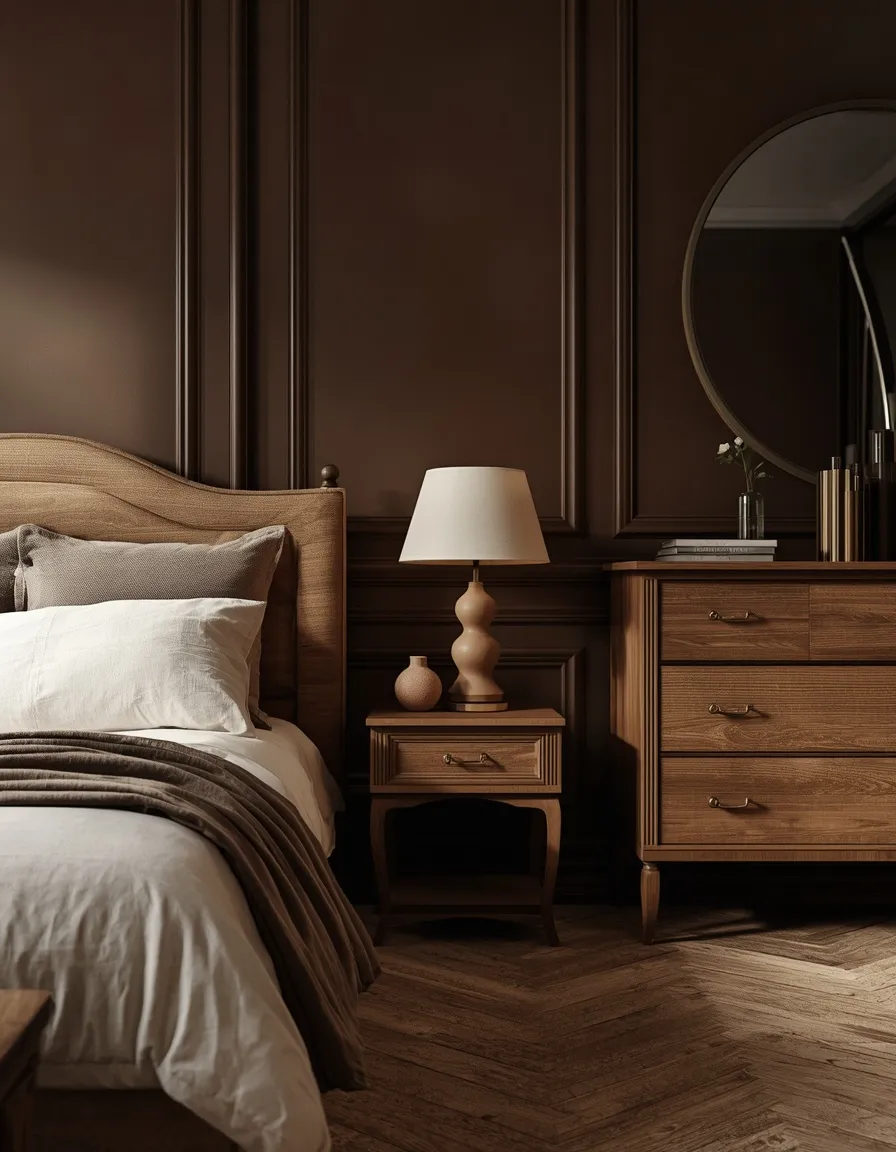
5. Chocolate Brown & Cream
Deep chocolate walls with cream bedding and brushed-oak furniture turn a bedroom into the kind of cocoon you want to stay in past the alarm.
Warm, chocolate-toned browns have become one of the defining bedroom color palette ideas of the past two years, sometimes nicknamed “dopamine brown” for the cozy, grounded mood they create. Because brown is a deep, low-LRV color, it works best on an accent wall or all four walls in a bedroom with generous natural light or layered lighting; in a very small, dim room, keep brown to the headboard wall and textiles rather than the full envelope. Cream, ivory, and warm white keep the room from feeling heavy, while brass or aged gold hardware adds a bit of shine. For more ways to layer this warmth throughout the room, our bedroom decor ideas hub has layout pairings that complement a brown-based scheme. Avoid pairing chocolate brown with cool gray, which mutes its warmth considerably.
- Creates a genuinely cozy, cocoon-like feel for colder climates or seasons
- Best suited to bedrooms with strong natural or layered artificial light
- Pairs beautifully with brass, aged gold, and natural wood tones
- Works as a full wall color or a single dramatic accent wall
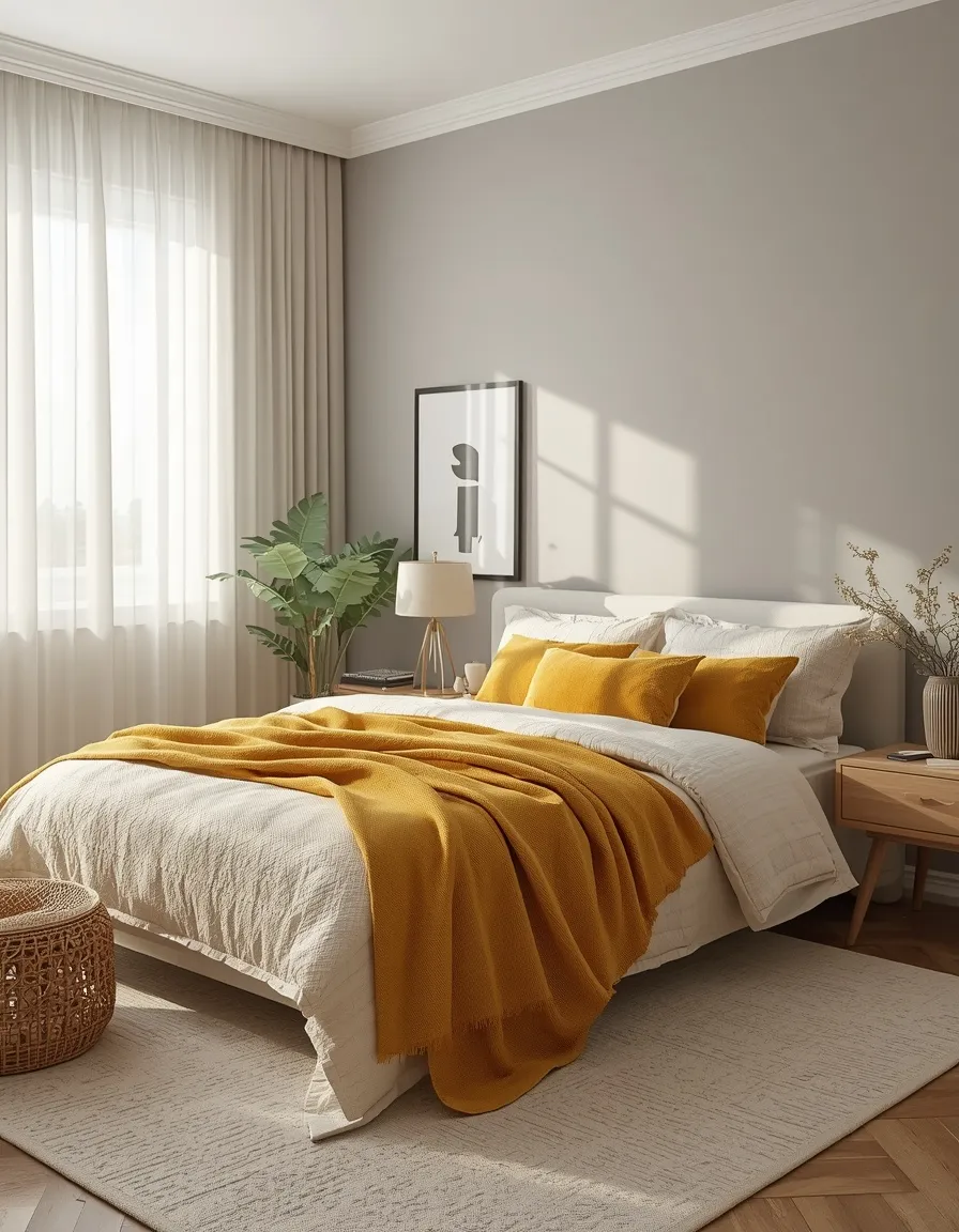
6. Warm Gray & Butter Yellow
A warm, greige-adjacent gray wall with a buttery yellow throw and a single mustard cushion keeps a bedroom from feeling flat, especially in a room that gets limited direct sun.
Gray alone can read cold or lifeless in a north-facing bedroom, so pairing it with a genuinely warm accent, rather than another cool tone, solves the most common complaint about gray schemes. Keep gray at roughly 60 to 70% of the room (walls, large furniture) and let butter yellow appear only in smaller doses: a throw, a lampshade, a piece of framed art. This keeps the room adaptable, since yellow accents are inexpensive to change out seasonally while the gray foundation stays timeless. A frequent mistake is choosing a cool, blue-based gray for a low-light room; ask to see the swatch in your actual room’s daylight, not showroom lighting, before buying full cans of paint.
- Solves the common complaint that gray bedrooms feel cold or flat
- Ideal fix for north-facing or naturally darker bedrooms
- Yellow accents are easy and affordable to rotate seasonally
- Reads modern and adaptable across minimalist to eclectic styles
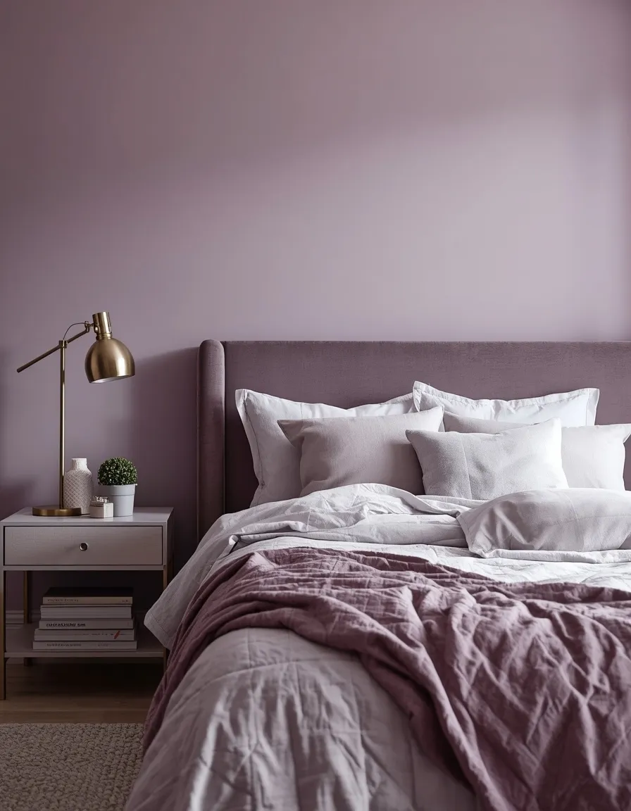
7. Lilac & Soft Gray
A muted lilac wall paired with soft dove-gray bedding gives a bedroom a dreamy, slightly nostalgic quality without slipping into a childhood bedroom look.
The trick to a grown-up purple palette is choosing a heavily grayed, low-saturation lilac rather than a bright lavender, and keeping the rest of the room quiet: gray, white, and one warm wood tone. This bedroom color palette idea suits renters especially well, since lilac can be introduced almost entirely through bedding, a velvet headboard, or curtains rather than a full repaint. It also tends to work best in bedrooms with cooler natural light, where a warmer palette might otherwise feel forced. One common misstep is adding too many purple accessories at once, which can tip the room toward theatrical; limit true purple to two or three elements and let gray and white do most of the visual work.
- A grown-up way to use purple without a themed or childish feel
- Fully achievable through textiles alone for renters or short-term spaces
- Suits bedrooms with naturally cool or diffused daylight
- Pairs well with soft gray, warm wood, and brushed nickel
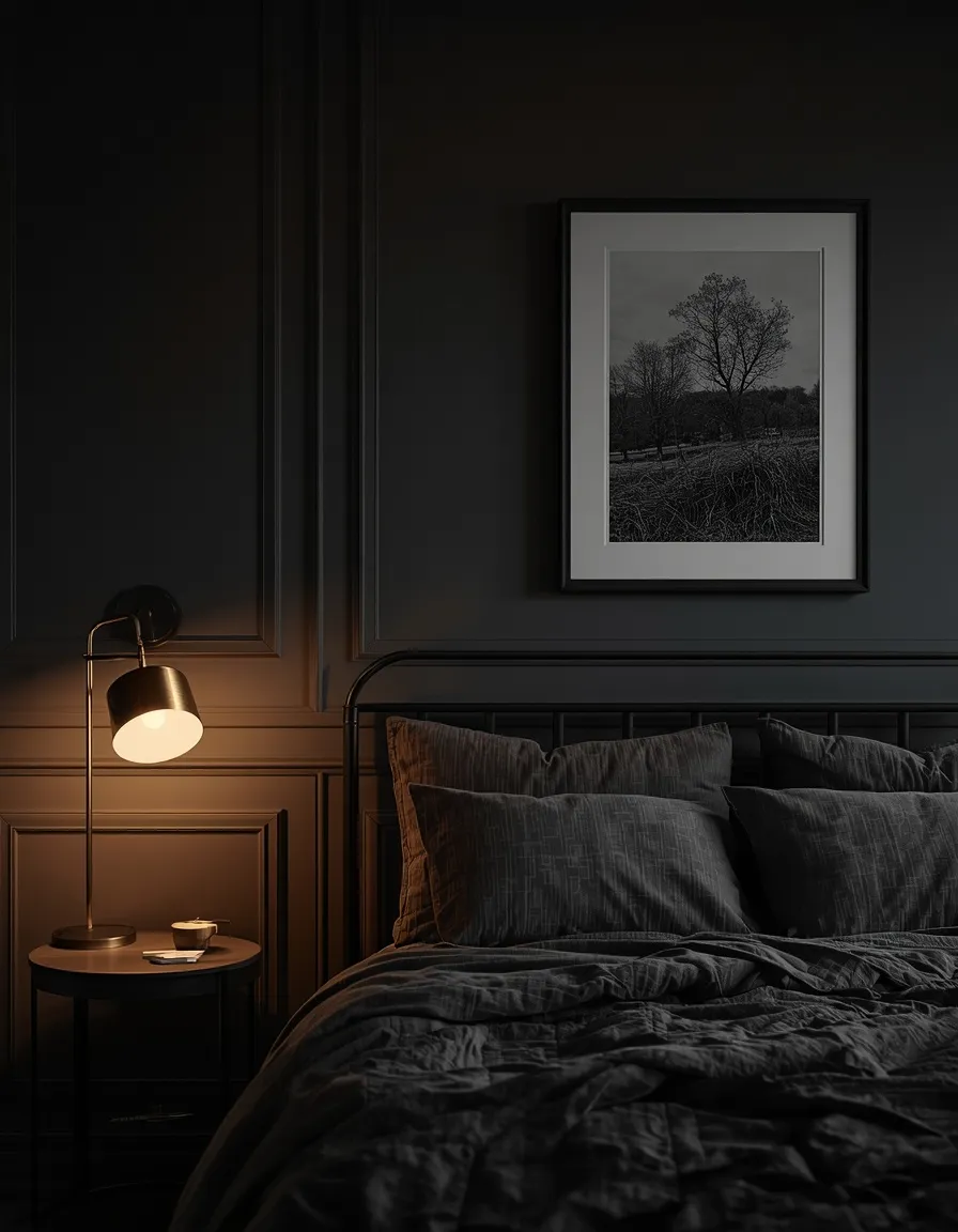
8. Charcoal & Black Accents
Charcoal walls with black-framed art and a single brass reading lamp give a bedroom the hushed, hotel-suite feeling of a genuinely dramatic retreat.
Dark, low-LRV palettes like this one work best in bedrooms with either strong natural light during the day or layered lighting at night, since a very dark room with only one overhead fixture can feel more cave-like than cozy. Balance charcoal walls with at least one true white or warm cream surface, such as ceiling paint or bedding, to keep the room from feeling closed in. Black hardware, framed art, or a black metal bed frame reads as an intentional accent rather than the entire mood. Because a fully dark room reduces how much light bounces around, add a dimmable lamp on each side of the bed rather than relying on a single overhead source, both for ambiance and so the space still feels safe to move through at night.
- Delivers a genuinely dramatic, boutique-hotel mood in a primary bedroom
- Requires layered lighting; a single overhead fixture will feel dim
- Best paired with at least one true white or cream surface
- Well suited to larger bedrooms or rooms with strong daylight
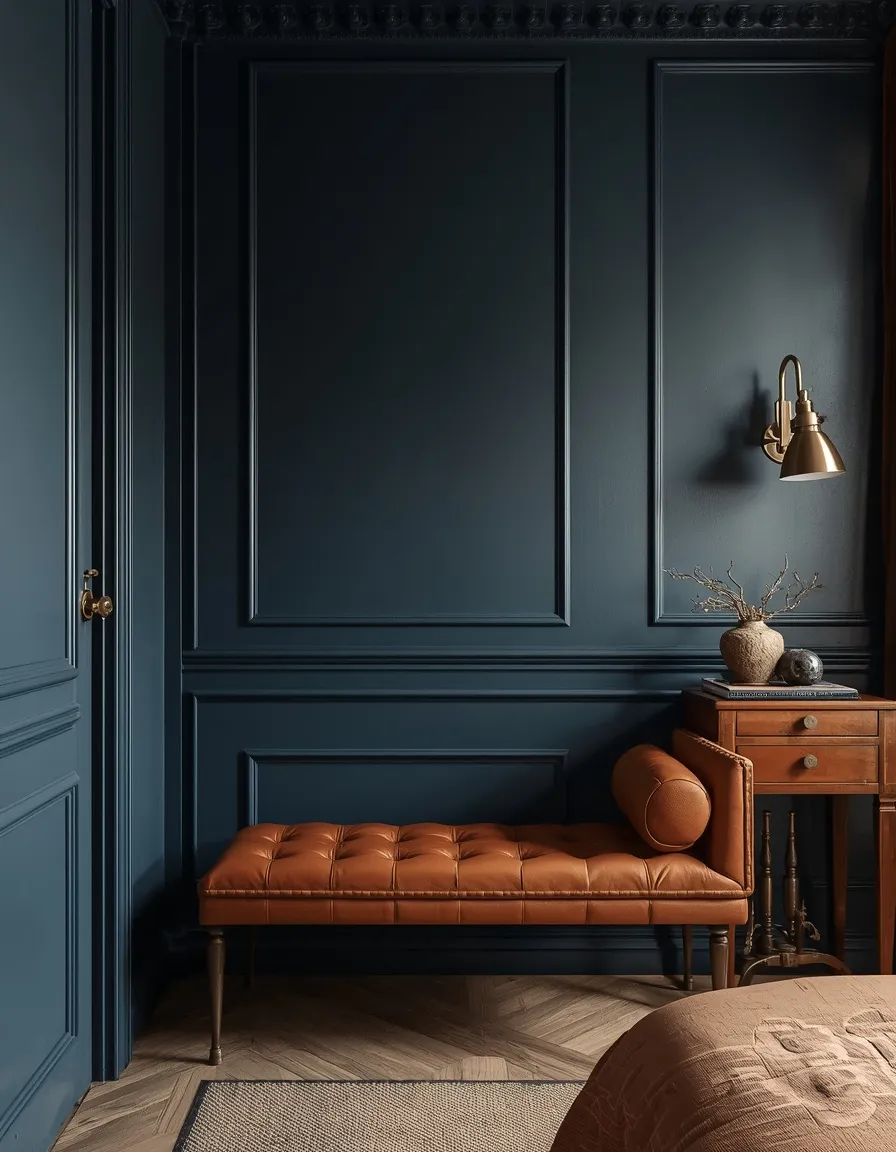
9. Navy & Aged Brass
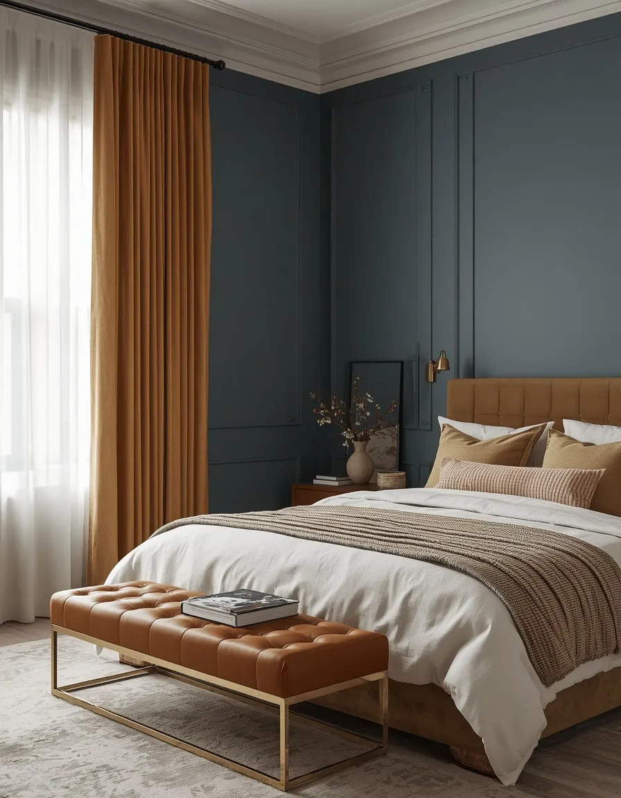
Deep navy walls, warm aged-brass hardware, and a camel leather bench give a bedroom the polished, slightly traditional feel of a well-worn study.
Navy is one of the most versatile of the darker bedroom color palette ideas because it reads as sophisticated rather than moody the way charcoal or black can. Use navy on the walls or a single headboard wall, then let aged brass, warm wood, and one leather or suede texture carry the remaining balance. This combination suits primary bedrooms and guest rooms alike, and it photographs particularly well against white or cream bedding, which keeps the palette from feeling heavy. A common mistake is pairing navy with cool silver or chrome, which flattens its warmth considerably; brass, gold, or warm bronze hardware brings out the undertone instead.
- Reads polished and classic rather than overtly moody or trendy
- Pairs best with brass, gold, or warm bronze, not cool metals
- Works well in both primary bedrooms and formal guest rooms
- Photographs strongly against white or cream bedding for crisp contrast
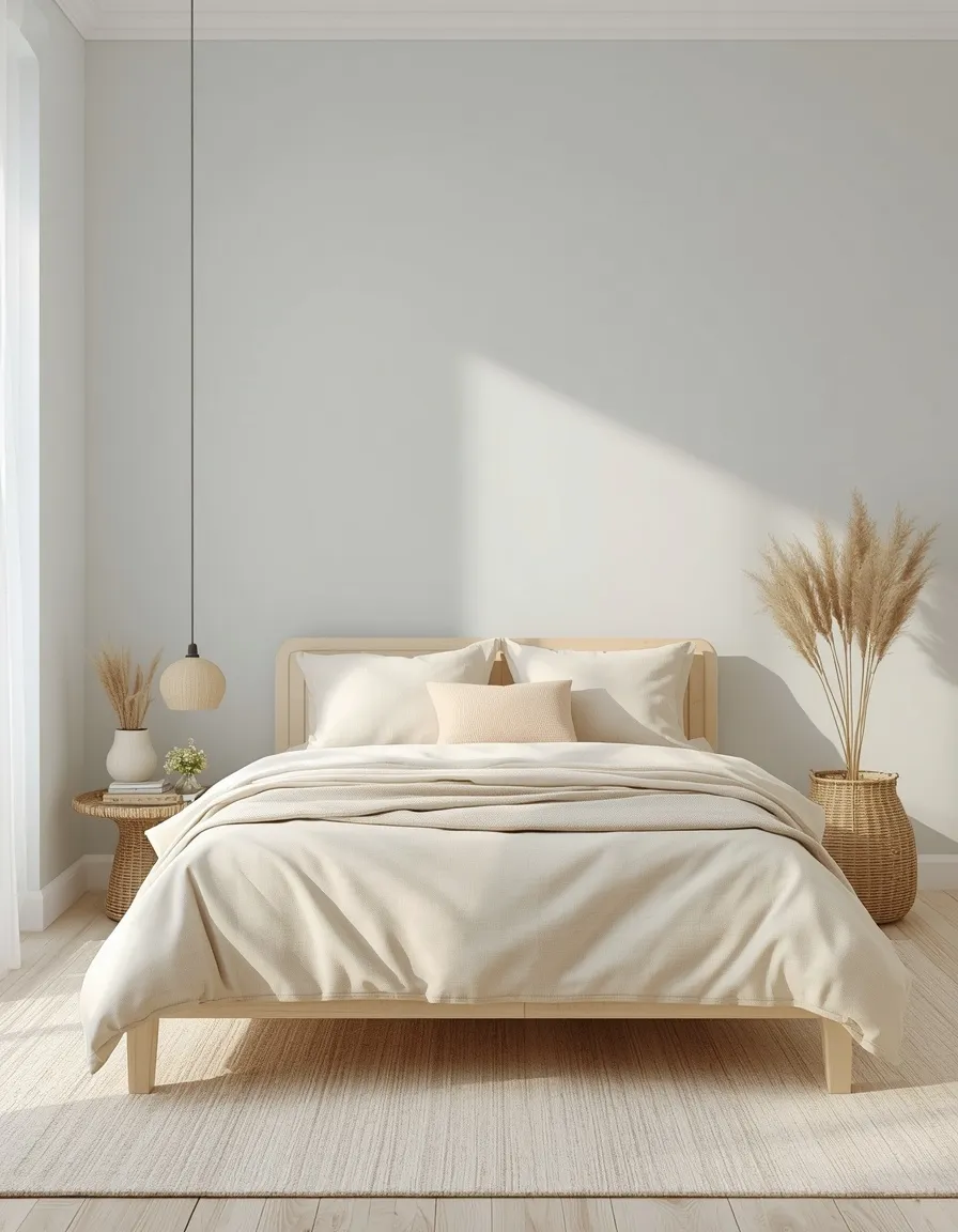
10. Coastal Blue & Sandy Neutral
A soft, washed-out blue wall paired with sandy beige linens and a bleached-wood bed frame brings a coastal calm to a bedroom, even landlocked ones.
This palette leans lighter and more diluted than dusty blue, closer to sea glass or faded denim, which keeps it feeling airy rather than saturated. Use sandy beige and driftwood tones as the dominant color, with the blue reserved for an accent wall, bedding, or window treatments, so the room doesn’t tip into a literal beach-house theme. It works particularly well in bedrooms with abundant natural light, where the pale palette reflects rather than absorbs the available brightness. Avoid pairing this palette with heavy, dark wood furniture, which fights the intentionally light, weathered feel; stick with whitewashed, bleached, or light rattan pieces instead.
- Feels airy and light-reflective, ideal for sunny or south-facing rooms
- Works well beyond literal coastal homes, in any climate or region
- Best with light or whitewashed wood rather than dark furniture
- Easy to soften further with linen, jute, and woven textures
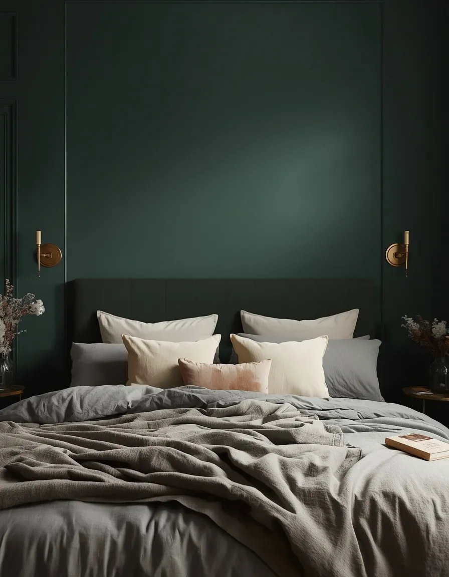
11. Evergreen Fog & Warm Gray
A deep, foggy evergreen accent wall behind the headboard, paired with warm gray bedding, turns a bedroom into a quiet clearing at dusk.
This is one of the most requested dark green bedroom color palette ideas, largely inspired by muted, gray-based greens that read as sophisticated rather than themed. Because it’s a genuinely dark, low-LRV color, it’s most successful as a single accent wall or ceiling in smaller bedrooms, and as a full-room color only when there’s strong natural or layered lighting. Warm gray, cream, and one metallic accent, brass rather than chrome, keep the room from feeling heavy. A common mistake is skipping a lighter ceiling color when using dark green on all four walls, which can make a room feel lower than it is; a soft white or pale gray ceiling keeps the sense of height.
- One of the most searched dark green bedroom color palette ideas
- Best used as an accent wall in smaller or lower-light rooms
- Full-room application needs strong natural light or layered lamps
- Pairs naturally with brass, cream, and warm gray textiles
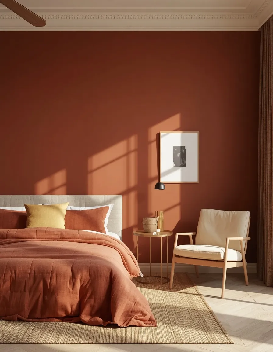
12. Muted Brick Red & Clay
A muted brick-red accent wall with clay-toned bedding and warm wood furniture gives a bedroom an unexpected but genuinely cozy energy, closer to autumn light than a fire engine.
Red is the most polarizing of the bedroom color palette ideas on this list, since a saturated, true red can feel stimulating rather than restful right before sleep. A muted, brick- or clay-based red solves this by lowering both the saturation and the brightness, keeping the energizing quality without the intensity. Use it in small doses, an accent wall, a single armchair, or bedding, rather than covering every surface, and balance it with plenty of warm neutral: cream, oat, or warm white. This palette tends to work best in bedrooms with good natural light, since red can feel closer to maroon in dim, artificial-only lighting. Avoid combining brick red with cool gray, which creates visual tension rather than warmth.
- The boldest option here; best used as an accent rather than throughout
- Muted brick or clay tones avoid the stimulating effect of true red
- Works well in bedrooms with strong natural daylight
- Pairs naturally with cream, oat, and warm wood tones
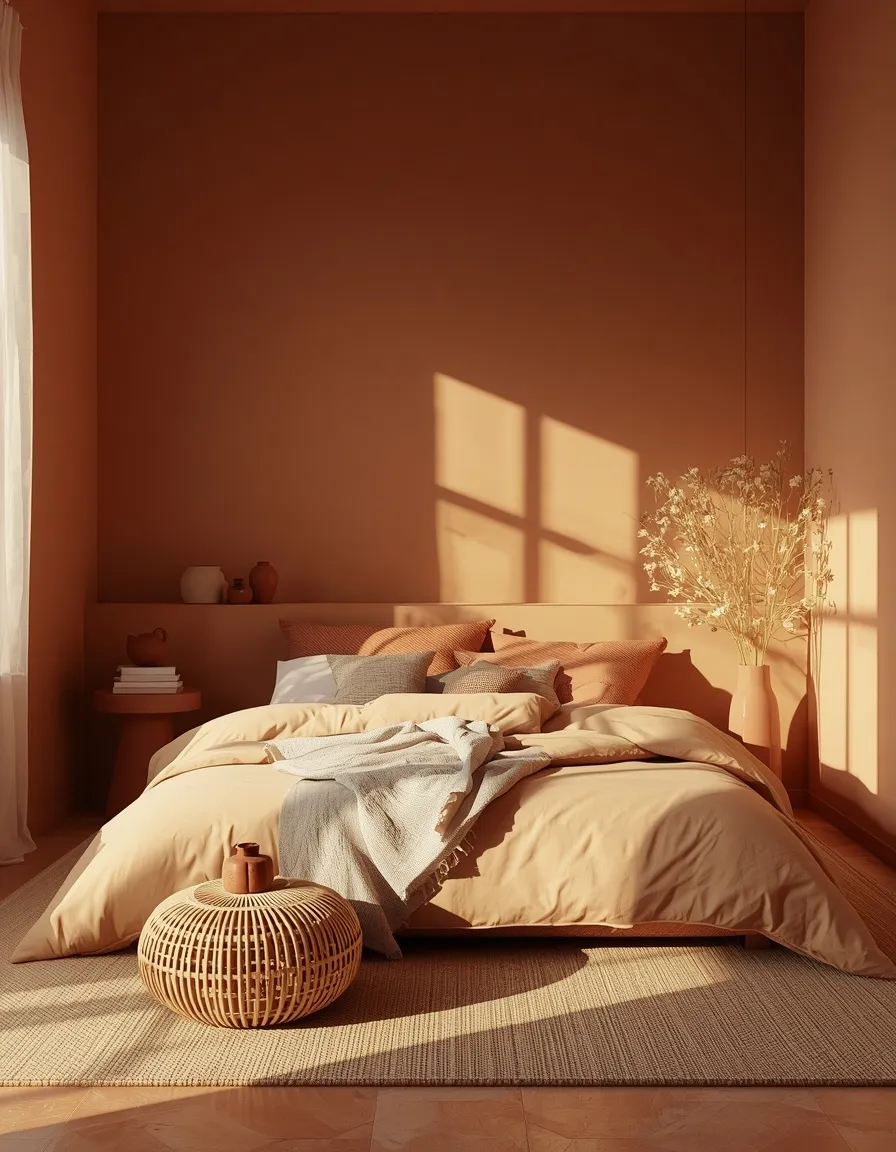
13. Terracotta & Warm Sand
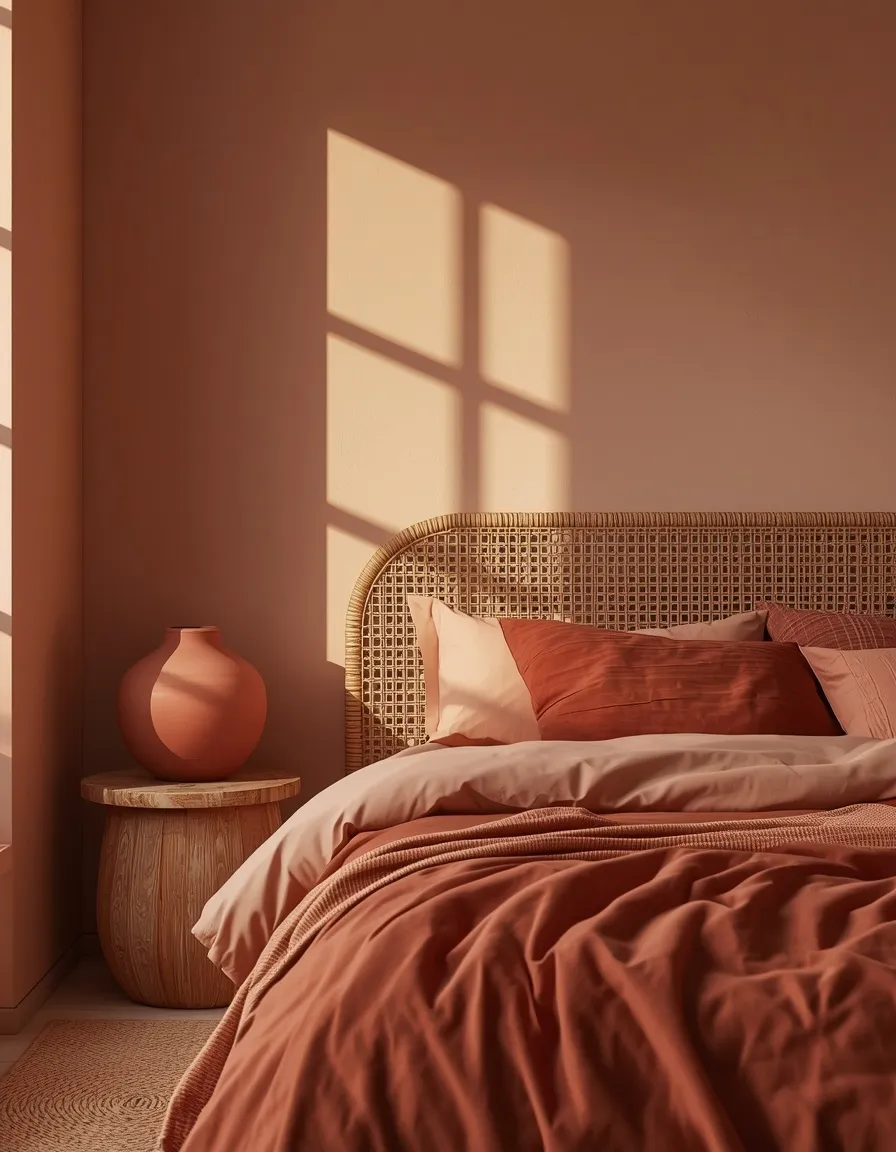
Sun-baked terracotta walls with warm sand bedding and woven textures give a bedroom the feel of a Mediterranean guesthouse at golden hour.
This palette leans more orange and saturated than blush or brick red, closer to raw clay pottery, and it suits bedrooms with a global, bohemian, or Mediterranean-modern sensibility particularly well. Keep terracotta to roughly 30 to 40% of the room, an accent wall or a large textile, and let warm sand and cream carry the dominant share so the space doesn’t feel overwhelming. Rattan, jute, and unglazed ceramics extend the palette without adding more paint. This combination reads richest with strong natural light, so it’s a better fit for a south-facing bedroom than a consistently dim, north-facing one; in lower light, the same colors can look muddier than intended, so a sample swatch check is worth the extra day.
- Suits bohemian, Mediterranean, and global-inspired bedroom styles especially well
- Reads richest in bedrooms with strong, warm natural light
- Extends naturally through rattan, jute, and unglazed ceramic accessories
- Best kept to accent-level use rather than covering every wall
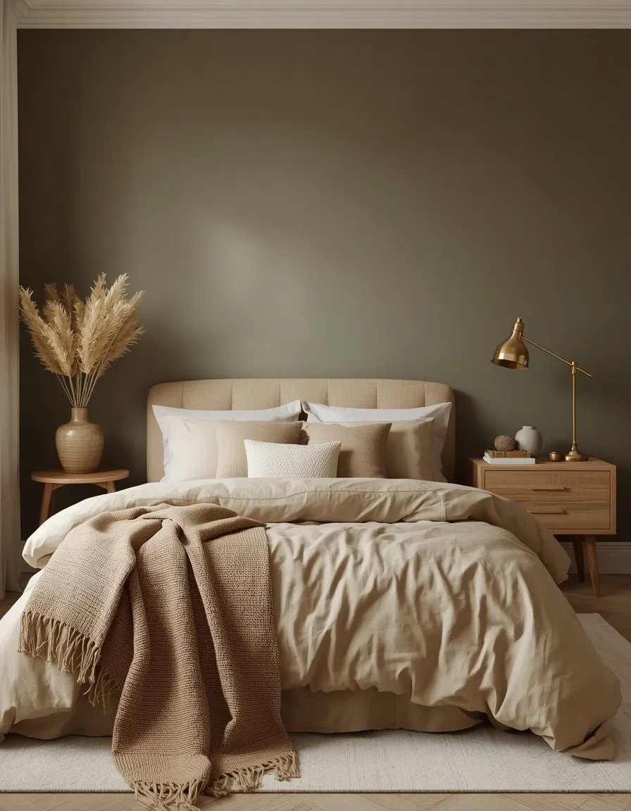
14. Olive & Oat
Muted olive walls paired with oat-toned linen bedding bring an earthy, food-inspired warmth to a bedroom that feels current without chasing a passing trend.
Olive differs from sage in both saturation and undertone: it leans more yellow and more saturated, closer to the color of the actual olive, while sage stays closer to gray-green. It has become one of the defining bedroom color palette ideas heading into 2026 alongside other nature-derived tones like clay and mushroom. Use olive on an accent wall or as a headboard-adjacent color, with oat, cream, and warm wood filling out the remaining balance, since a full room of saturated olive can read heavier than intended in a small space. This palette pairs particularly well with vintage or secondhand furniture, since the earthy tone flatters aged brass, worn leather, and natural imperfections rather than needing everything to look brand new.
- One of the defining bedroom color palette ideas for 2026
- More saturated and yellow-toned than sage, with a richer effect
- Flatters vintage, secondhand, and naturally aged furniture pieces
- Best as an accent wall in smaller or narrower bedrooms
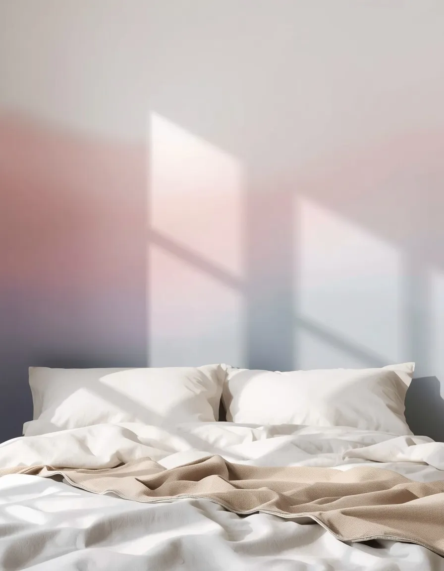
15. Aura Gradient Pastels
A soft, blurred gradient wall moving from blush to lilac to pale blue, sometimes called an “aura” wall, turns a plain bedroom into the dreamiest corner of the house without a single hard line.
Aura color palettes are one of the standout bedroom color palette ideas for 2026, borrowing the soft, ombre quality of the aura photography trend and translating it directly onto walls, headboards, or even a single curved accent shape. The technique works because the colors are heavily desaturated and blended, so even though three or four hues are in play, the overall effect reads as calm rather than busy. This is best attempted as a single accent wall or a painted arch behind the bed rather than the full room, both because it’s a more advanced painting technique and because a smaller dose keeps the trend from overwhelming the space. Keep every other surface, bedding, rugs, furniture, in a single soft neutral so the gradient wall stays the clear focal point.
- One of the most searched 2026 bedroom color palette trends
- Best executed as a single accent wall or painted arch shape
- Requires a steadier hand or a professional for a smooth blend
- Pairs best with a single neutral for bedding, rugs, and furniture
Conclusion
A bedroom’s color palette touches nearly everything else in the room: how restful it feels, how spacious it looks, and how it photographs on a slow Sunday morning. Whether you land on a quiet warm greige, a moody evergreen accent wall, or a full aura gradient, the strongest bedroom color palette ideas all follow the same logic, one dominant tone, a supporting neutral, and a small, intentional accent. Test a real swatch on your actual wall before buying full cans of paint, and give it a few days to settle before deciding. For more room-by-room inspiration, our bedroom decor collection has the next step waiting whenever you’re ready.
FAQs
What is the most relaxing color palette for a bedroom?
Muted, desaturated blues and greens, like dusty blue or soft sage, are consistently cited as the most relaxing bedroom color palette ideas because their lower saturation reduces visual stimulation before sleep. Warm neutrals like greige are a close second, offering a similarly calm base without leaning as strongly cool.
What color should you avoid in a bedroom?
Highly saturated, bright colors like true red or neon shades are generally the hardest to live with in a bedroom, since they can feel stimulating rather than restful right before sleep. If you’re drawn to a bold color like red, use it in small, muted doses, an accent wall or a single piece of furniture, rather than across every surface.
How do I choose a bedroom color palette for a small room?
Stick to higher-LRV, lighter colors like warm greige, soft sage, or coastal blue as the dominant tone, since they reflect more available light and make the room feel less enclosed. Save darker options like evergreen fog or charcoal for a single accent wall rather than the full room.
What is the 60-30-10 rule for bedroom colors?
It’s a simple ratio for balancing a palette: 60% dominant color on walls and large surfaces, 30% secondary color on furniture or bedding, and 10% accent color in smaller details like pillows or art. Following this ratio keeps three or four colors feeling intentional instead of chaotic.
What bedroom colors are trending for 2026?
Earthy, nature-derived tones like olive and clay are gaining ground alongside softer, blended aura gradient palettes that move between two or three pastel hues on a single wall. Both trends favor muted, less saturated versions of their base color rather than bright or primary tones.
Can I use dark colors in a small bedroom?
Yes, but it works best as a single accent wall, a headboard nook, or a ceiling rather than covering all four walls, especially in a room with limited natural light. Pairing the dark tone with a lighter ceiling and layered lamps helps keep the room from feeling smaller than it is.
What if I’m renting and can’t paint my walls?
Most of the palettes in this guide translate through bedding, an area rug, curtains, and artwork alone, so a full repaint isn’t necessary to try them. Focus your rented palette on the 30% and 10% portions of the 60-30-10 rule, since those are the elements you can change without touching the walls.