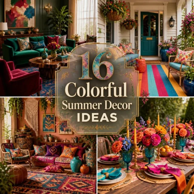

There’s a reason summer makes us reach for color: the season practically demands it. summer Colorful decor ideas let you bring that same energy indoors, layering jewel-bright cushions, painterly patterns, and saturated blooms into rooms that feel joyful and full of life. The difference between a room that sings and one that clashes isn’t how much color you use, but how you combine it, and that’s the part most guides leave out. From a porch that greets the street in bold stripes to a mantel stacked with vivid ceramics, these 16 complete looks show you how to build real, cohesive color. At Sunday Abode, we think a home should reflect the people in it, and few things do that better than color used with confidence.
Key Takeaways
- Cohesive color beats random color, a simple palette formula (one dominant, two supporting, one accent) keeps a bold room from clashing.
- Repeat every color at least twice across a room so the eye reads it as a deliberate scheme, not scattered pieces.
- Balance saturated color with some neutral or white breathing space so the room feels lively, not overwhelming.
- Summer sun fades saturated fabrics fastest, so choose fade-resistant, solution-dyed materials for porches, patios, and sunny windows.
- Bold blooms finish any colorful look, but lilies and several other summer flowers are toxic to pets, choose safe stems where animals live.
1. Bold Jewel-Tone Living Room
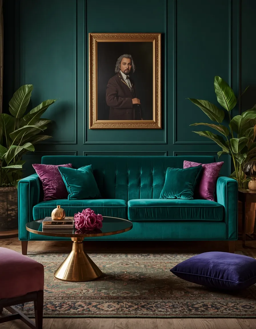
A living room in deep jewel tones feels rich, warm, and unmistakably summer. Emerald, sapphire, and amethyst cushions against a teal velvet sofa, with brass accents and a patterned rug, create a saturated, sophisticated space that glows in evening light.
Jewel tones read as grown-up color rather than childish brights, which makes them a smart way to go bold without going loud. Pick one dominant jewel tone for a large piece like the sofa or rug, then support it with two more across cushions and art, and add brass or gold as a warming metallic. Repeat each color at least twice so the scheme feels intentional. This suits living rooms with decent natural light, which keeps deep colors from feeling heavy. Add a few plants for fresh green contrast.
- Best for: living rooms with good light; anyone wanting rich, refined color.
- Why it works: jewel tones deliver bold color with a sophisticated, grown-up feel.
- Key elements: teal sofa, emerald/sapphire/amethyst cushions, brass, patterned rug.
2. Colorful Striped Front Porch
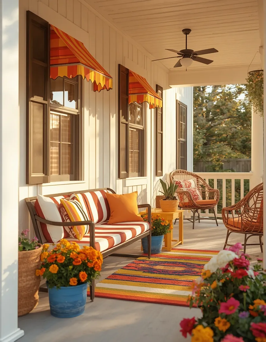
A striped, color-drenched front porch turns your entrance into a cheerful summer statement. Bold awning-stripe cushions, a colorful outdoor rug, painted planters spilling with mixed blooms, and a bright side table welcome guests with energy and warmth.
Stripes are the easiest way to combine several colors without clashing, since the pattern organizes them for you. Choose a two- or three-color stripe and echo those exact colors in the planters and accessories so the porch reads as one scheme. Use fade-resistant, solution-dyed acrylic outdoor fabrics, because ordinary prints bleach and mildew fast in summer sun and rain. Plant painted pots with mixed annuals like zinnias, marigolds, and petunias for lasting color. This works on any porch or covered entry.
- Best for: homeowners and renters wanting a bold, welcoming entrance.
- Watch out: use fade-resistant outdoor fabric; sun bleaches cheap prints quickly.
- Key elements: awning-stripe cushions, colorful rug, painted planters, mixed annuals.
3. Vibrant Color-Block Scheme
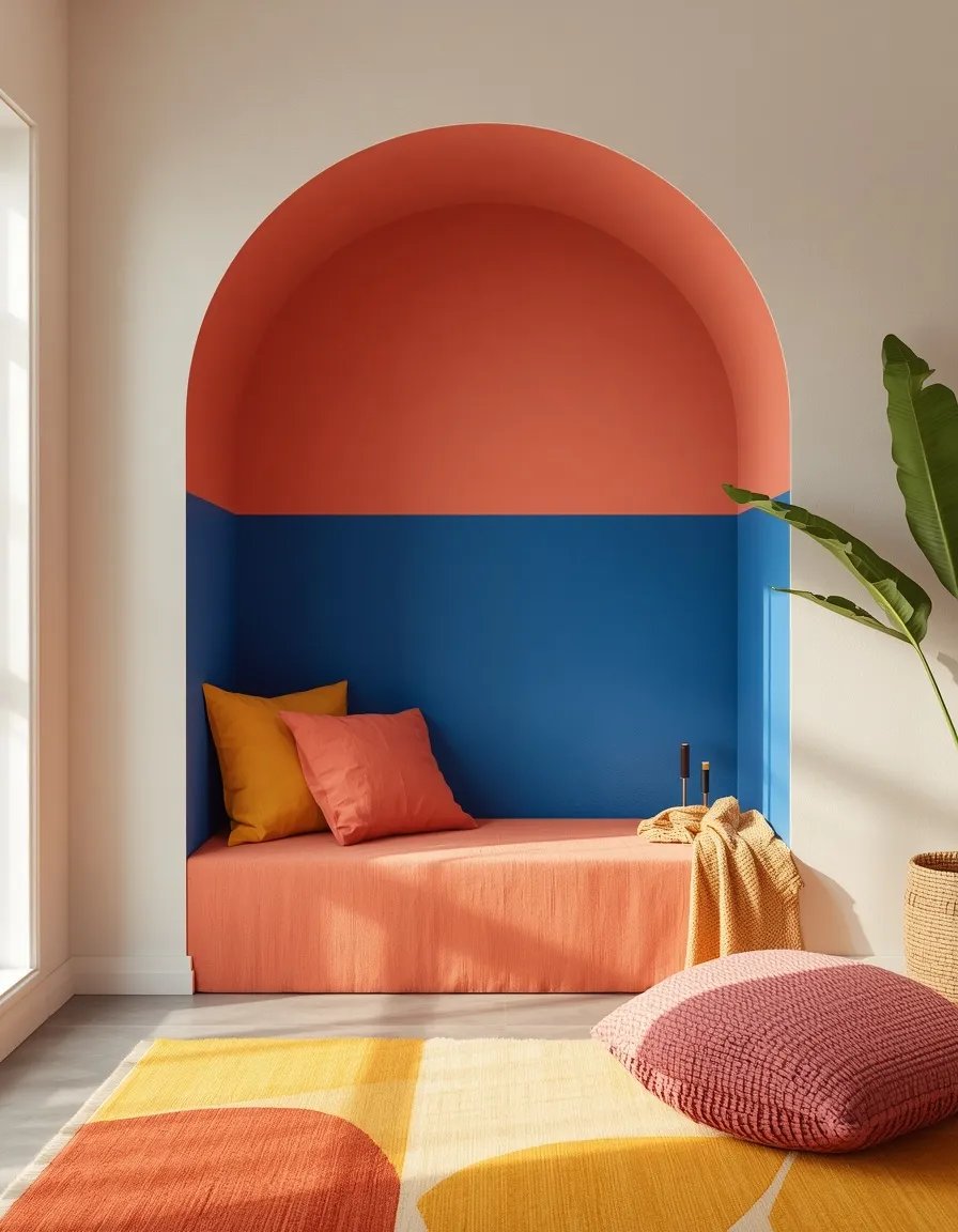
A color-blocked room makes a confident, modern statement with large fields of pure color. Bold blocks of two or three saturated hues, cobalt, coral, and mustard, on walls, cushions, and art create graphic, high-energy summer style.
Color blocking works because it organizes color into clean, deliberate zones instead of scattering it. Choose two or three colors that sit well together, then use them in distinct blocks, a painted alcove, solid cushions, a bold rug, balanced by neutral walls or a plain sofa so the eye can rest. This suits modern and maximalist homes. If you’re nervous, start with removable pieces like cushions, art, and a peel-and-stick accent panel so you can adjust the balance before committing to paint. Repeat each color at least twice.
- Best for: modern and maximalist homes; confident color lovers.
- Why it works: clean blocks of color read graphic and deliberate, not messy.
- Key elements: two or three saturated hues, neutral base, blocked placement.
4. Festival-Inspired Boho Room
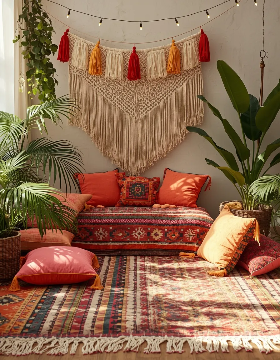
A festival-inspired boho room captures summer’s free-spirited, celebratory energy. Layered kilim rugs, tasseled cushions in hot pinks and oranges, macrame, bunting, and abundant plants create a joyful, gathered space that feels like a permanent summer party.
This look thrives on mixing pattern and warm, saturated color, tied together by a shared palette of warm brights, corals, fuchsias, ochres, and turquoise. Layer textures generously: woven rugs, fringed throws, embroidered cushions. Hang fabric bunting or string lights for that festival-vibe finish, and use plenty of greenery to ground the color. Repeat two or three colors throughout so the maximalist mix still feels intentional. This renter-friendly look needs no installation and hides a small budget well, since thrifted and handmade pieces belong here.
- Best for: renters and boho lovers wanting joyful, celebratory color.
- Why it works: a shared warm palette unifies a rich pattern-and-texture mix.
- Key elements: kilim rugs, tasseled cushions, macrame, bunting, string lights, plants.
5. Colorful Summer Mantel
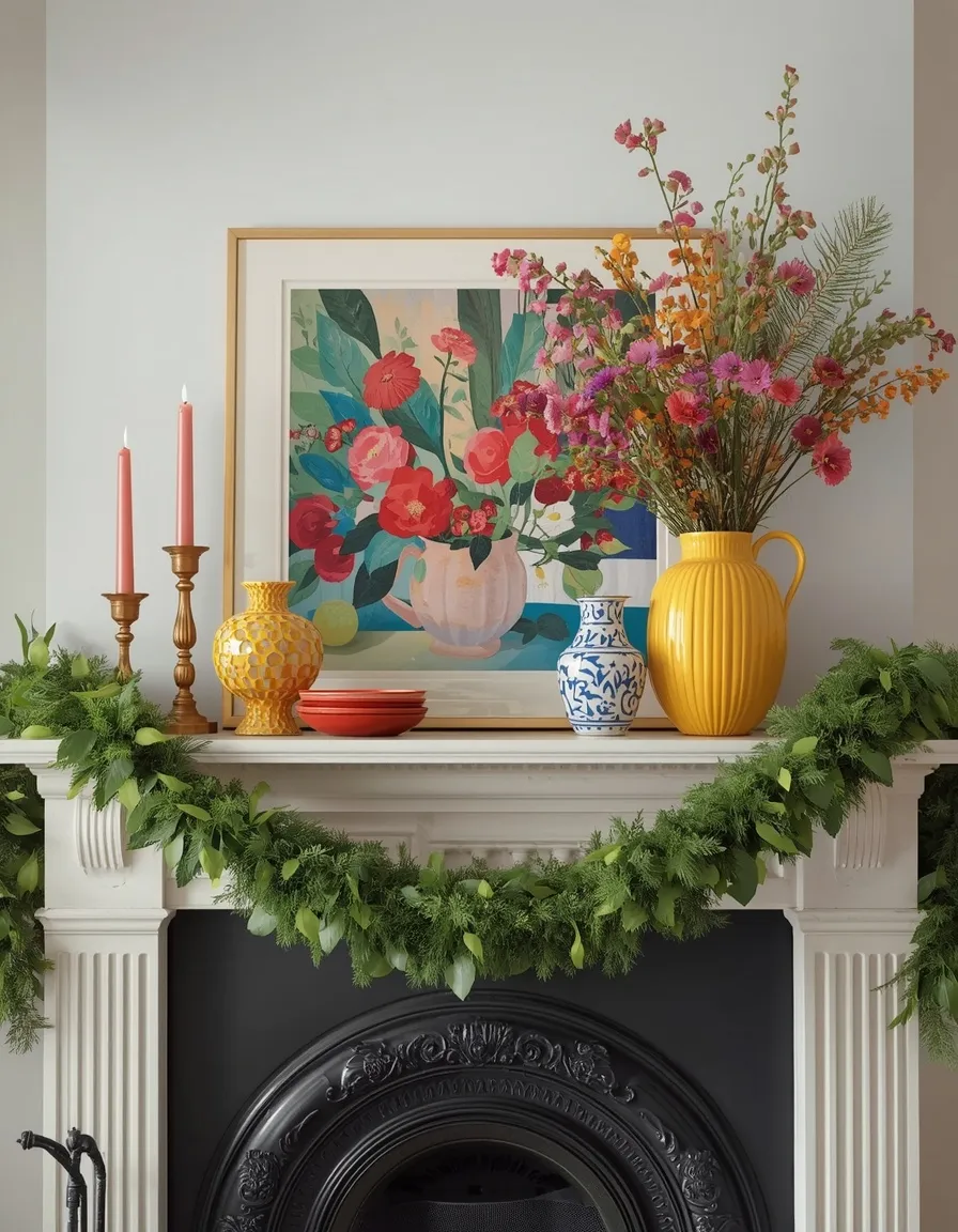
A vividly styled mantel turns an idle summer fireplace into a color-packed focal point. Bright ceramics, a bold piece of art or a colorful mirror, fresh flowers in a saturated vase, and a leafy garland transform the mantel into the room’s centerpiece.
Build the mantel in layers: lean a colorful artwork or mirror at the back, then vary heights with grouped ceramics, candlesticks, and a vase, arranged in odd numbers. Pull two or three colors from the art into the objects so the display feels unified. Trail a fresh or faux green garland along the edge for softness against the color. Since the fireplace sits unused in summer, the mantel is free to go fully decorative. Keep any flammable décor and greenery well clear of candle flames, and never leave lit candles unattended.
- Best for: living rooms and bedrooms with a mantel or mantel-like shelf.
- Watch out: keep greenery and décor clear of candle flames; never leave lit.
- Key elements: bright ceramics, bold art/mirror, saturated vase, green garland.
6. Painted Fireplace Feature
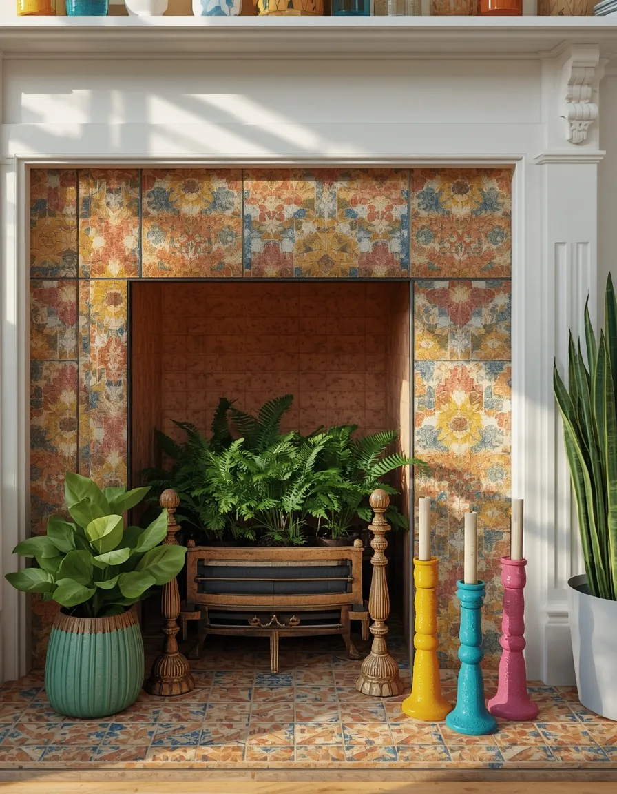
A boldly styled summer fireplace turns a cold-weather feature into a warm-season showpiece. A colorful stack of pillar candles, a painted or tiled surround, potted plants inside the firebox, and bright objects on the hearth make the fireplace feel alive in summer.
With the fire unused, fill the firebox with something summery, a cluster of potted ferns, a woven basket of dried flowers, or a row of colorful candles (unlit is safest). A removable peel-and-stick tile in a bold pattern refreshes a dated surround without permanent change, ideal for renters. Repeat the surround’s colors in objects on the mantel and hearth for cohesion. This suits any non-working or seasonally idle fireplace. If you do light candles inside the firebox, keep them away from any greenery and never leave them burning unattended.
- Best for: idle summer fireplaces; renters wanting a bold, reversible refresh.
- Watch out: unlit candles are safest; keep any flame clear of plants and décor.
- Key elements: firebox plants or candles, peel-stick tiled surround, bright hearth objects.
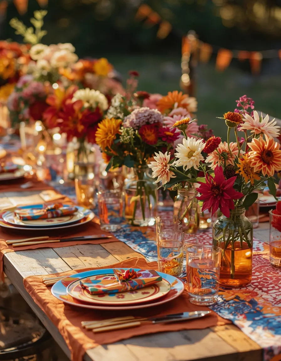
7. Colorful Summer Party Table
A color-drenched party table makes any summer gathering feel like a celebration. A bold tablecloth, mismatched colorful plates, patterned napkins, and jars of bright blooms create a festive, joyful tablescape for barbecues, birthdays, and garden parties.
Anchor the table with one bright base, a solid cloth or runner, then layer coordinated colorful plates, glassware, and napkins, repeating two or three colors so the mix looks planned rather than random. Fill jars or bottles with bold blooms like sunflowers, dahlias, or zinnias for easy centerpieces. Keep centerpieces low so guests can see across the table, and choose pet- and child-safe flowers near food. This scales from an intimate dinner to a big barbecue and works indoors or out.
- Best for: summer barbecues, birthdays, and garden-party entertaining.
- Key elements: bold cloth, mixed colorful plates, patterned napkins, low blooms.
- Why it works: a bright base plus repeated colors makes a festive, coordinated table.
8. Rainbow Gallery Wall
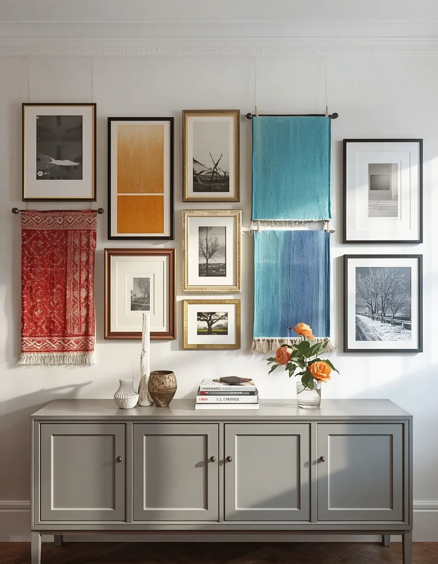
A rainbow-organized gallery wall turns a blank space into a joyful color statement. Prints, art, and framed textiles arranged by color, flowing across the spectrum or grouped in bold blocks, bring energy and personality to a living room, hallway, or stairwell.
Plan the layout on the floor first, keeping frames roughly 5–8 cm (2–3 in) apart for balance. Organizing art by color, a loose rainbow flow or clustered color groups, gives a busy, colorful wall structure so it reads intentional rather than chaotic. A consistent frame color (all white, all wood, or all black) ties diverse pieces together. Hang everything with damage-free adhesive strips rated for the frame weight to protect rental walls. Press the strips firmly and wait an hour before hanging for the best hold.
- Best for: aesthetic-minded decorators and blank feature walls.
- Why it works: organizing art by color gives a busy wall a clear, intentional structure.
- Watch out: use weight-rated adhesive strips so frames don’t fall or mark walls.
9. Bright Colorful Bedroom
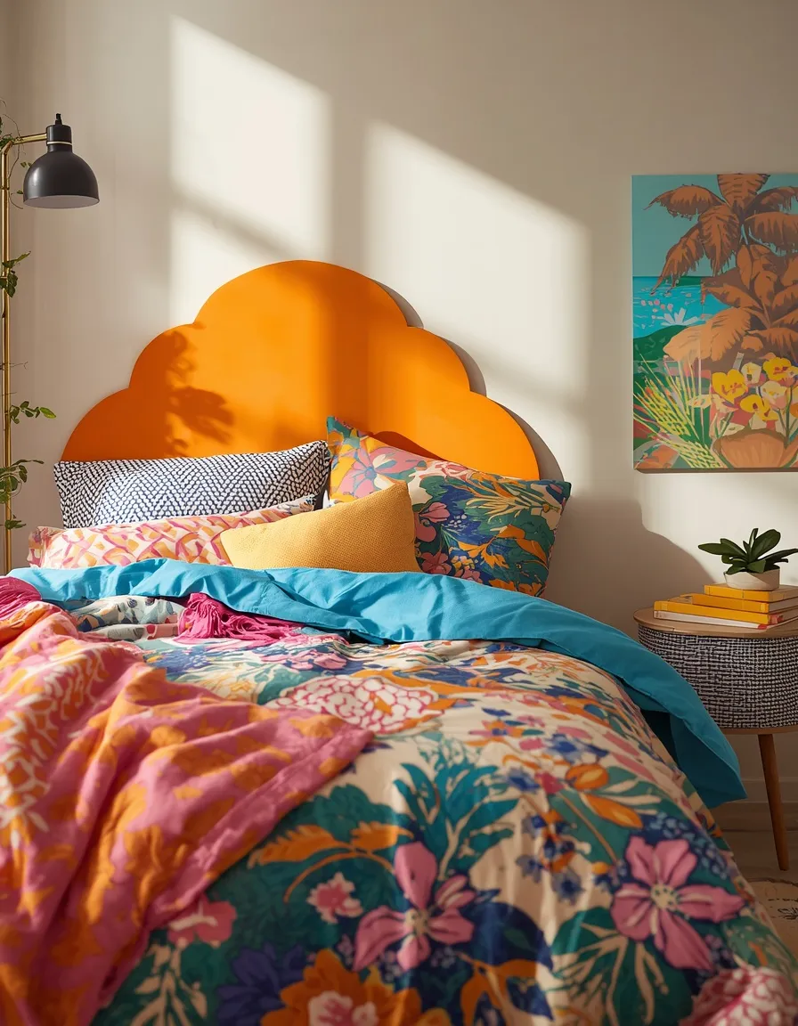
A colorful bedroom wraps summer nights in cheerful, saturated hue. A boldly patterned duvet, contrasting cushions, a painted headboard wall, and vivid art create a happy, energizing retreat that still feels restful with the right balance.
For a bedroom, balance is everything: use bold color on the bedding and one feature, but keep some calm with a neutral or soft wall behind it so the room stays sleep-friendly. A patterned duvet in two or three colors, echoed in cushions and art, gives a cohesive scheme. Switch to breathable cotton or linen bedding as nights warm, since sleeping too hot disrupts rest. This suits anyone wanting personality in the bedroom, and a peel-and-stick colored headboard wall keeps it renter-safe and reversible.
- Best for: bedrooms that want personality without losing a restful feel.
- Watch out: switch to breathable bedding as nights warm to sleep comfortably.
- Key elements: patterned duvet, contrasting cushions, feature wall, vivid art.
10. Tropical Bright Sunroom
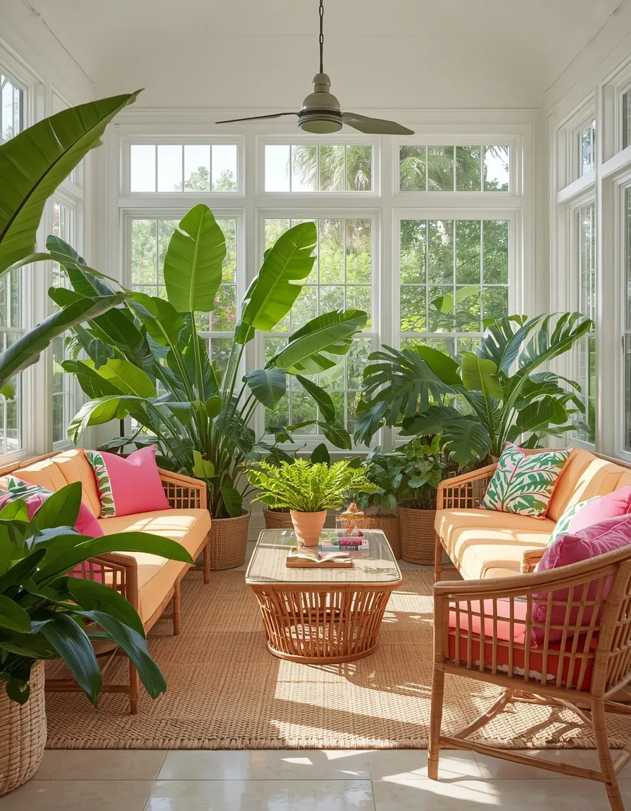
A tropical sunroom bursts with saturated color and lush foliage for a permanent-vacation feel. Hot-pink and orange cushions, banana-leaf prints, rattan furniture, and abundant real plants create an exuberant, sun-soaked space.
Layer saturated warm brights, fuchsia, coral, tangerine, against loads of green foliage, which both intensifies the color and keeps it feeling fresh. Real tropical plants like monstera, bird of paradise, and parlor palm thrive in a bright sunroom’s light, sited a meter or so back from the hottest glass. Note that monstera and bird of paradise are toxic to pets if chewed, so parlor palm and areca palm are the pet-safe choices. This suits sunrooms, enclosed porches, and bright living rooms. Add rattan and bamboo for natural texture.
- Best for: sunrooms and bright rooms wanting exuberant tropical color.
- Watch out: monstera and bird of paradise are pet-toxic; palms are safe swaps.
- Key elements: hot-pink/orange cushions, palm prints, rattan, abundant foliage.
11. Mediterranean Color Pop
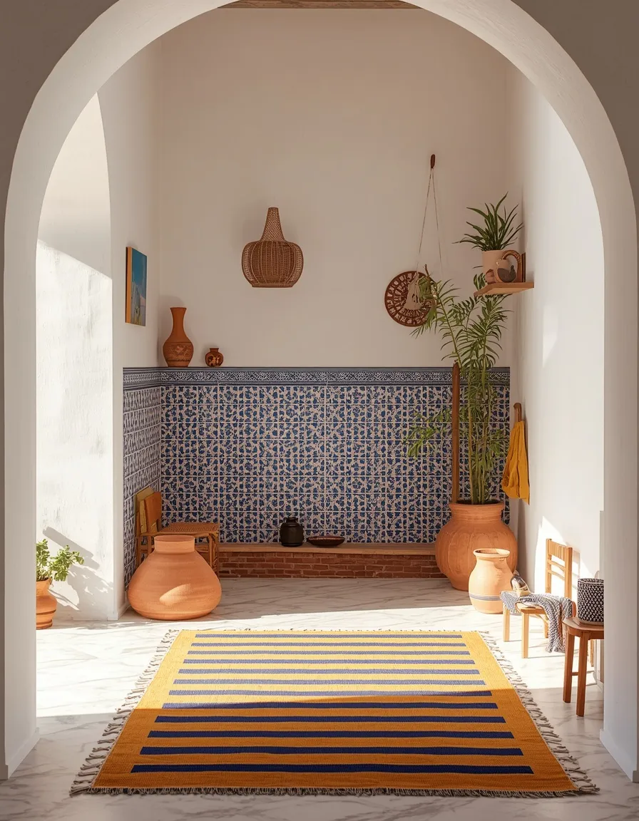
A Mediterranean-inspired room brings sun-baked color and hand-crafted charm to summer. Cobalt blue, terracotta, and mustard against white walls, with patterned tiles and ceramic accents, evoke a Greek island or Moroccan riad.
Base the look on crisp white, then add the classic Mediterranean brights, cobalt, terracotta, ochre, and olive, in tiles, ceramics, and textiles. Patterned tile (real or peel-and-stick) on a backsplash, tabletop, or stair riser anchors the palette. Mix in handmade-looking pottery and a striped rug for authenticity. The white base keeps the strong colors from overwhelming, which is the practical key here. This suits kitchens, dining rooms, and entryways, and works beautifully in homes that get strong, warm light.
- Best for: kitchens, dining rooms, and sunny homes wanting warm crafted color.
- Why it works: a white base lets cobalt, terracotta, and mustard sing without clashing.
- Key elements: patterned tile, cobalt/terracotta/mustard textiles, handmade ceramics.
12. Colorful Kids’ Room or Playroom
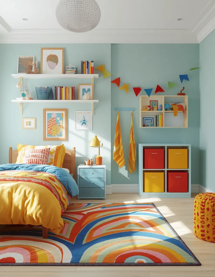
A colorful kids’ room bursts with playful, happy energy. Bold primaries or cheerful pastels on bedding, a fun patterned rug, colorful storage, and vibrant wall art create an imaginative space children love.
Use color freely here, but keep a light or neutral base on big surfaces so the room doesn’t overwhelm at bedtime. Colorful bins and open shelving make tidy-up easier while adding to the scheme. Safety comes first in a kids’ room: anchor tall bookcases and dressers to the wall with anti-tip straps, since unsecured furniture is a real tipping hazard for young children. Choose washable, durable fabrics that survive daily use. This grows with the child if you keep large pieces neutral and layer color through swappable accents.
- Best for: children’s bedrooms and playrooms.
- Watch out: anchor tall furniture with anti-tip straps to prevent tipping.
- Key elements: bold bedding, patterned rug, colorful storage bins, vibrant art.
13. Colorful Backyard Retreat
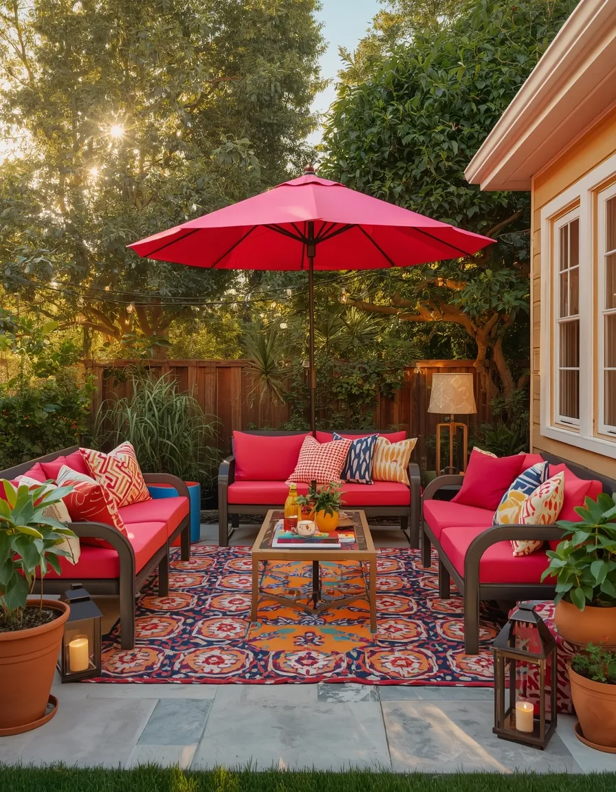
A color-packed backyard retreat extends your living space outdoors for summer. Bright outdoor cushions, a bold patterned rug, colorful lanterns, a market umbrella, and string lights turn a patio or deck into a vibrant gathering spot.
Choose weatherproof, fade-resistant furnishings in a warm, saturated palette, and define the seating zone with an outdoor rug. Colorful lanterns and hanging blooms layer in more hue, while a market umbrella or shade sail adds both color and essential sun protection. Solution-dyed acrylic cushions hold their color far longer than cheaper fabrics in direct sun. Add solar string lights for evenings. This suits any patio, deck, or backyard with room to sit. Bring cushions in or store them in a deck box during storms to extend their life.
- Best for: patios, decks, and backyards with room for outdoor seating.
- Watch out: add shade and fade-resistant fabrics; sun wears saturated décor fast.
- Key elements: bright cushions, patterned rug, colorful lanterns, umbrella, string lights.
14. Pattern-Mixed Statement Space
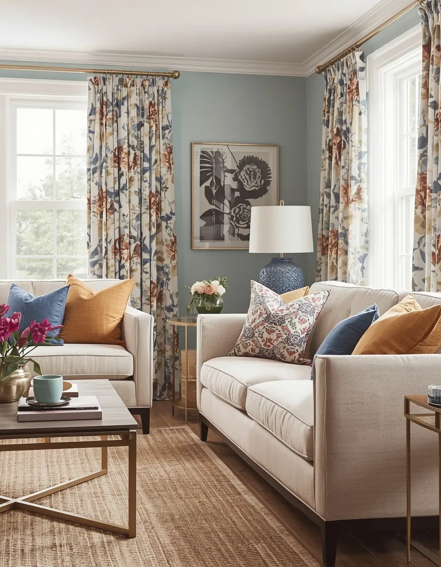
A confidently pattern-mixed room turns color into a rich, layered summer statement. Florals, stripes, and geometrics in a shared palette combine across cushions, curtains, and rugs for a collected, designer-level look.
Mixing patterns successfully comes down to two rules: keep them in a shared color palette, and vary the scale, pair a large floral with a medium stripe and a small geometric so they don’t compete. A unifying palette of two or three colors is what stops a pattern mix from clashing. Ground busy patterns with solid pieces and neutral space to rest the eye. This suits confident decorators and traditional-meets-eclectic homes. Start with cushions to test combinations before committing to curtains or a rug.
- Best for: confident decorators and eclectic, layered homes.
- Why it works: a shared palette and varied pattern scale keep a mix cohesive, not busy.
- Key elements: florals, stripes, geometrics in one palette, varied scale, solids.
15. Citrus-Bright Kitchen
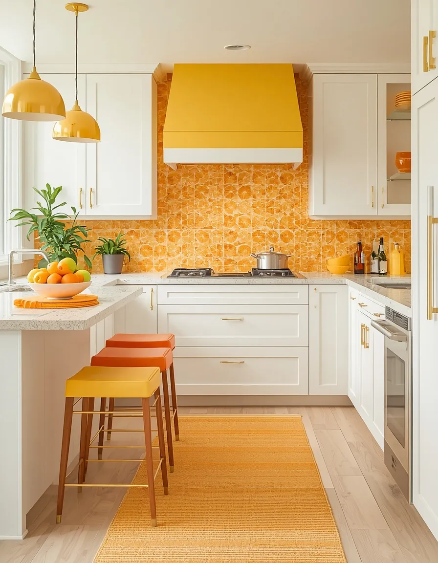
A citrus-bright kitchen fills the hardest-working room with zesty summer color. Lemon yellow, lime green, and orange accents against white cabinets, with bold textiles and a bowl of real citrus, make the kitchen feel fresh and energetic.
Add color through swappable pieces, a bright runner, colorful bar stools, patterned tea towels, and open shelving styled with vivid dishware, keeping counters mostly clear so it reads styled, not cluttered. A bowl of real lemons, limes, and oranges is the simplest bold centerpiece there is. Peel-and-stick tiles in a citrus pattern add a renter-safe punch of color to a backsplash. Grow a windowsill herb in a sunny spot for green contrast; most herbs want at least six hours of direct sun. This works in any kitchen.
- Best for: renters and homeowners wanting a zesty, energetic kitchen.
- Key elements: citrus-toned textiles, bright bar stools, peel-stick tile, real citrus bowl.
- Watch out: keep counters clear so bold pieces read intentional, not cluttered.
16. Bold Colorful Flower Display
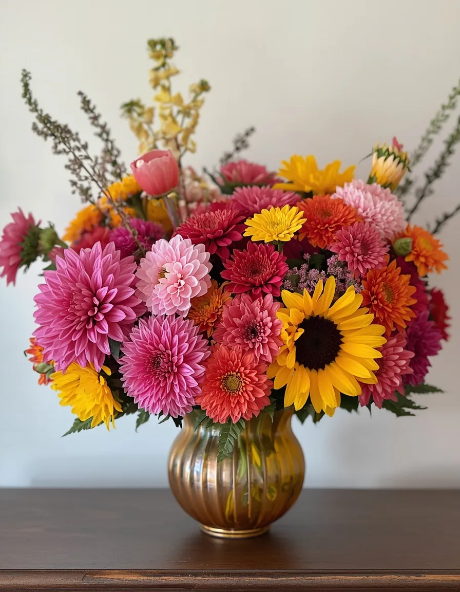
A big, saturated flower arrangement is the fastest way to inject color into any room. A generous bunch of mixed summer blooms, dahlias, zinnias, cosmos, and sunflowers, in a bold vase becomes an instant, joyful centerpiece.
For maximum color impact, mix blooms in three or four saturated shades that share an undertone (all warm, or all cool) so the bunch feels rich rather than random. Summer flowers last longest when you trim stems at an angle, change the water every two days, and keep them out of direct afternoon sun and away from ripening fruit. If pets share the home, choose carefully: lilies are especially toxic to cats, so lean on pet-safer stems like sunflowers, zinnias, roses, and snapdragons. This refreshes any room for very little, week to week.
- Best for: anyone wanting instant, low-cost color in any room.
- Watch out: lilies are highly toxic to cats, choose pet-safe blooms in pet homes.
- Key elements: mixed saturated blooms sharing an undertone, bold vase, fresh water.
How Do You Combine Colors Without Clashing?
The secret to colorful decor that looks designed rather than chaotic is a simple palette formula: one dominant color, two supporting colors, and one accent. Getting the proportions right matters more than the specific colors.
A reliable version is the 60-30-10 rule: about 60% of the room in your dominant color (often on large pieces or walls), 30% in a supporting color, and 10% in a bold accent. Repeat each color at least twice across the room so the eye reads a scheme, not scattered pieces. Then leave some neutral or white breathing space so the color has room to shine. This structure is exactly what separates a joyful, colorful room from an overwhelming one.
This intentional approach to color runs through our whole summer decorating collection, where bold choices are always balanced with a plan. If your home has a flowing, open layout, color needs to carry cohesively from zone to zone, and our guide to styling summer decor in open-concept homes shows how to keep a shared palette reading as one connected space.
Keeping Bold Colors Vivid Through the Sun
Saturated colors fade faster in strong summer sun than any pale shade, so material choice protects your investment. A little planning keeps bold decor vivid for years.
For sunny windows, porches, and patios, choose fade-resistant fabrics, solution-dyed acrylics outdoors and tightly woven or UV-treated textiles indoors, since these hold saturated color far longer than cheap prints. Deep reds, purples, and bright pinks are especially prone to fading, so reserve those for shadier spots or protect them with sheer curtains or UV window film. Rotate cushions and move rugs occasionally so any fading stays even rather than patchy.
Which Colorful Look Suits Your Style?
Your confidence with color, your space, and the mood you want point to the right starting look. This quick reference matches each idea to the space and boldness level it suits best.
| Look | Best space | Boldness | Sun-exposure note |
| Jewel-tone living room | Living room | High | Any |
| Striped front porch | Porch / entry | Medium–high | Use fade-proof fabric |
| Color-block scheme | Modern rooms | High | Any |
| Festival boho room | Any room | High | Indoor, no fade risk |
| Mediterranean color pop | Kitchen / dining | Medium | Loves warm light |
| Pattern-mixed space | Eclectic rooms | Medium–high | Any |
| Backyard retreat | Patio / deck | High | Add shade + fade-proof |
Conclusion
The best summer colorful decor ideas prove that bold and cohesive aren’t opposites, they’re partners. Build on a simple palette of one dominant, two supporting, and one accent color, repeat each hue at least twice, and leave a little breathing space, and any room can go vivid without ever tipping into chaos. Keep sunny and outdoor spots in fade-resistant fabrics, anchor tall furniture in kids’ rooms, and choose pet-safe blooms, and your colorful look stays gorgeous and safe all season. Browse more seasonal inspiration in our summer decor ideas, then pick the room that could use a jolt of joy and start layering color this weekend.
Frequently Asked Questions
Q: How do I use lots of color without my room looking messy?
Follow a simple palette formula: one dominant color, two supporting colors, and one bold accent, in roughly a 60-30-10 split. Repeat each color at least twice so the room reads as a scheme, and leave some neutral or white space to rest the eye. Structure, not restraint, is what keeps colorful rooms cohesive.
Q: What colors work best for a colorful summer look?
Warm brights like coral, fuchsia, tangerine, and mustard feel energetic and summery, while jewel tones like emerald and sapphire read richer and more refined. Mediterranean cobalt, terracotta, and ochre are also classic summer choices. Pick a small palette and repeat it rather than using every color at once.
Q: How do I mix patterns without them clashing?
Keep all the patterns in a shared color palette and vary their scale, pair a large floral with a medium stripe and a small geometric so they don’t compete. Ground busy patterns with solid pieces and some neutral space. Starting with cushions lets you test combinations before committing to curtains or a rug.
Q: Will bright, saturated colors fade in the summer sun?
Yes, saturated colors fade faster than pale ones, and deep reds, purples, and bright pinks are especially prone. For sunny and outdoor spots, choose fade-resistant fabrics like solution-dyed acrylic, and protect indoor textiles with sheer curtains or UV window film. Rotating cushions keeps any fading even rather than patchy.
Q: How can I add color to a rental without painting?
Use removable pieces: bold cushions, colorful rugs, art hung with damage-free strips, and peel-and-stick wallpaper or tile for an accent wall, backsplash, or fireplace surround. These lift off cleanly at move-out. Fresh flowers and colorful textiles deliver a lot of color with zero permanent change.
Q: Which colorful summer flowers are safe around pets?
Sunflowers, zinnias, roses, and snapdragons are generally considered pet-safer choices. Lilies are especially toxic to cats and should be avoided entirely in cat homes, and several other common blooms are toxic to pets. Always check a flower before bringing it where animals roam.